
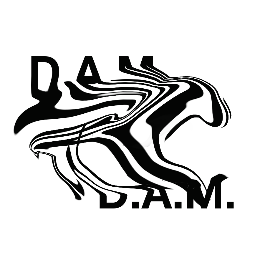
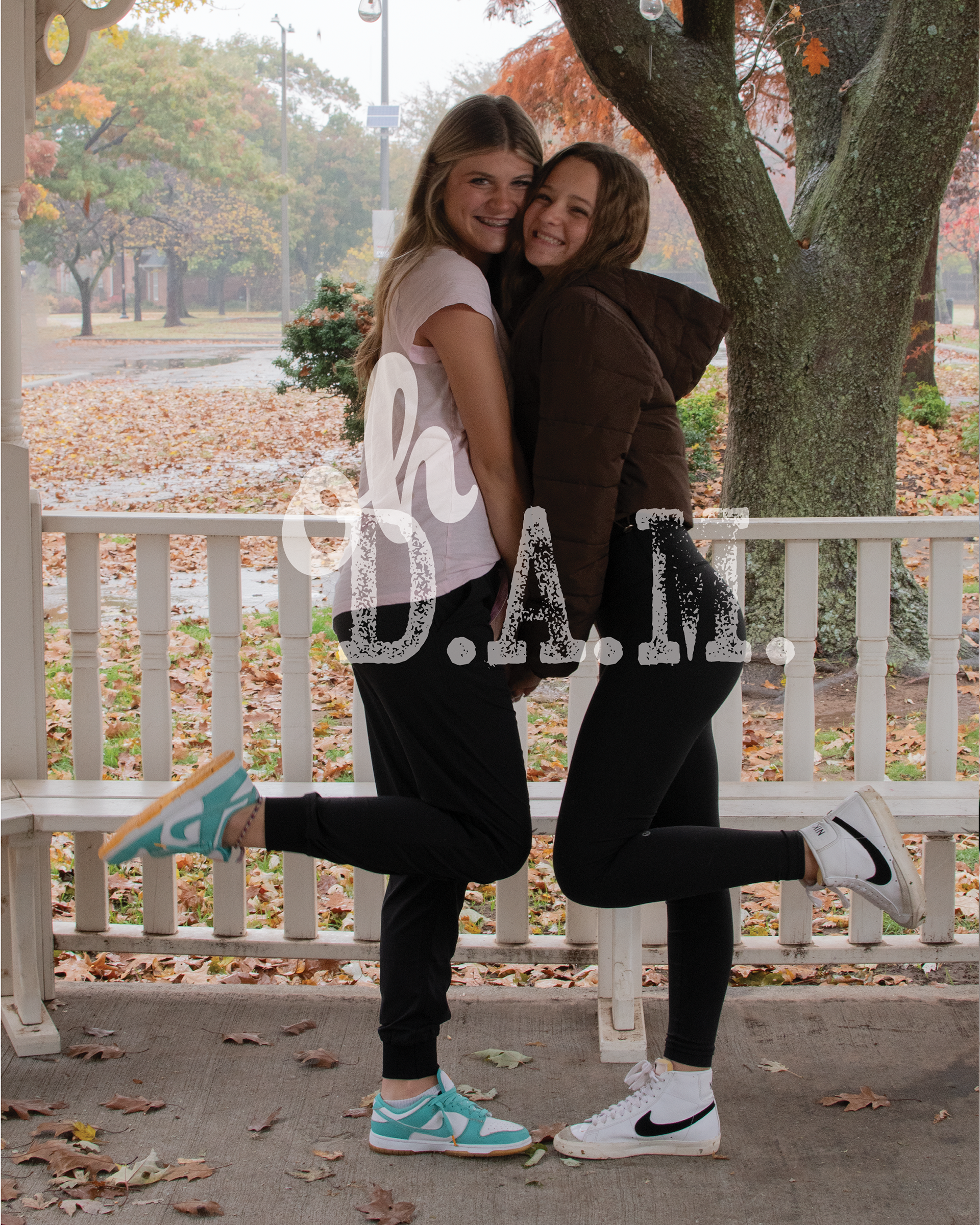
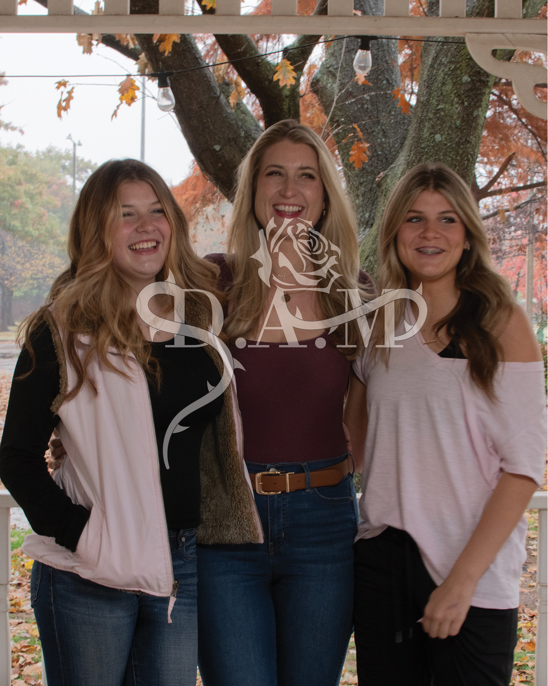
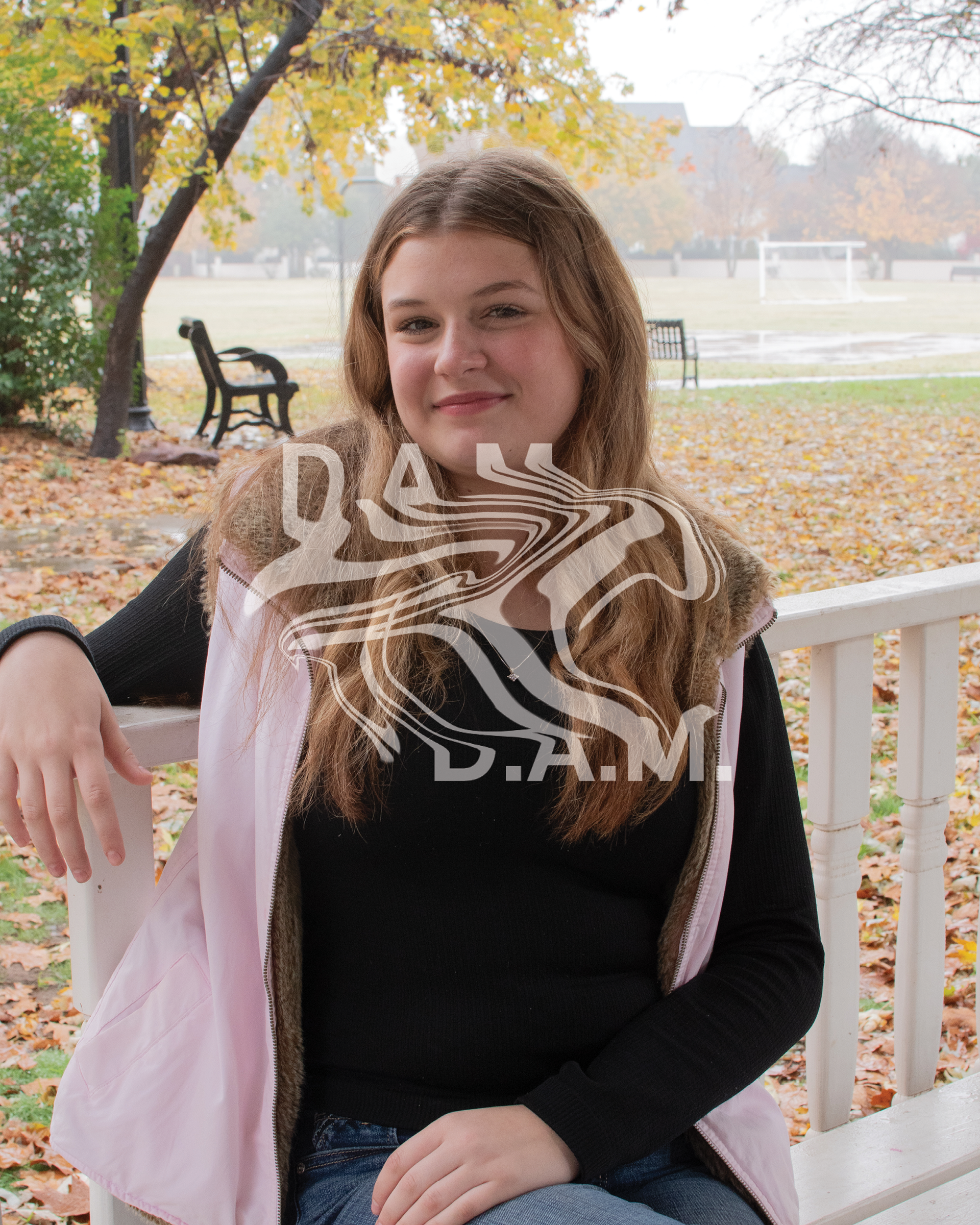
Watermark
April 2024 | Freelance Client
For this project, I designed a simple yet edgy watermark for a photographer with the initials D.A.M. The goal was to create a mark that was both distinctive and versatile for use across various photography styles. We ultimately chose a playful approach by incorporating the phrase “oh D.A.M” into the watermark, cleverly playing off the photographer’s initials while adding personality and memorability to their brand.


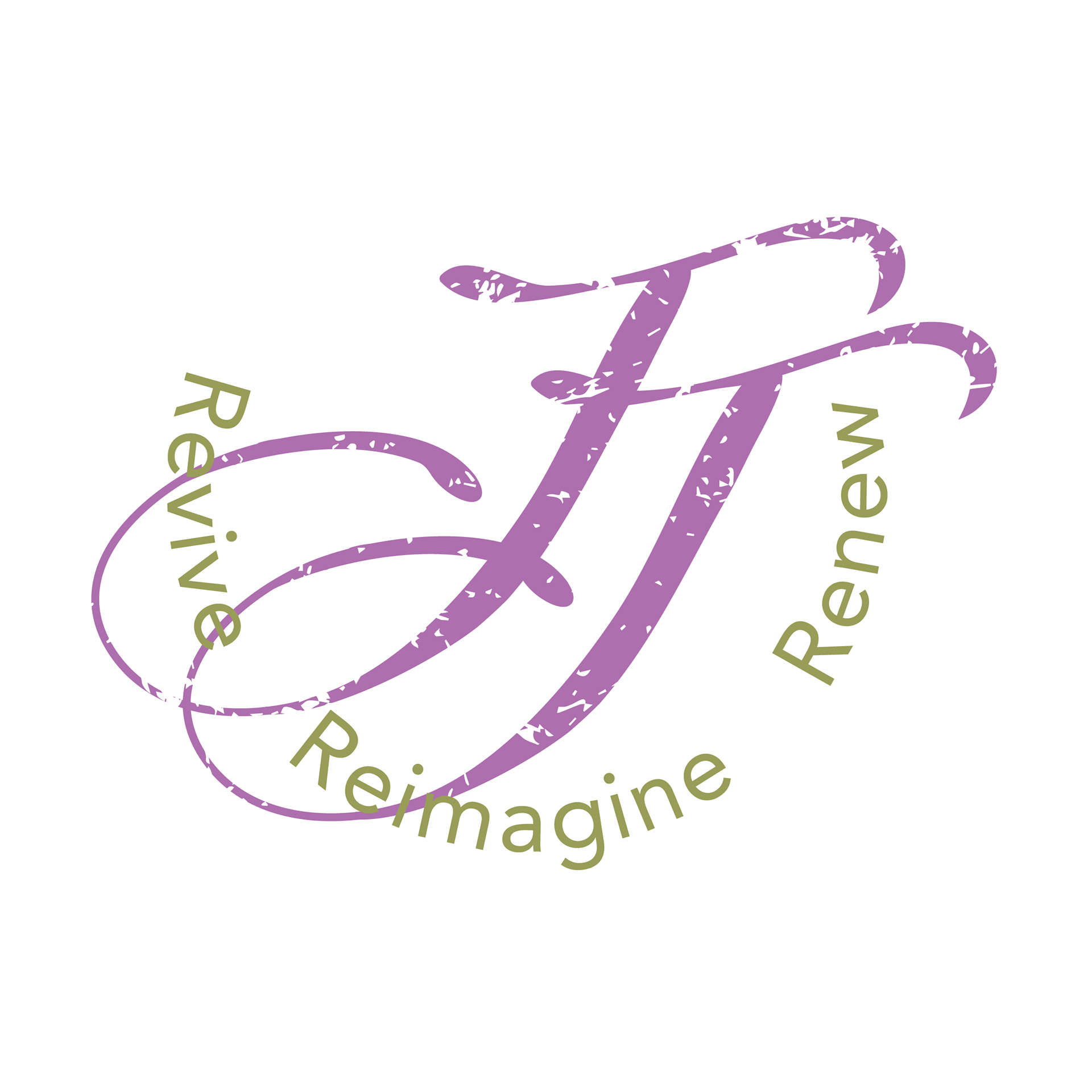
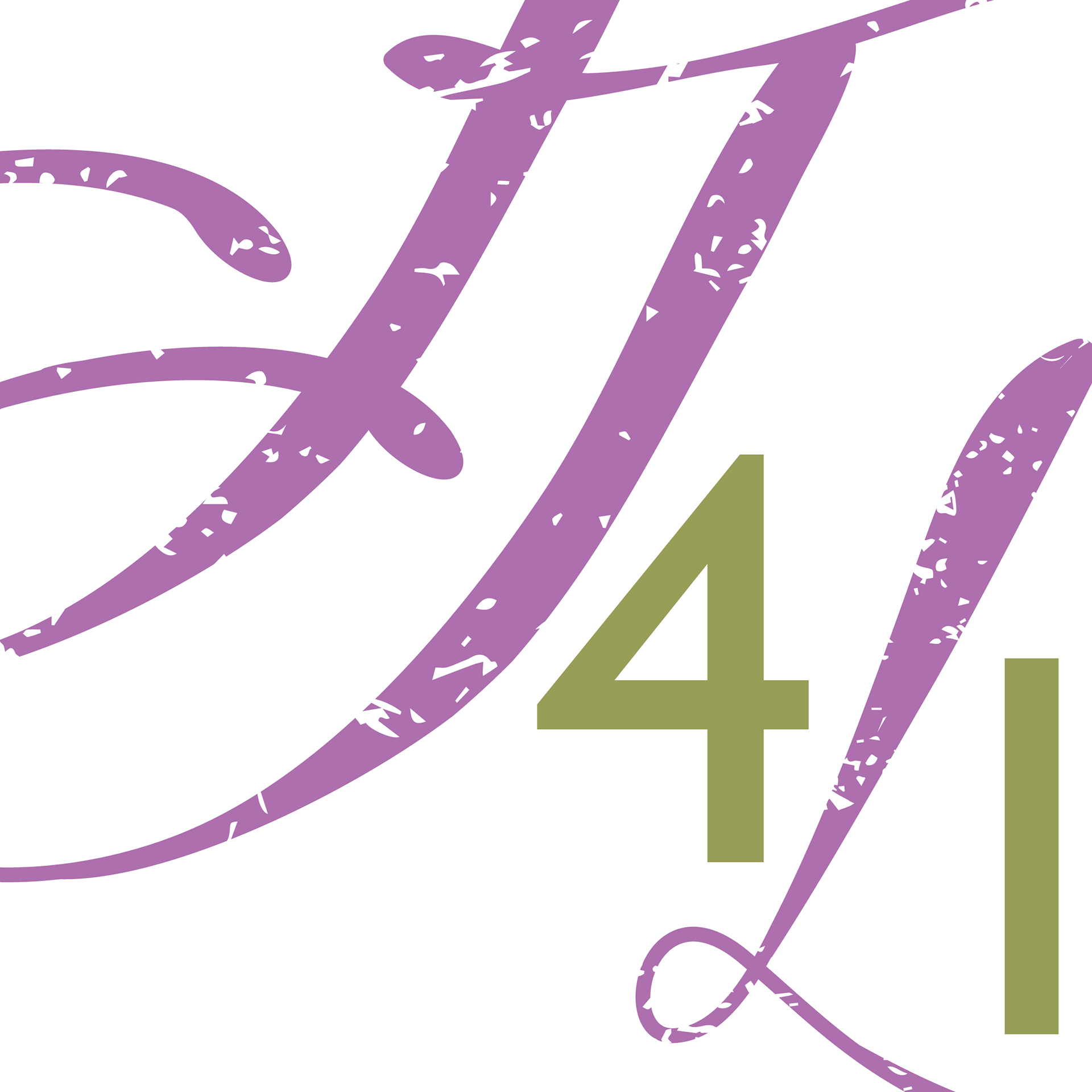
JJ4Life
Nov. 2023-Jan. 2024 | JJ4Life
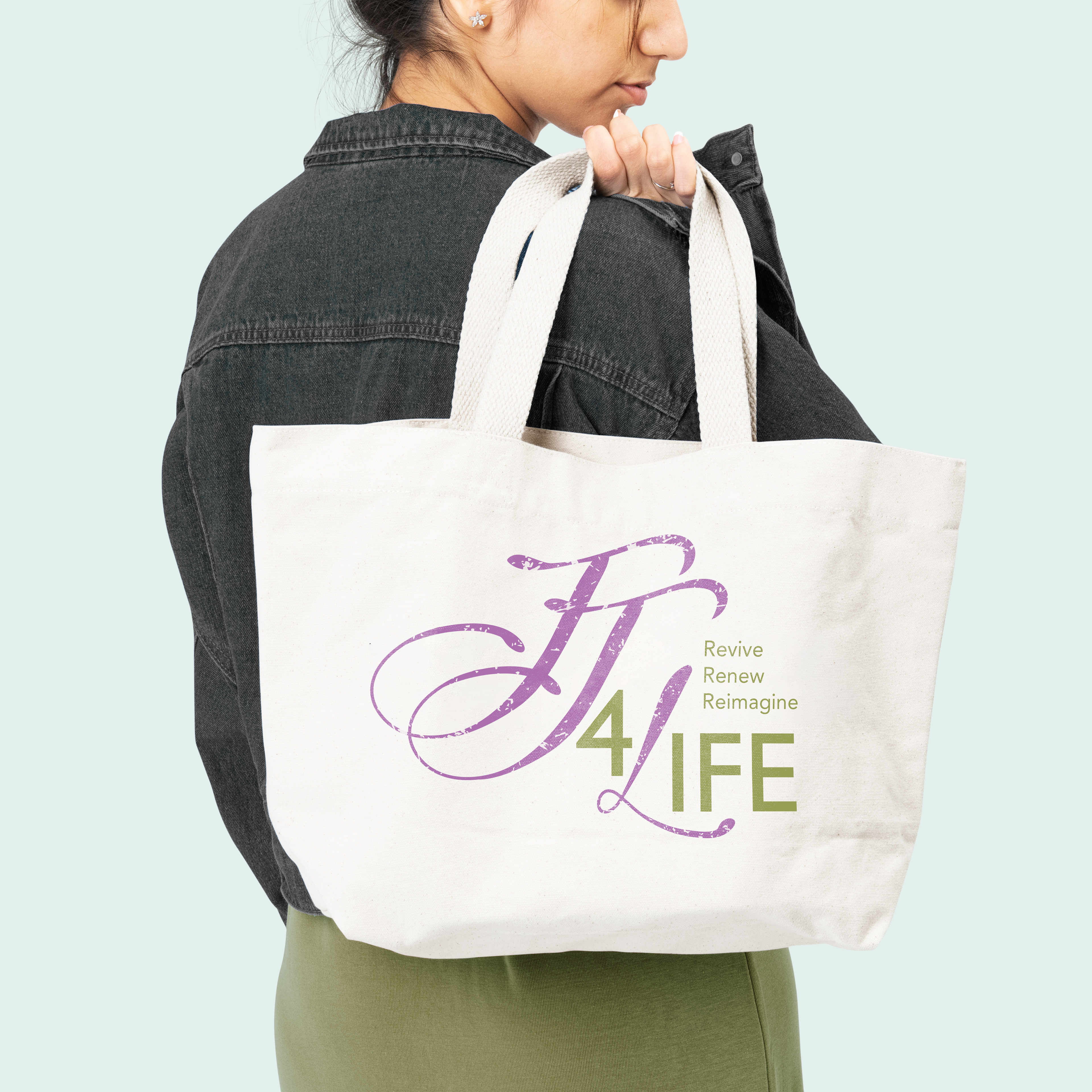
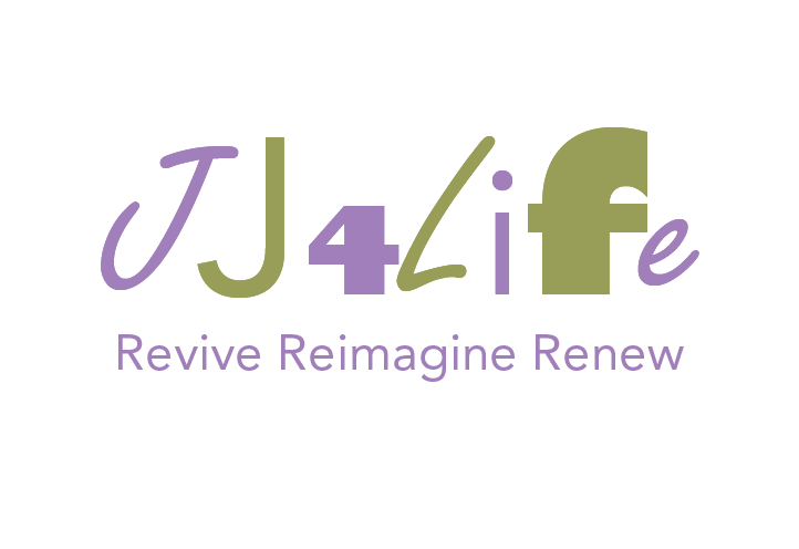
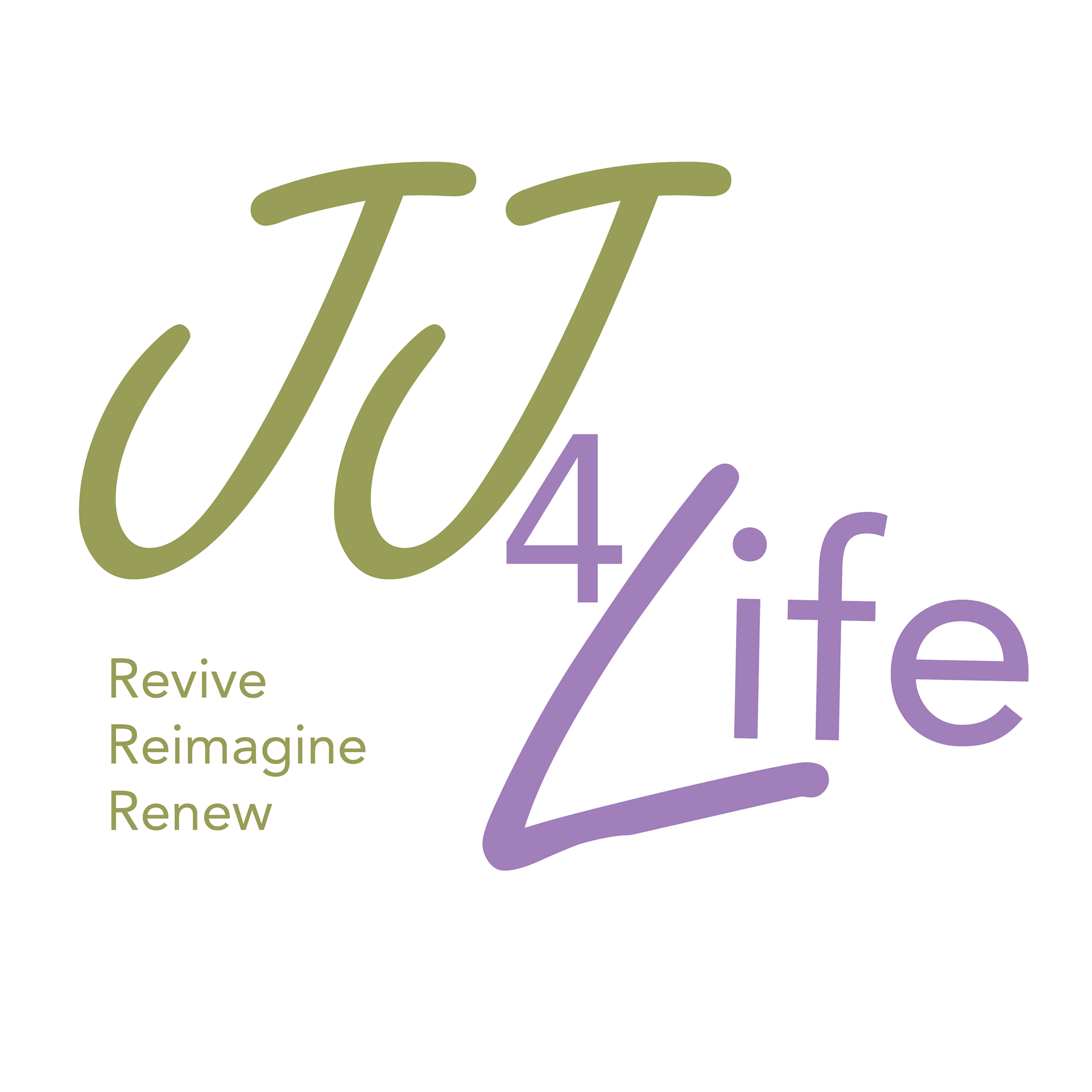
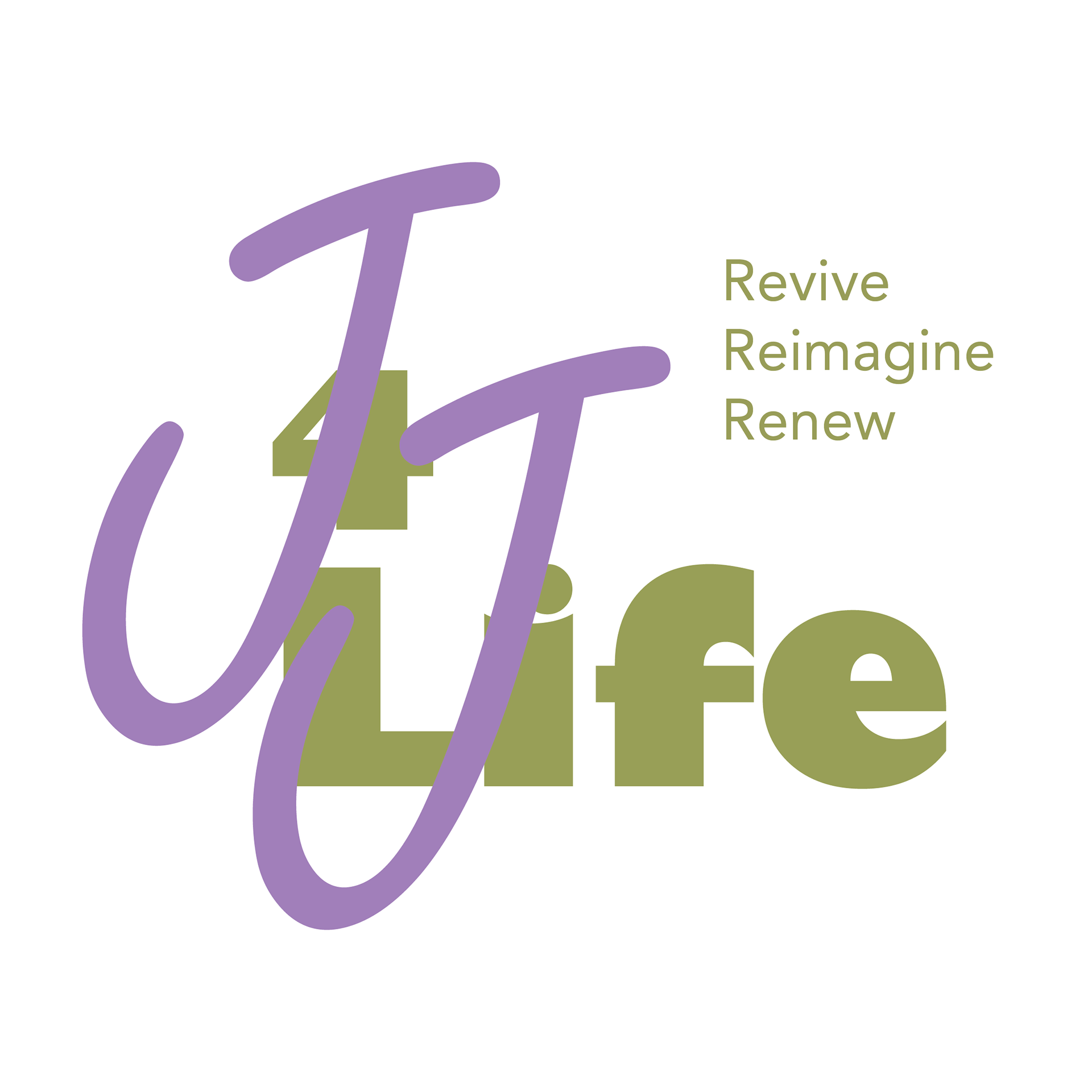
JJ4Life is a husband-and-wife creative team based in San Diego, California, with a passion for giving new life to old things. Their work spans a wide range of projects—from handmade jewelry and refurbished furniture to transforming broken electronics (like old computers) into unique, functional pieces like lamps.
They needed a logo and slogan that would set them apart from a typical thrift store and better reflect the heart of their business: creative refurbishment. With that in mind, I designed a logo that visually communicates both the worn and the renewed. The distressed type used for the “JJ” and “L” represents the “old,” while the clean green type used for the rest of the logo symbolizes growth, renewal, and sustainability—core values of the JJ4Life brand.
The slogan, Revive Reimagine Renew, comes from the concept of the company and how the couple described their work.
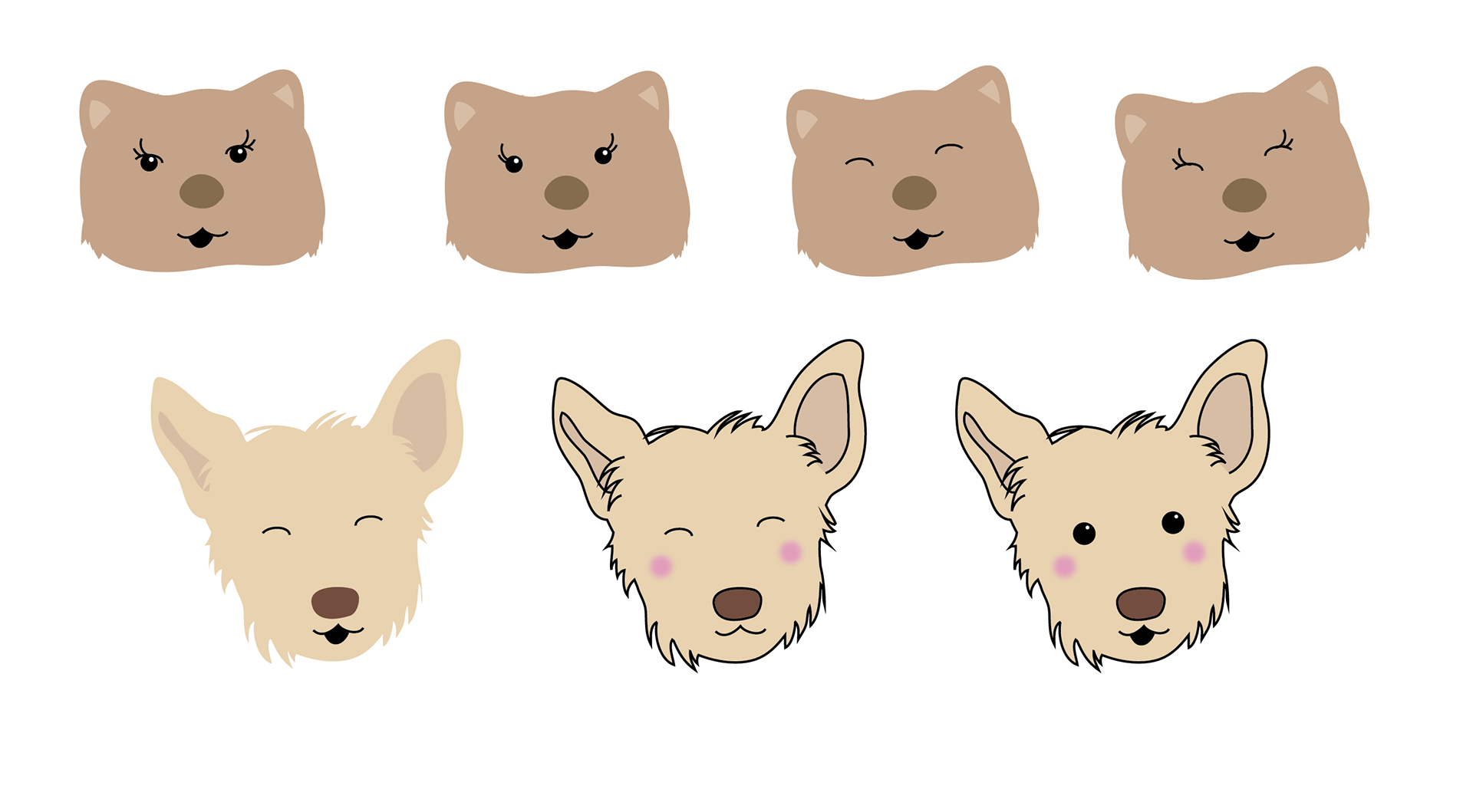
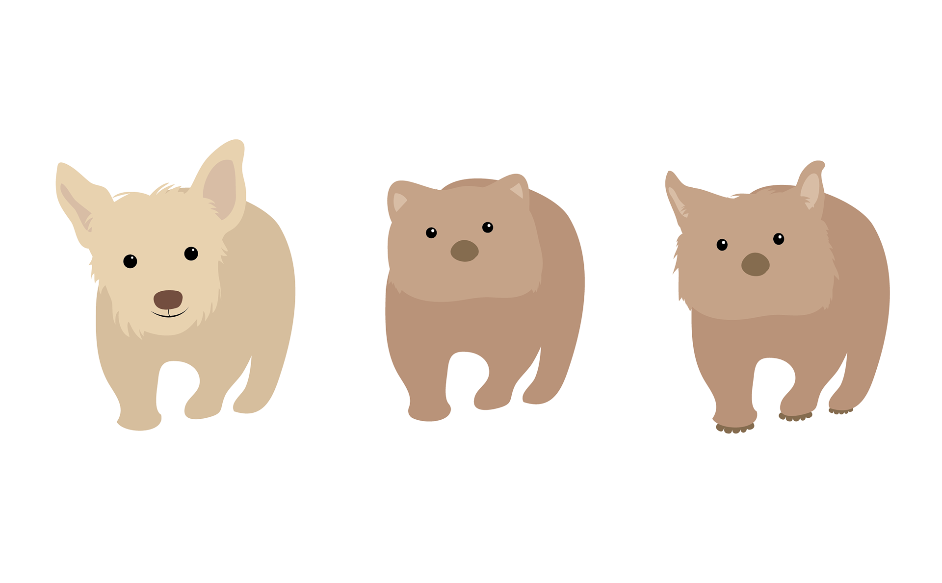
They regularly receive donations and are passionate about giving back—ensuring that everything gifted to them finds its way back into their city.
To support this part of their mission, they needed a designated space for community drop-offs. Enter the Wombat Corner—a whimsical character inspired by a cartoon wombat and the couple’s sweet dog, Ophelia. Below are early concept sketches and character explorations, including variations of facial expressions as the Wombat came to life.


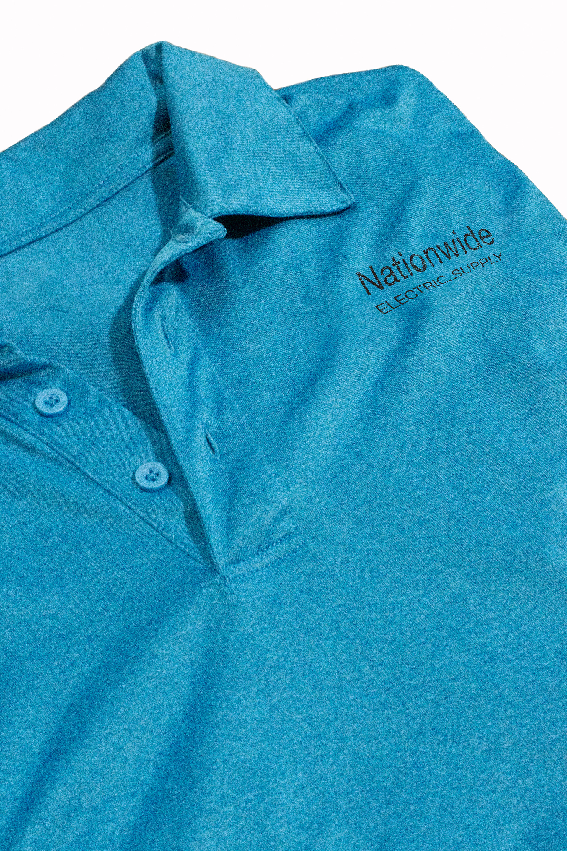
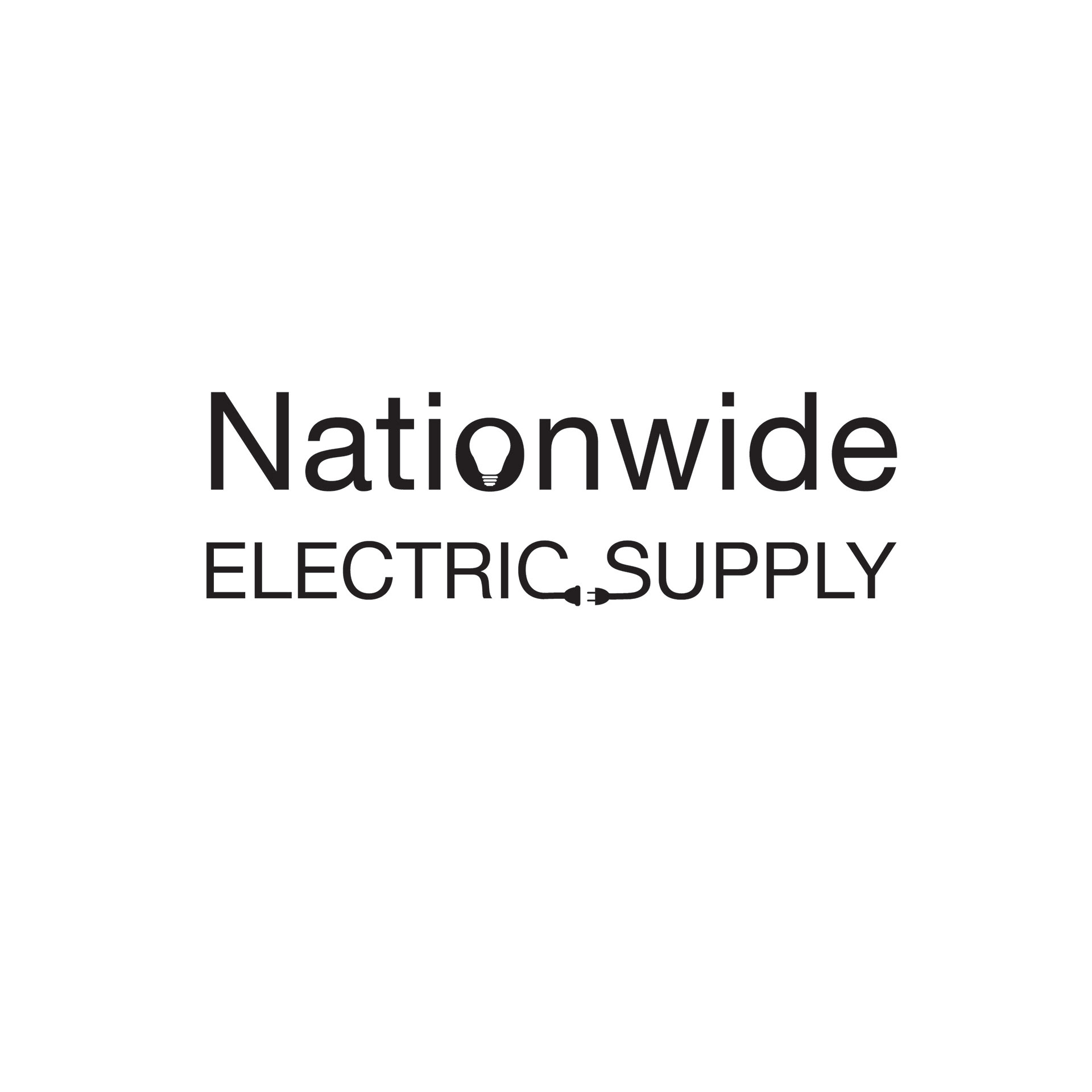
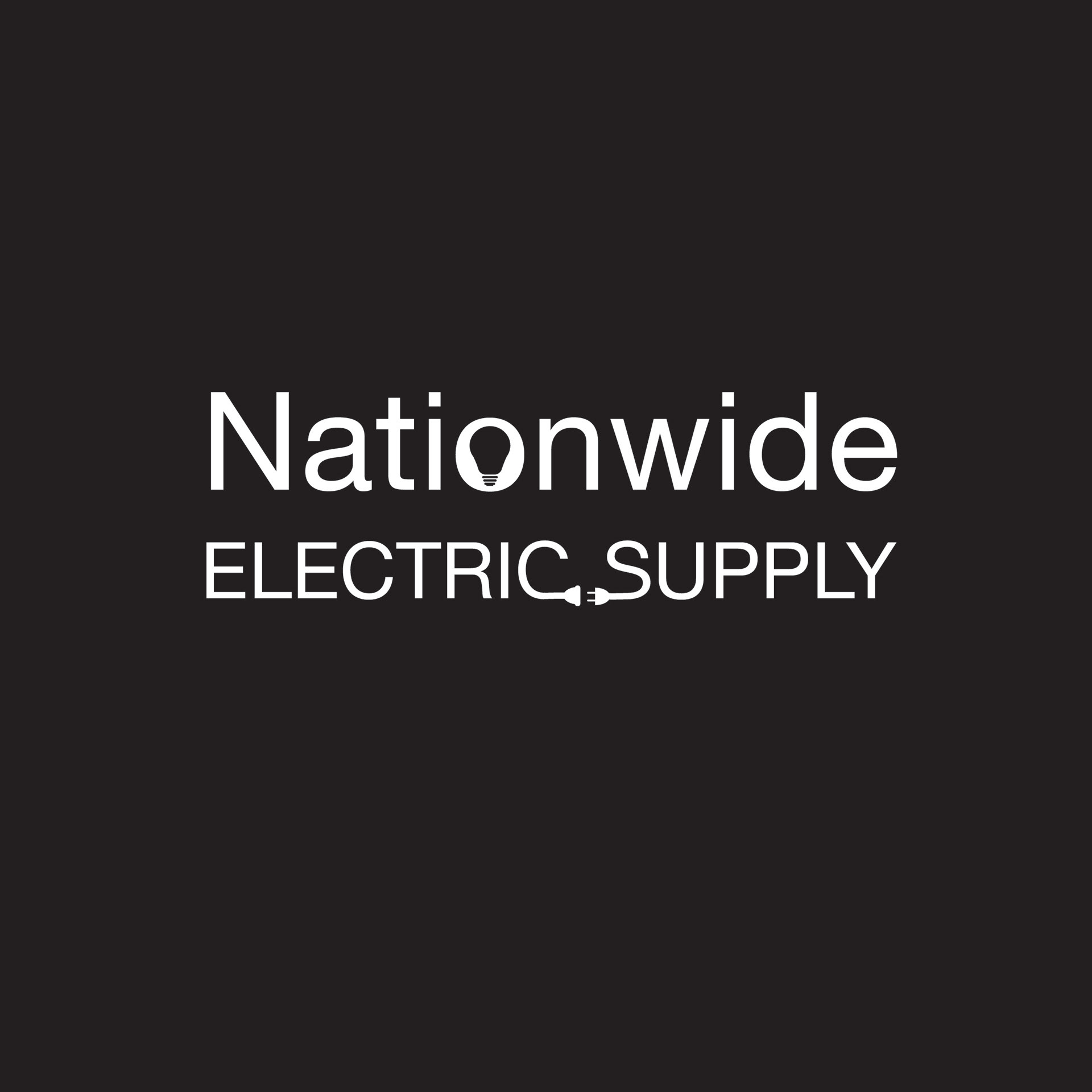
Nationwide
Electric Supply
Electric Supply
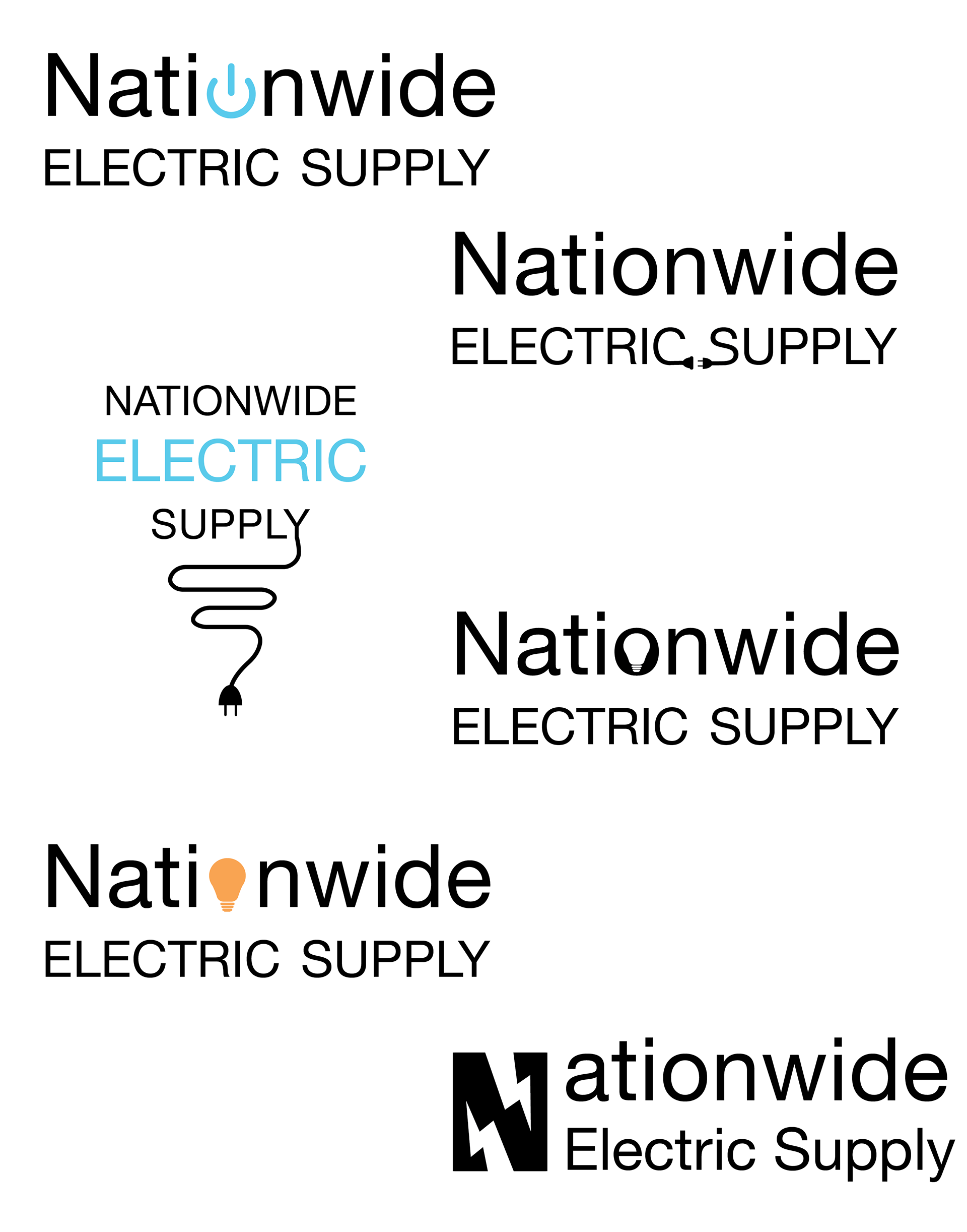
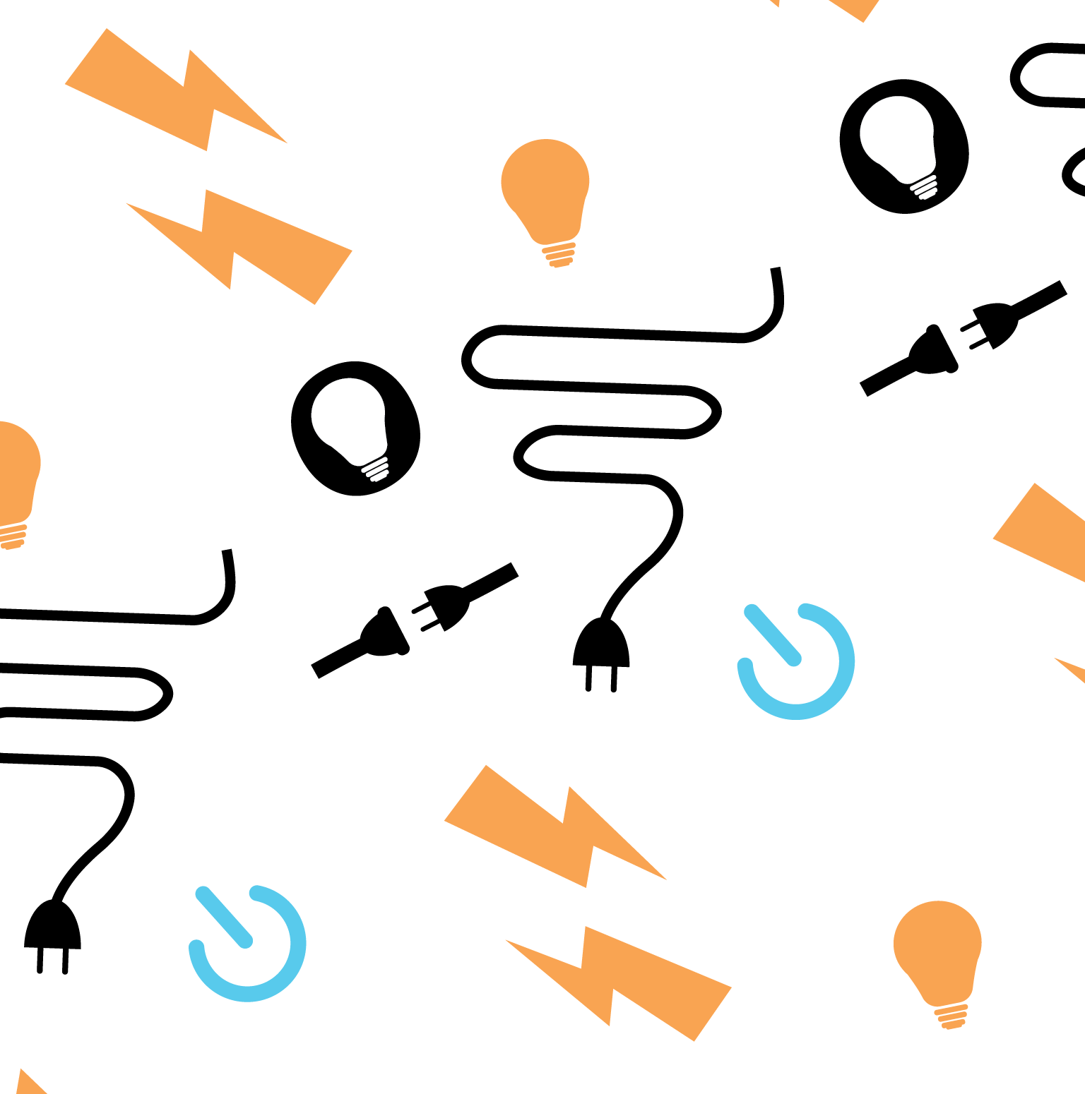
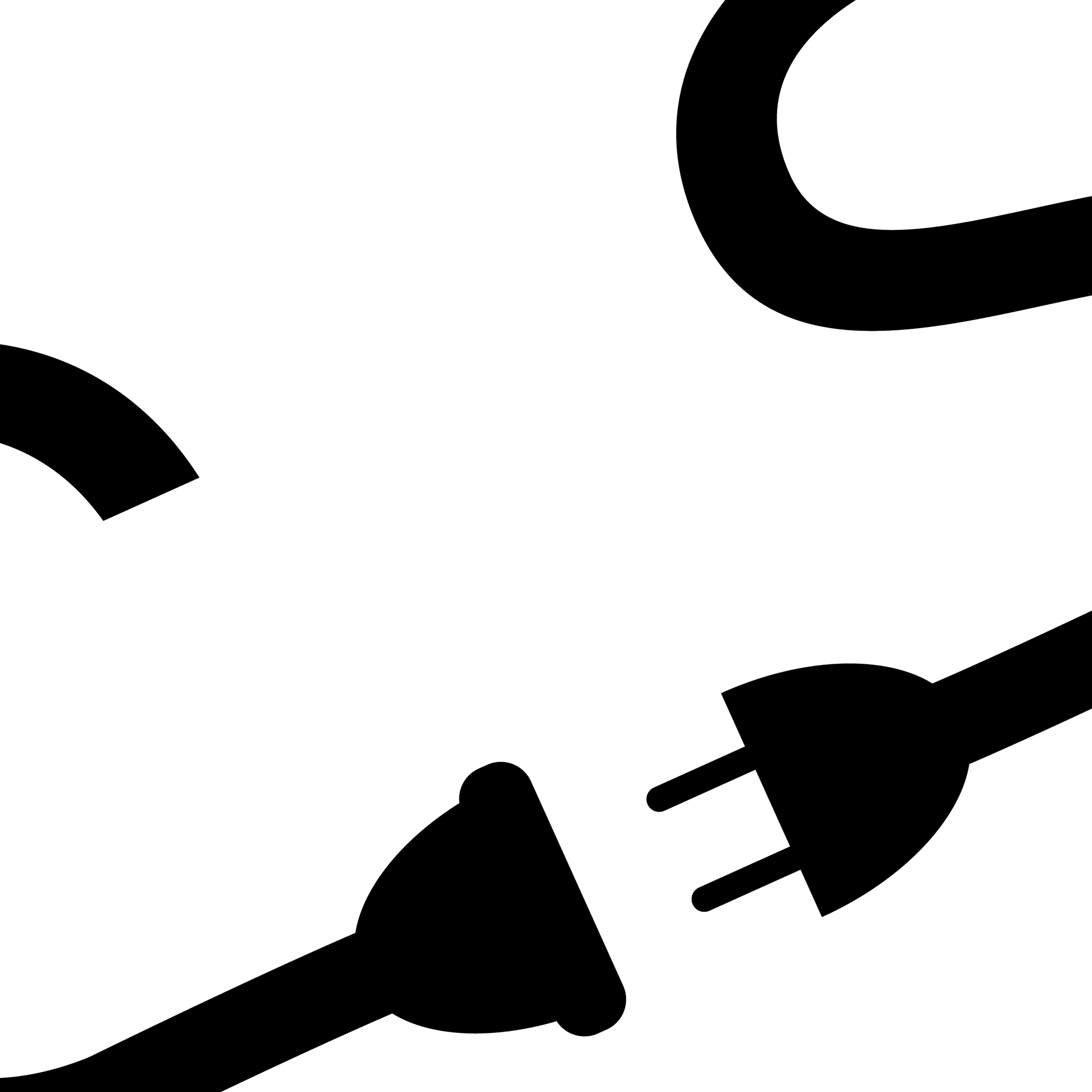
May 2023 | Marketing Hope
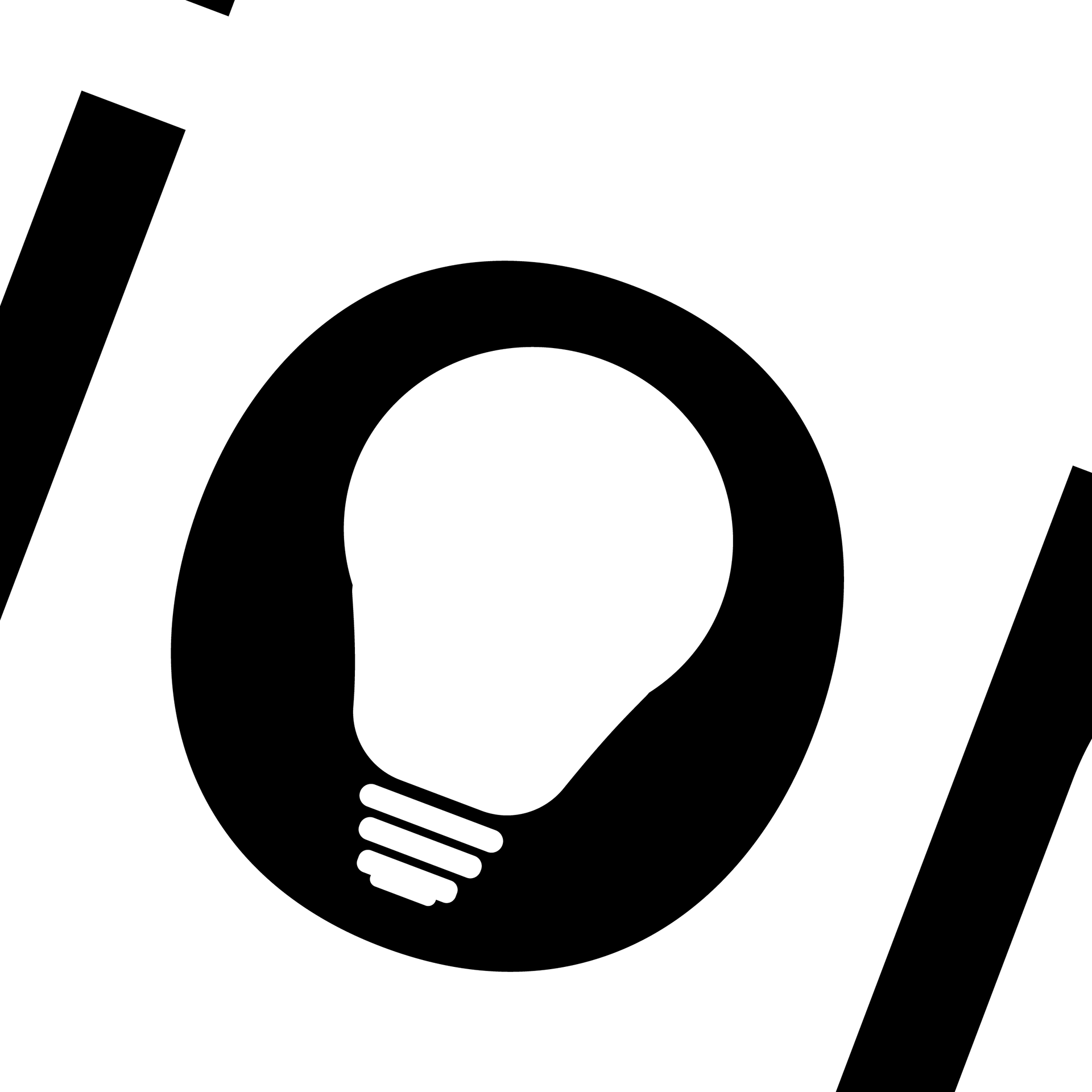
Nationwide Electric Supply is a Colorado-based company providing parts and components for a wide range of electrical needs. The goal for their logo was to keep the design clean and straightforward, while incorporating clever visual elements that reflect the industry. A lightbulb subtly appears in the negative space of the “O,” symbolizing ideas and innovation, while a power plug is nestled between the “C” and “S” to represent connection and energy—small surprises that give the logo both function and personality.
The Mark
Hope Show
Hope Show

Jan. 2023 | Marketing Hope
This logo was created for a podcast centered on community, education, and supporting the growth of small businesses. The goal was to visually capture the spirit of building others up in a safe and nurturing environment.
Inspired by the protective behavior of elephants—where adults encircle and shield the young from harm until they’re strong enough to do the same for others—the logo symbolizes a cycle of support, mentorship, and empowerment. It reflects the podcast’s mission to foster a space where small business owners can grow, thrive, and eventually help others do the same.
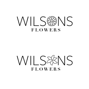
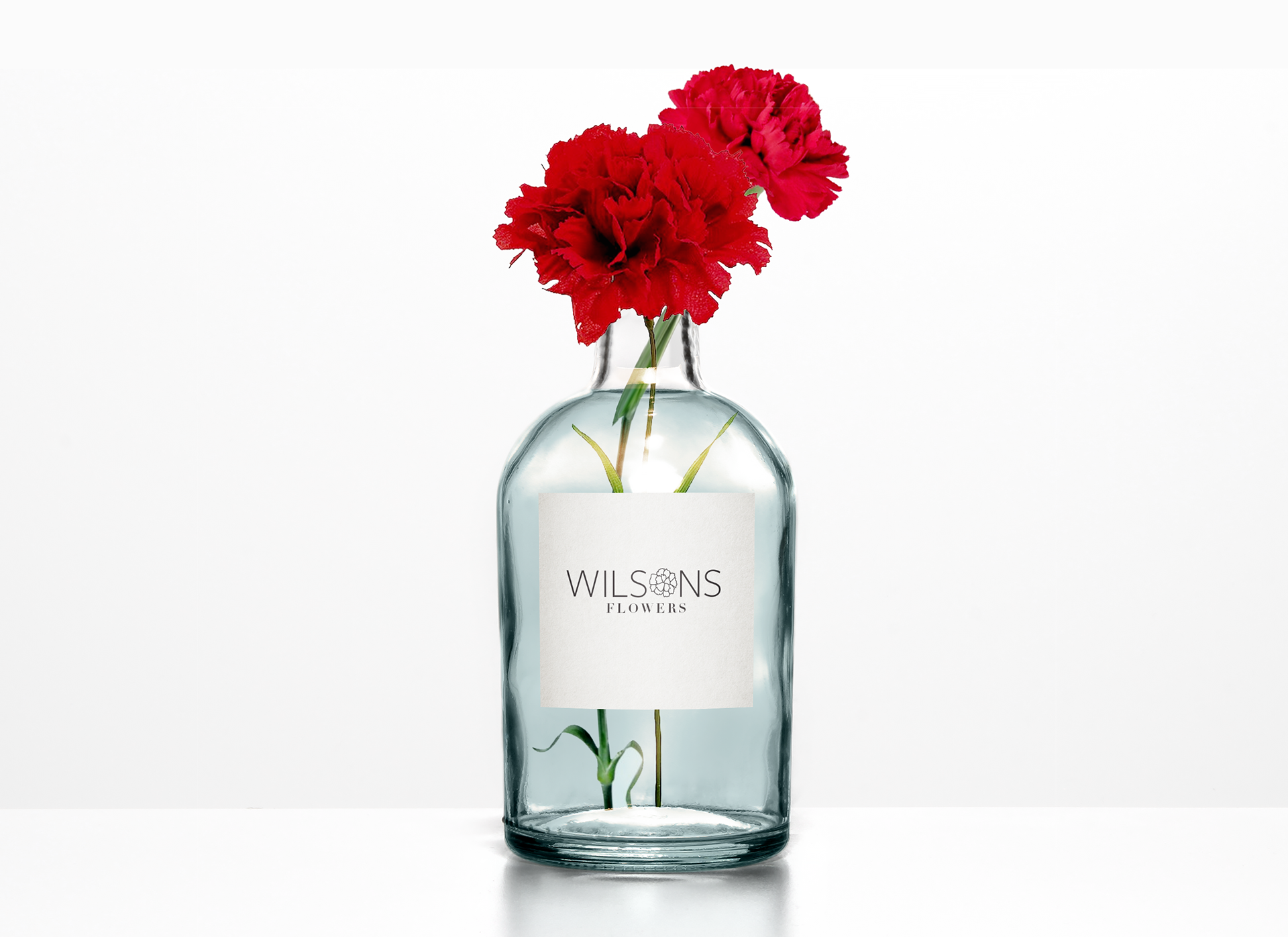
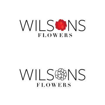
Logo Concepts