Watermarks
April 2024 | Freelance Client 
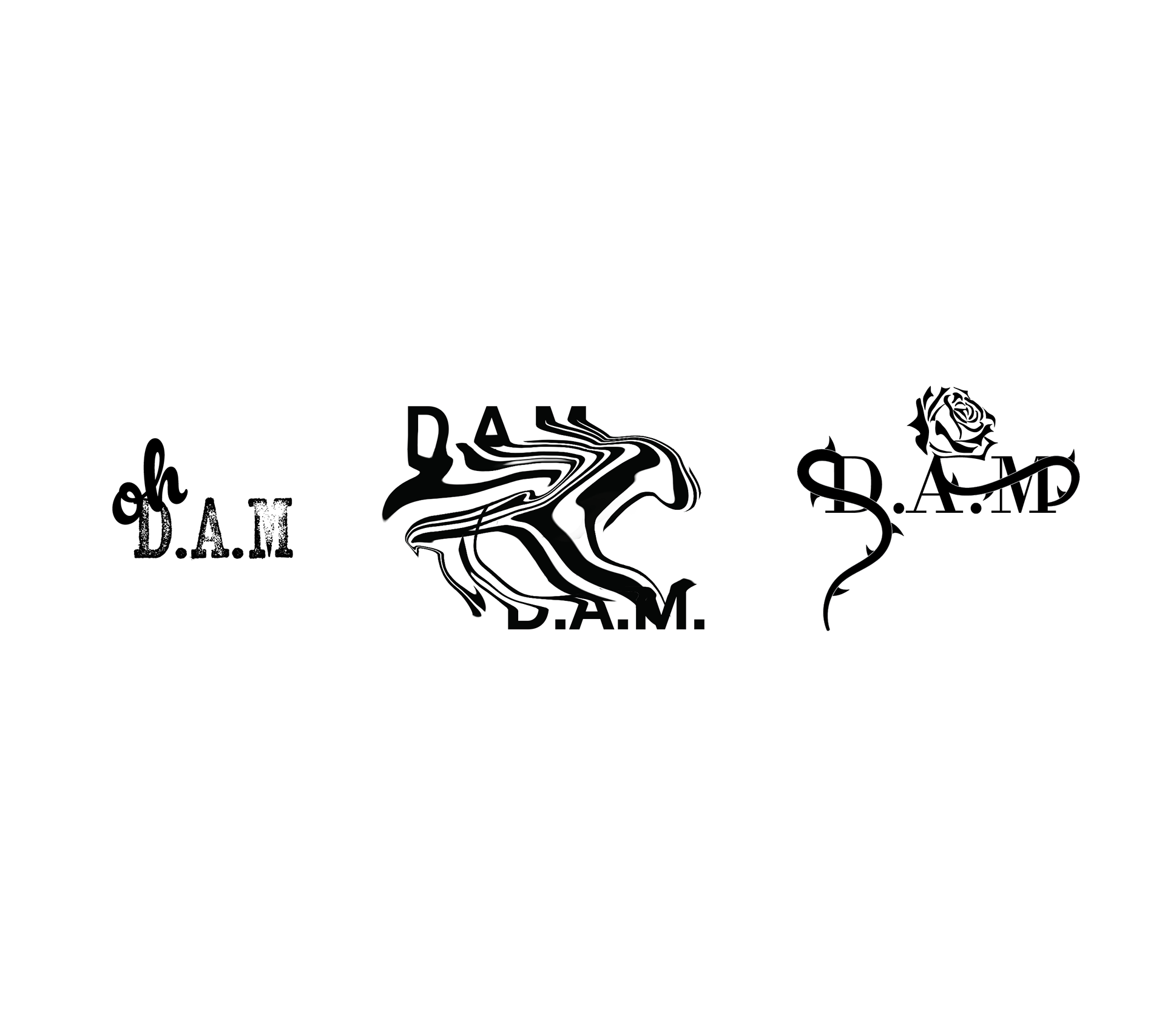
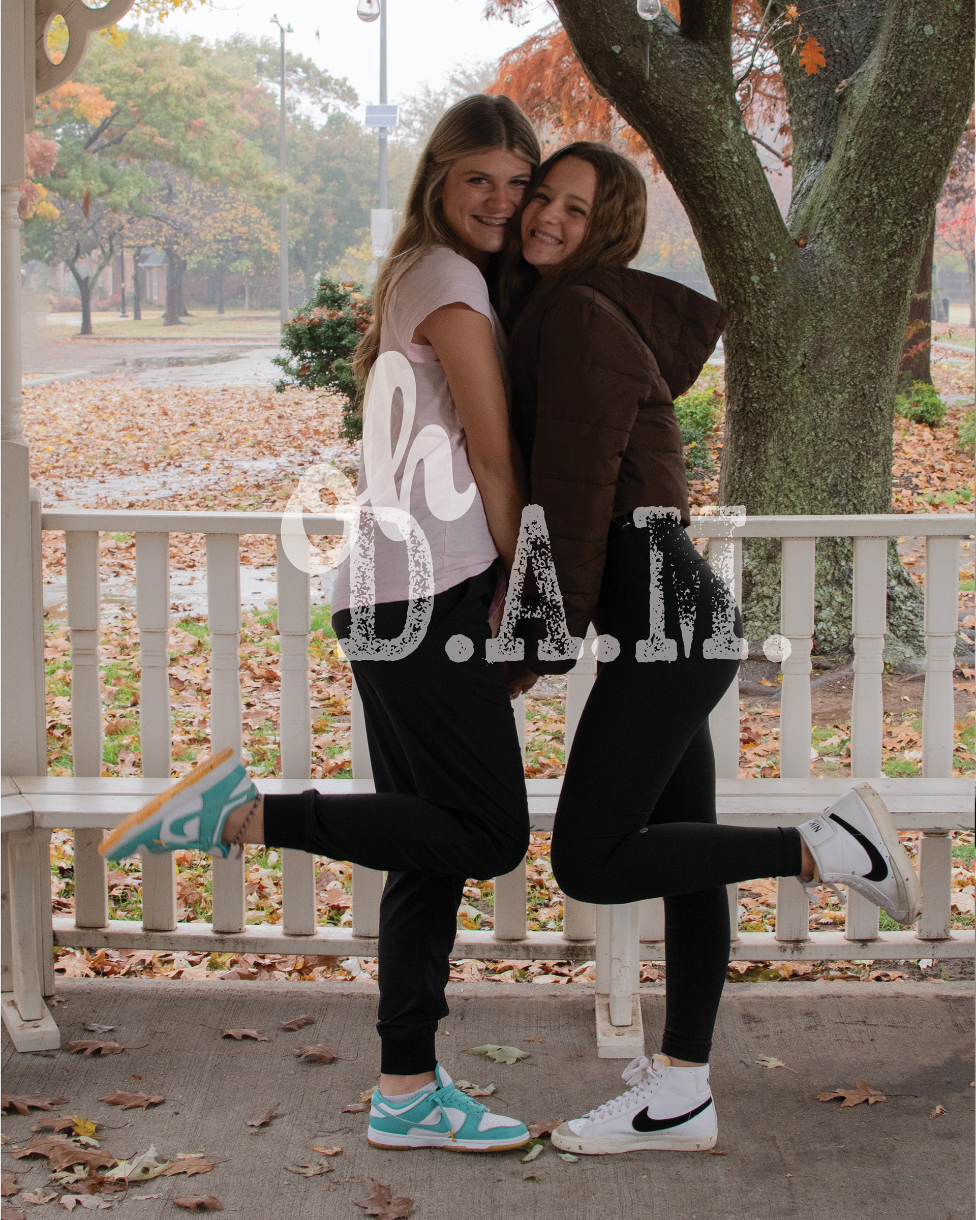
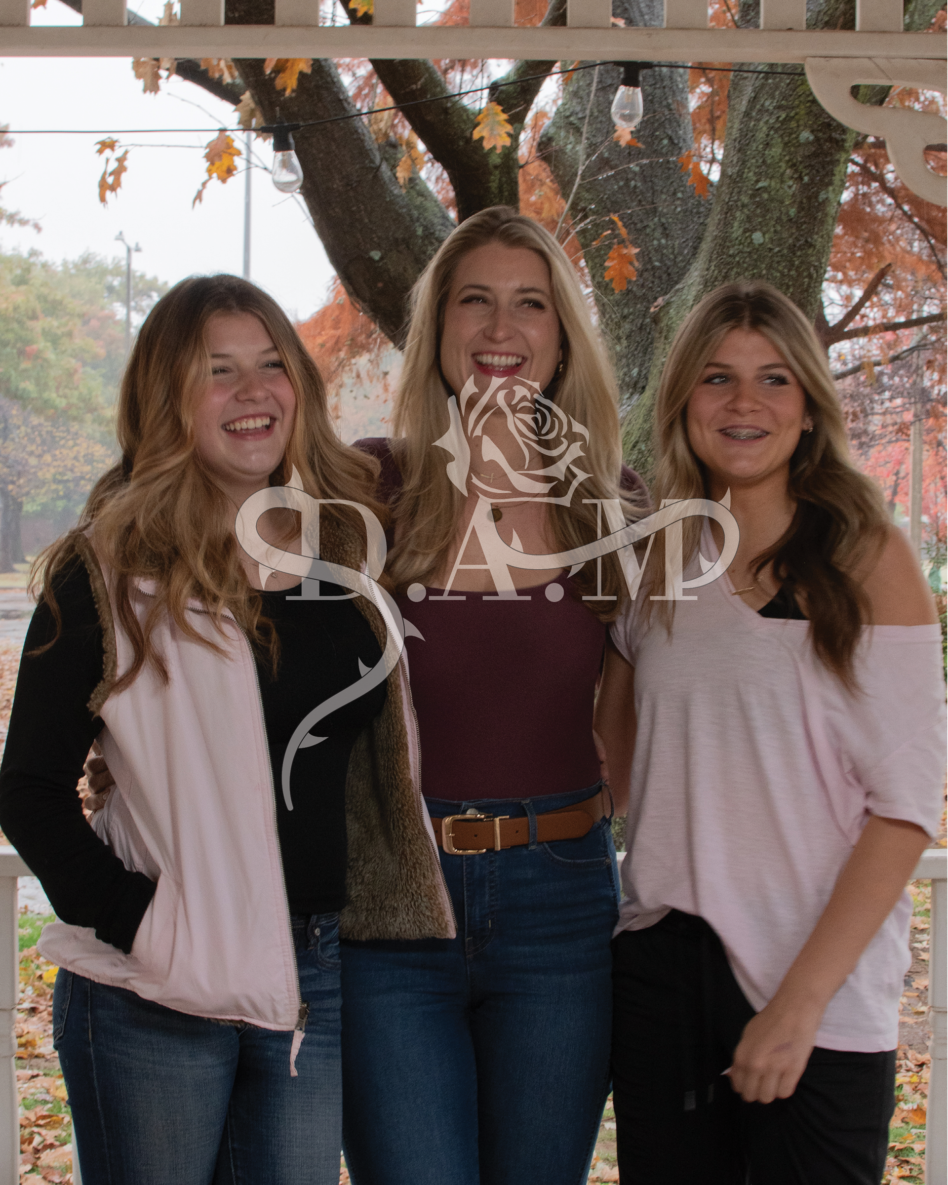
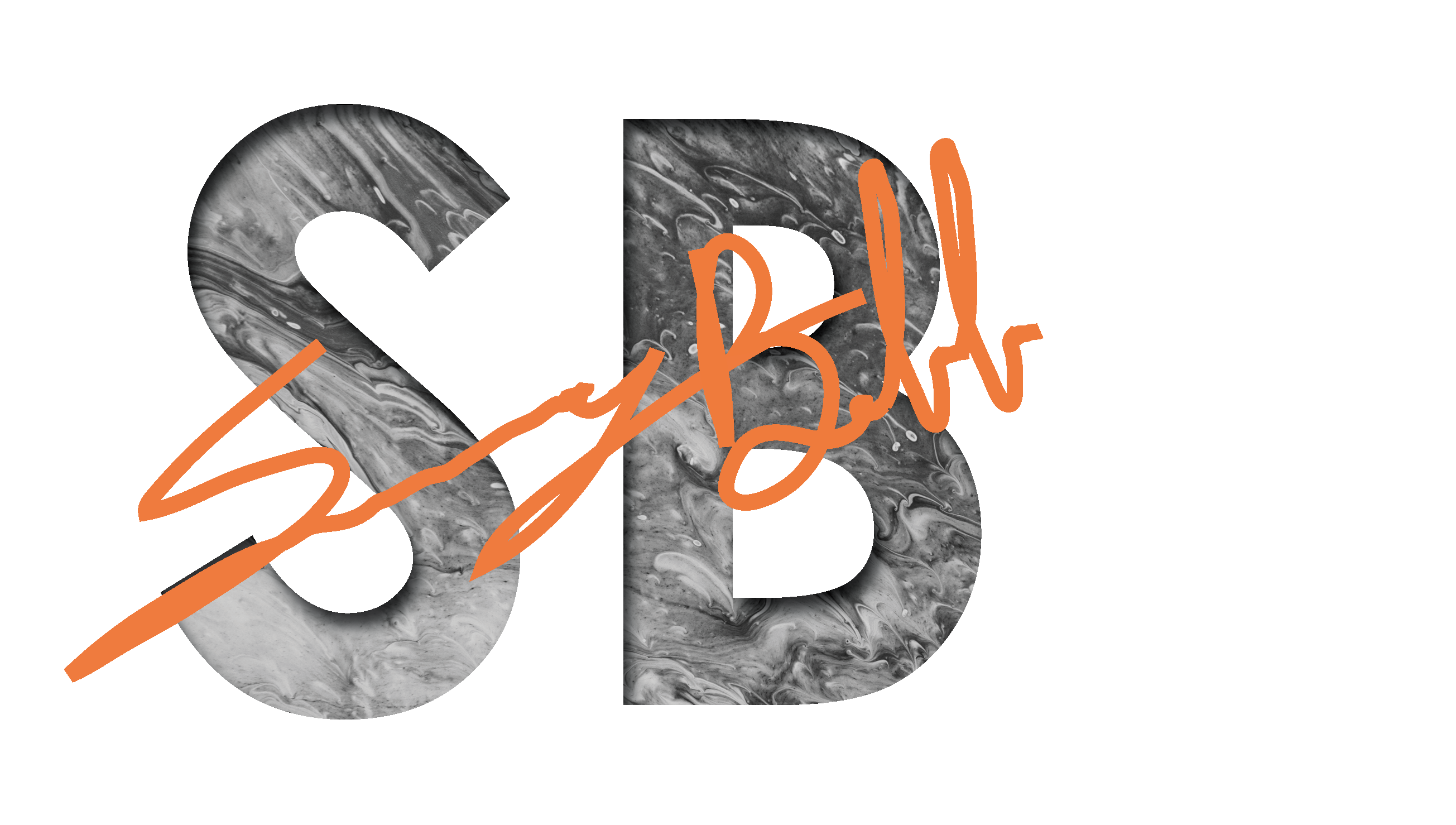
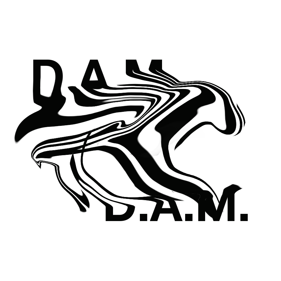
For this project, I designed a simple yet edgy watermark for a photographer with the initials D.A.M. The goal was to create a mark that was both distinctive and versatile for use across various photography styles. We ultimately chose a playful approach by incorporating the phrase “oh D.A.M” into the watermark, cleverly playing off the photographer’s initials while adding personality and memorability to their brand.
JJ4Life
Nov. 2023-Jan. 2024 | JJ4Life
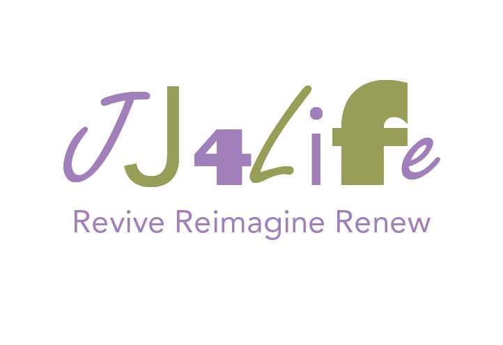
JJ4Life is a husband-and-wife creative team based in San Diego, California, with a passion for giving new life to old things. Their work spans a wide range of projects—from handmade jewelry and refurbished furniture to transforming broken electronics (like old computers) into unique, functional pieces like lamps.
They needed a logo and slogan that would set them apart from a typical thrift store and better reflect the heart of their business: creative refurbishment. With that in mind, I designed a logo that visually communicates both the worn and the renewed. The distressed type used for the “JJ” and “L” represents the “old,” while the clean green type used for the rest of the logo symbolizes growth, renewal, and sustainability—core values of the JJ4Life brand.
The slogan, Revive Reimagine Renew, comes from the concept of the company and how the couple described their work.
They regularly receive donations and are passionate about giving back—ensuring that everything gifted to them finds its way back into their city.
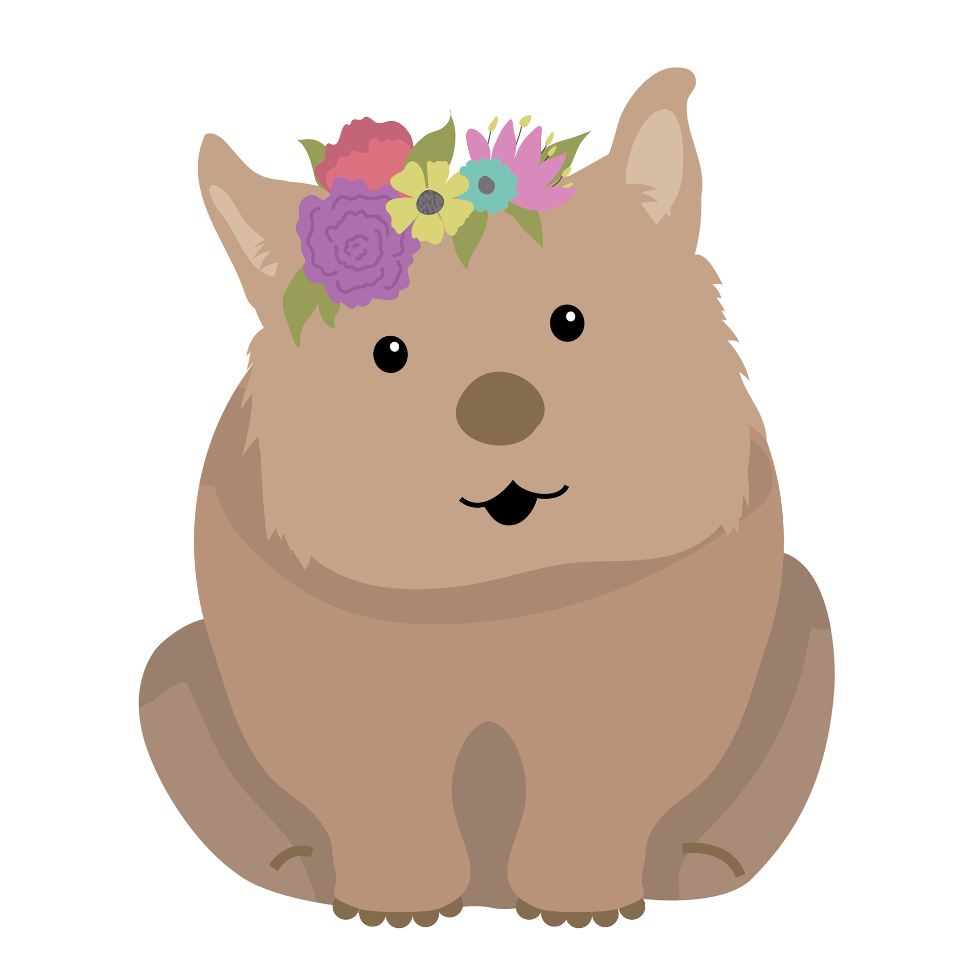
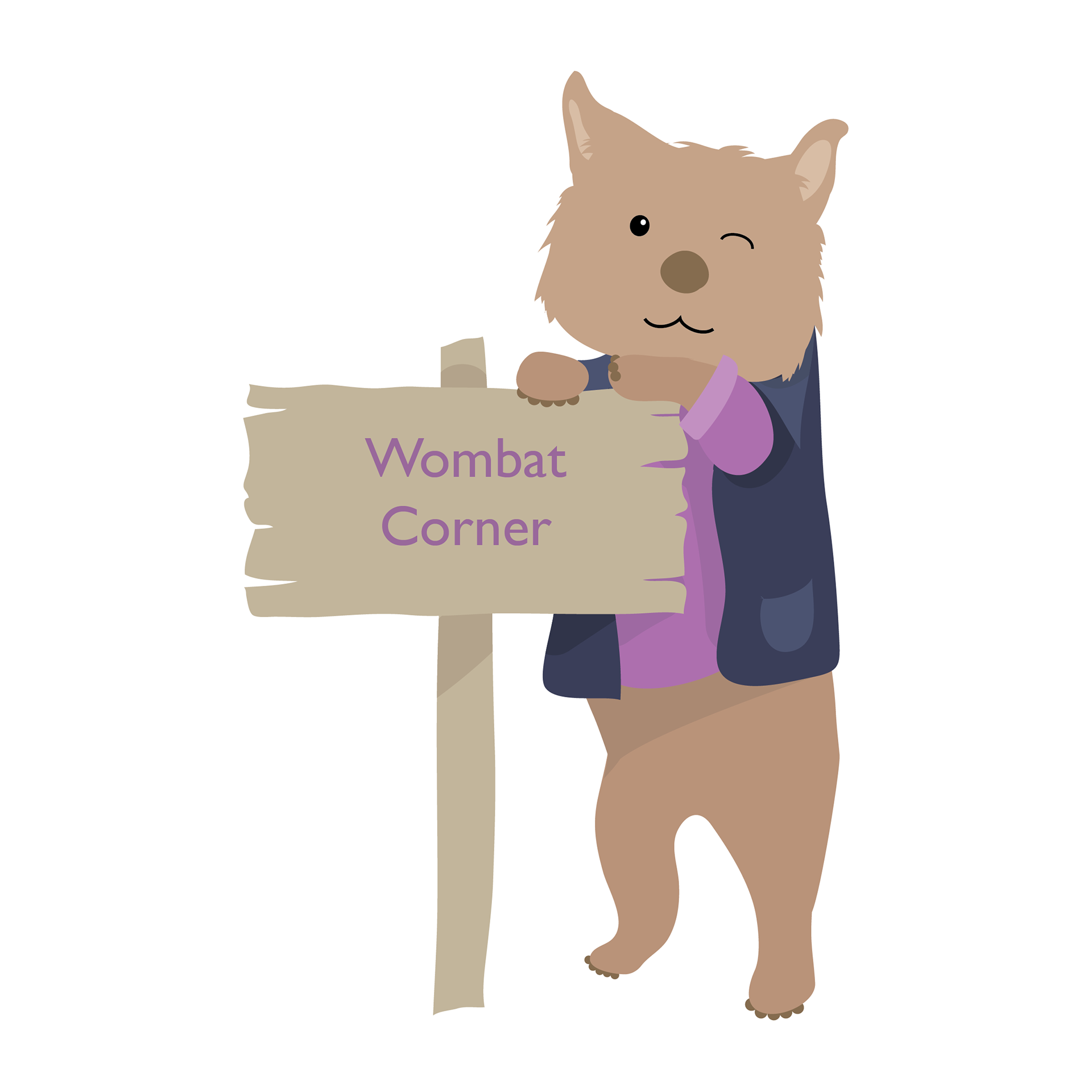
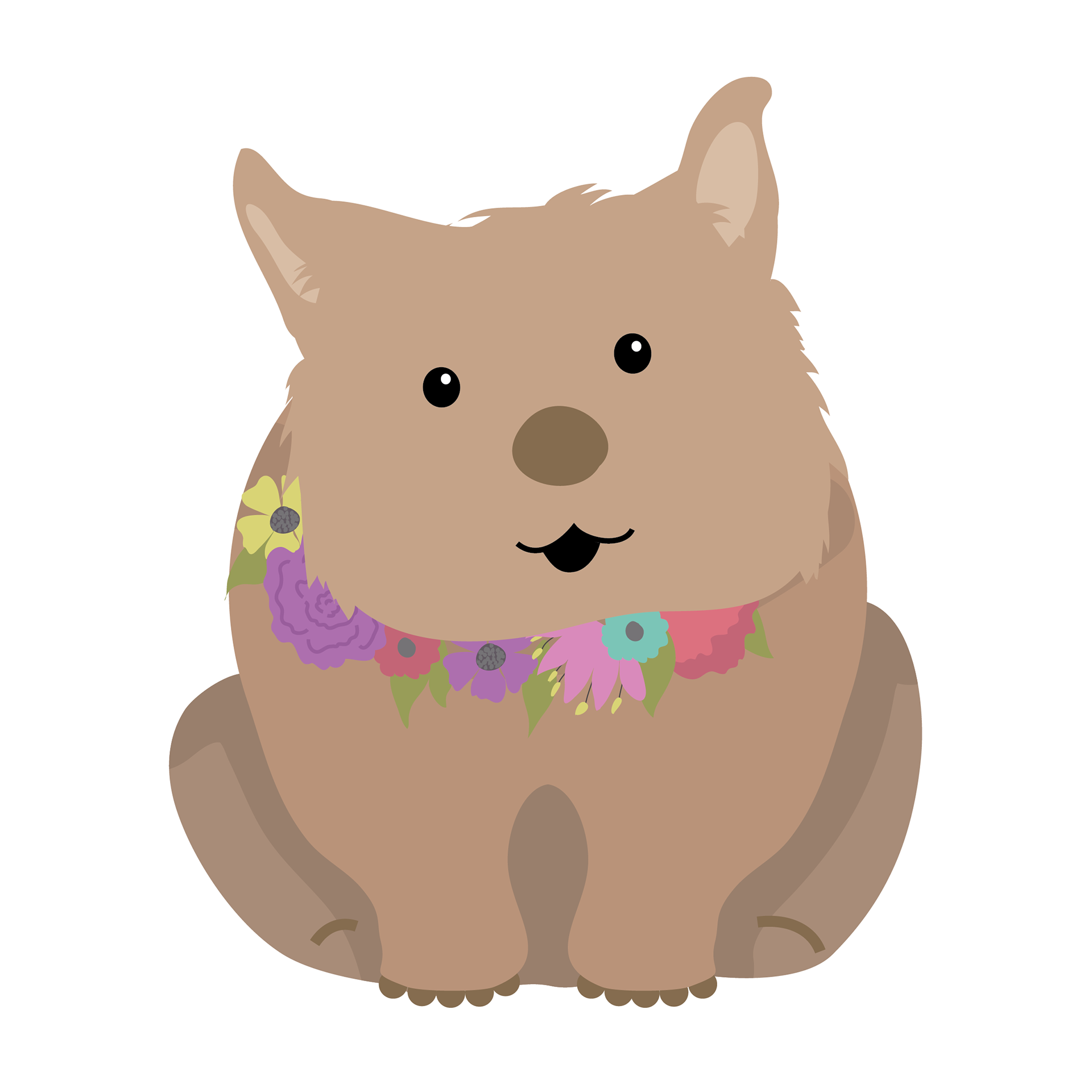
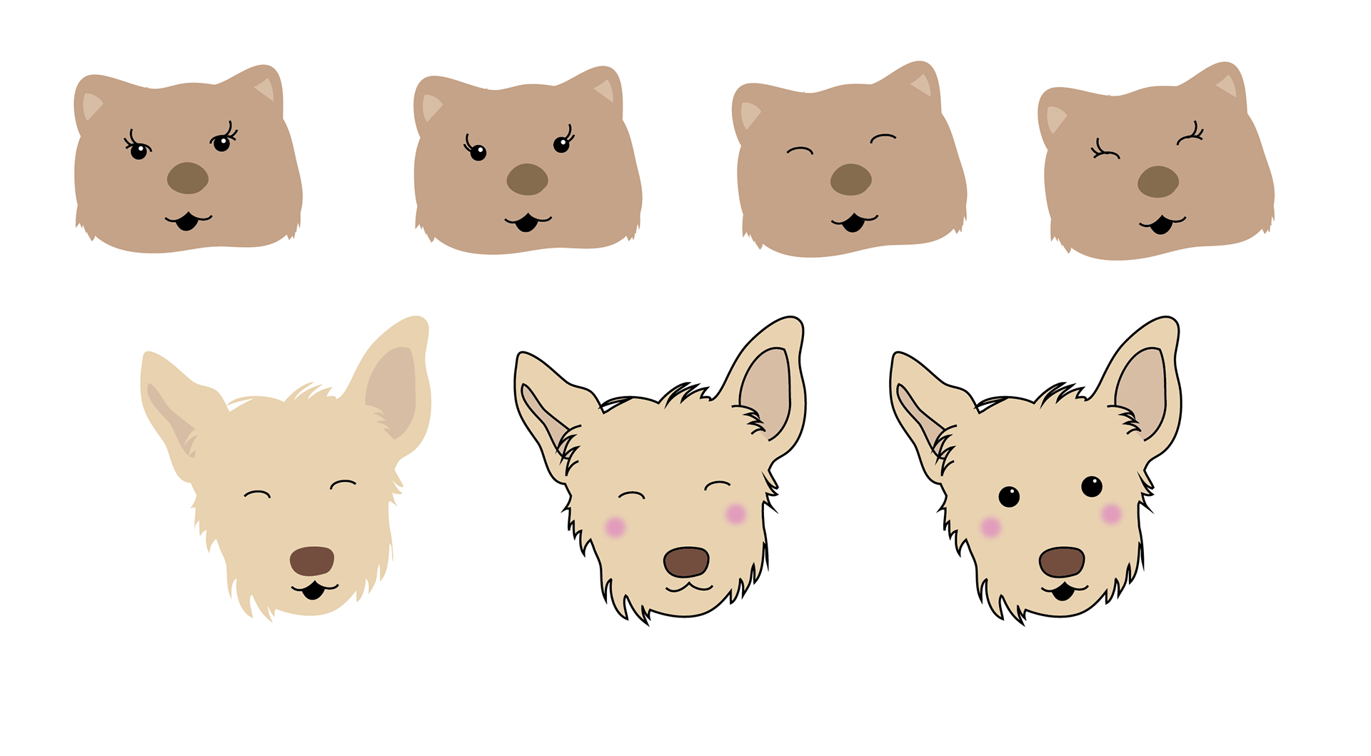
To support this part of their mission, they needed a designated space for community drop-offs. Enter the Wombat Corner—a whimsical character inspired by a cartoon wombat and the couple’s sweet dog, Ophelia. Below are early concept sketches and character explorations, including variations of facial expressions as the Wombat came to life.
Nationwide
 Electric Supply
May 2023 | Marketing Hope
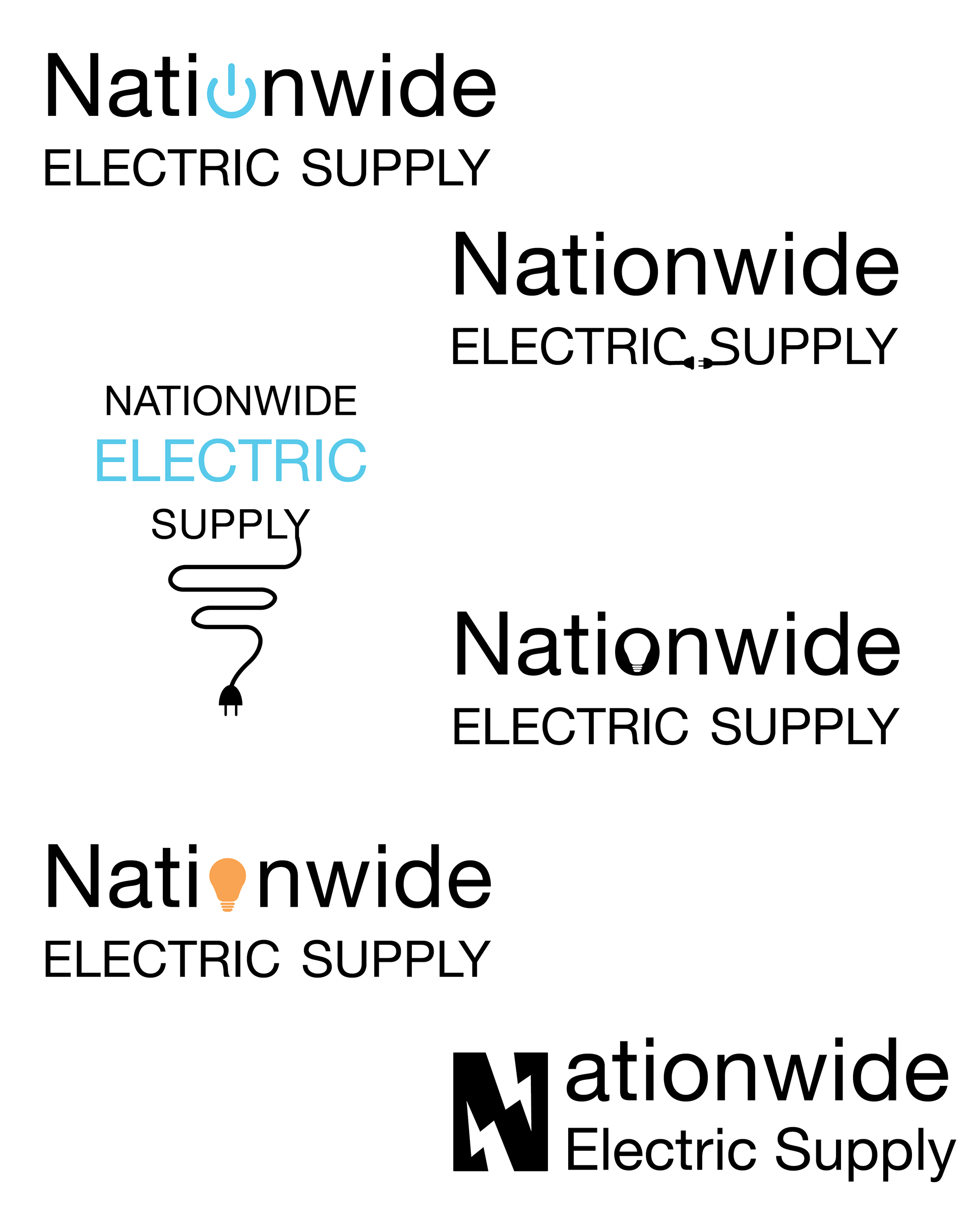
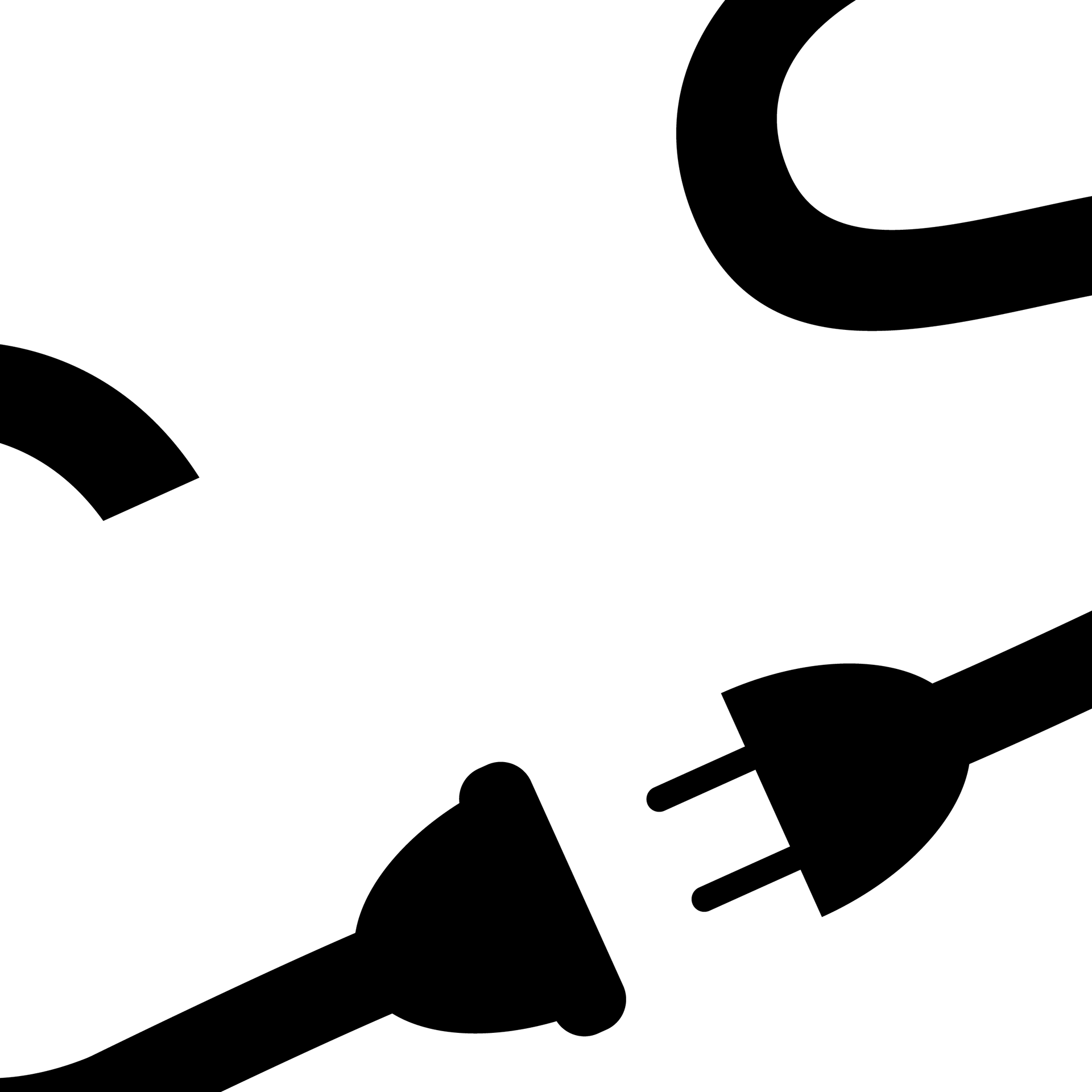
Nationwide Electric Supply is a Colorado-based company providing parts and components for a wide range of electrical needs. The goal for their logo was to keep the design clean and straightforward, while incorporating clever visual elements that reflect the industry. A lightbulb subtly appears in the negative space of the “O,” symbolizing ideas and innovation, while a power plug is nestled between the “C” and “S” to represent connection and energy—small surprises that give the logo both function and personality.
The Mark Hope
 Show
Jan. 2023 | Marketing Hope
This logo was created for a podcast centered on community, education, and supporting the growth of small businesses. The goal was to visually capture the spirit of building others up in a safe and nurturing environment.
Inspired by the protective behavior of elephants—where adults encircle and shield the young from harm until they’re strong enough to do the same for others—the logo symbolizes a cycle of support, mentorship, and empowerment. It reflects the podcast’s mission to foster a space where small business owners can grow, thrive, and eventually help others do the same.
Logo Idea
Solar Power
Study and exploration into designing a logo for a solar power company. Keep checking back for mock-ups
and final project.
Atomic Realty
Atomic Realty is a new company located in Los Alamo, New Mexico. They are a realty company that believes
in giving the lowest and fairest price to their costumers. They pride themselves on their costumer service and genuine nature. Check out their site https://atomic-realty.com/. In this project, the goal was to create a logo that incorporated the history of this town. It also needed to stand apart for the other business logos in that region.
Los Alamo, New Mexico is home to the LANL or Los Alamo National Laboratory. This is one of the most famous federal science laboratory, due to being the birth place of the atomic bomb. This history is what gave raise to the company name. The atomic bomb works from a free neutron of an atom hitting the nucleus of a fissile atom causing them to split into two smaller atoms and affecting the next one. This creates a change reaction that ends in a band. Above are the three atoms that can be used to create an atom bomb, the pattern forming around the center is the path the neutrons take. Those patterns are disrupted and broken in the proceed of the fissile. I wanted to echo that breaking of the pattern in the design. 
For the logo, the idea was to combine the history with the housing industry. Beginning with creating a house from the first letters of the company name A and R. Next was combining the house with the patterns created from the neutron movement shown above.
In the first two rows, the house represents the center of the atoms. The differences being the placement of the lines, along with how tall of wide the house should be. The last line explored the idea of the house being the center of the atom and the A the part causing the disturbance in the neutron path representing how the bomb worked. 
For the colors, the idea was to us the red and yellow associated with the town and the turquoise associated with New Mexico. The turquoise also represents the bomb, adding a glow to give the feel of radioactive. Due to the resource a new companies has, the decision was to keep the logo with one solid color.
Sock Dreams
Re-brand
For this project, the idea was to re-brand Sock Dreams. Founded by Niqkita in 2000, with a dream of sharing
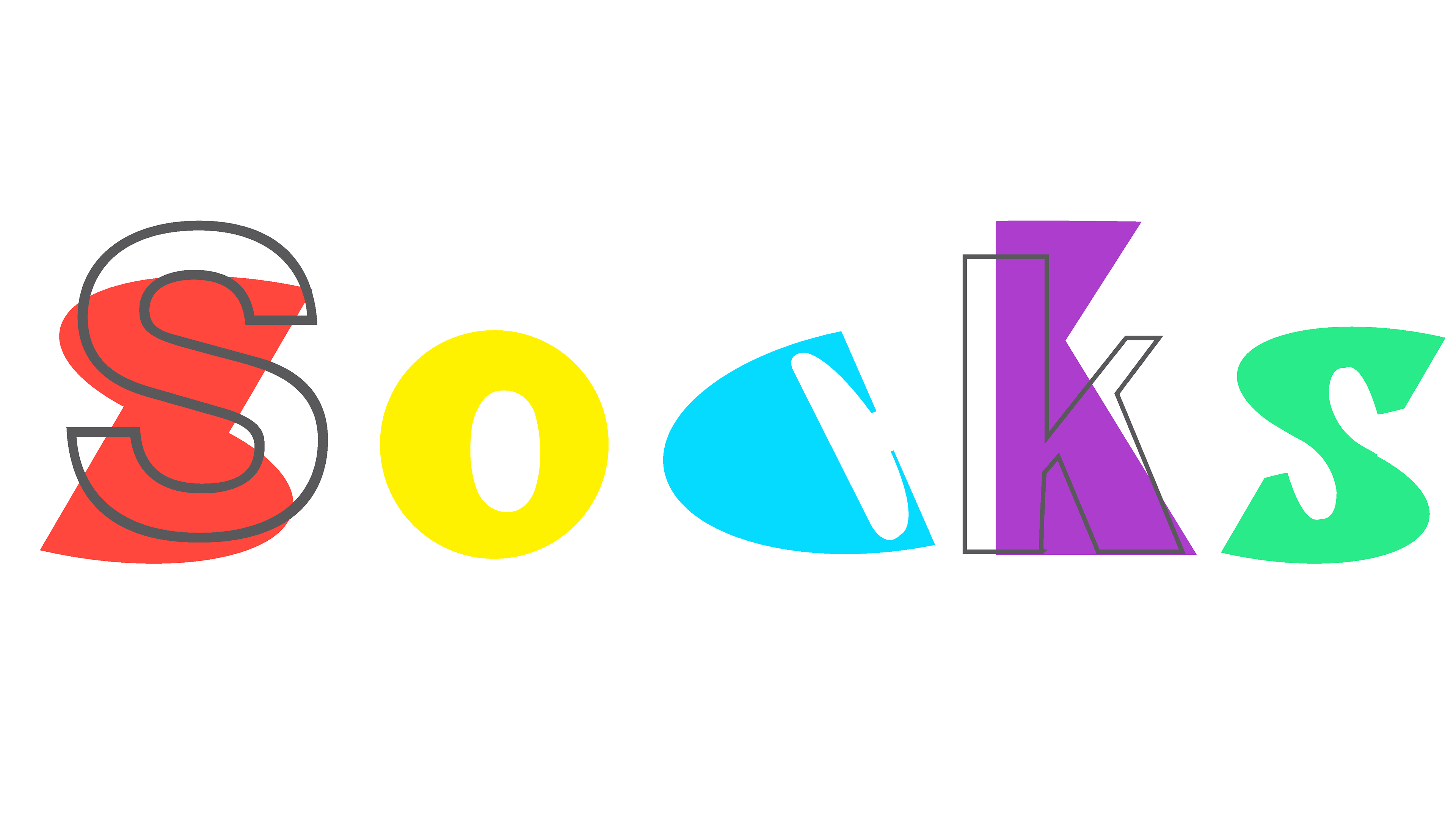
her love of socks with the world. They expanded the brands to include more variety and better fit for a wider range of legs. Believing everyone deserves fun socks that make them feel happy and comfortable. The original logo, shown below, is illustrative, hard to read at small sizes, and only seem to be targeting women. The company provides sock options for all ages and sexes. For the new logo, shown above, the idea is to show the fun and uniqueness of the company, while being welcoming to everybody. The original logo shown below.
The narrative for the new brand is. A fun and unique experience with every sock. This brand encompasses 
all ages, shapes and sizes. Its a celebration of socks and self. Dare to be uniquely you.

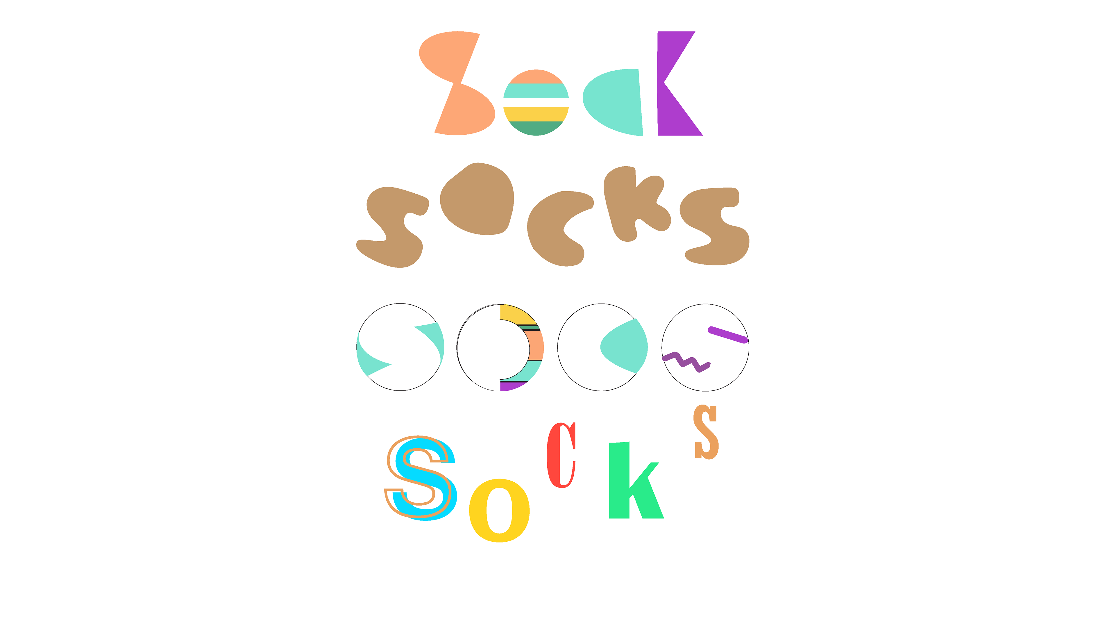
Focusing on the words creative, unique, playful, colorful and eclectic is the bases of the re-branded logo.
Above are several iterations and studies into different ways of showing letters. The goal was to make the
final logo meets those five words and bring new life to the company.
104 Annual
Art show
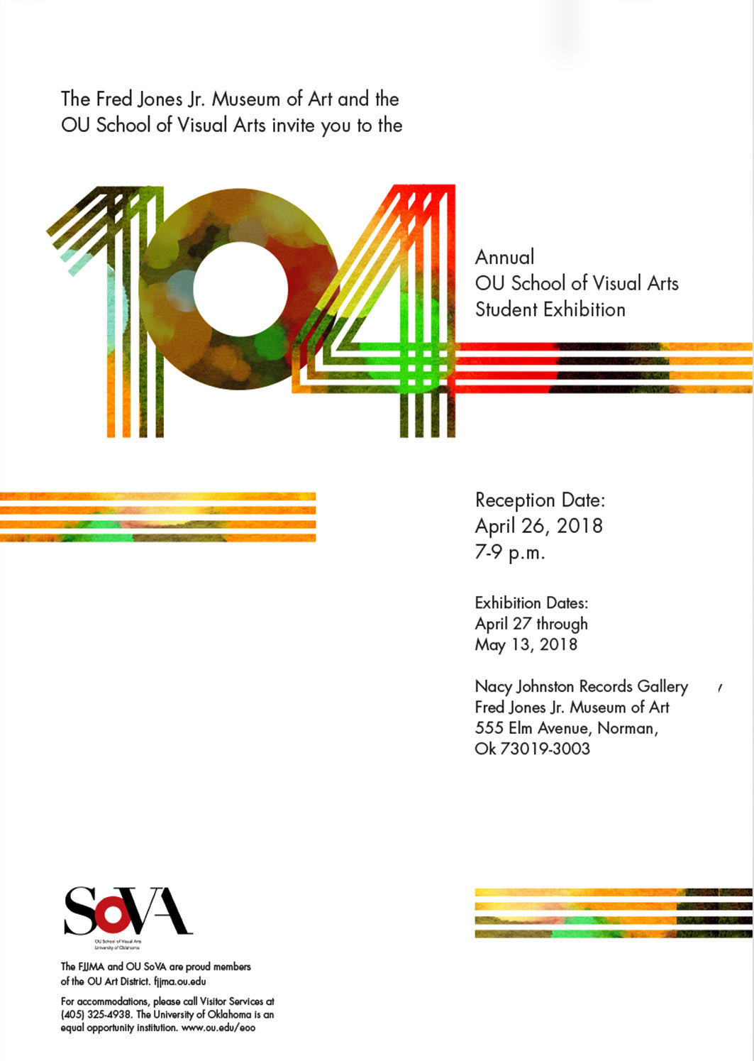
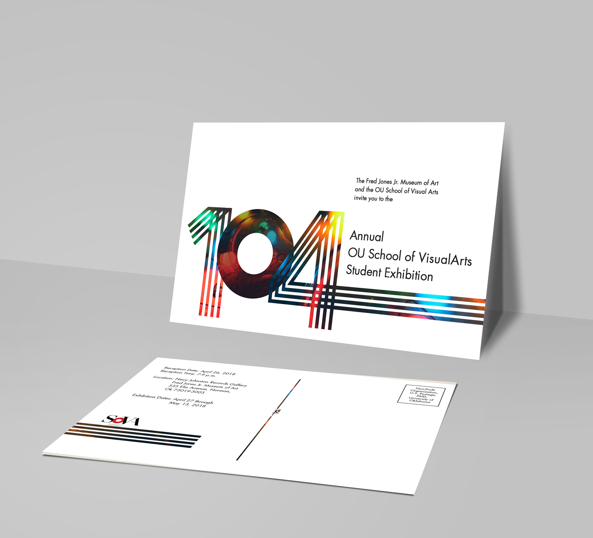
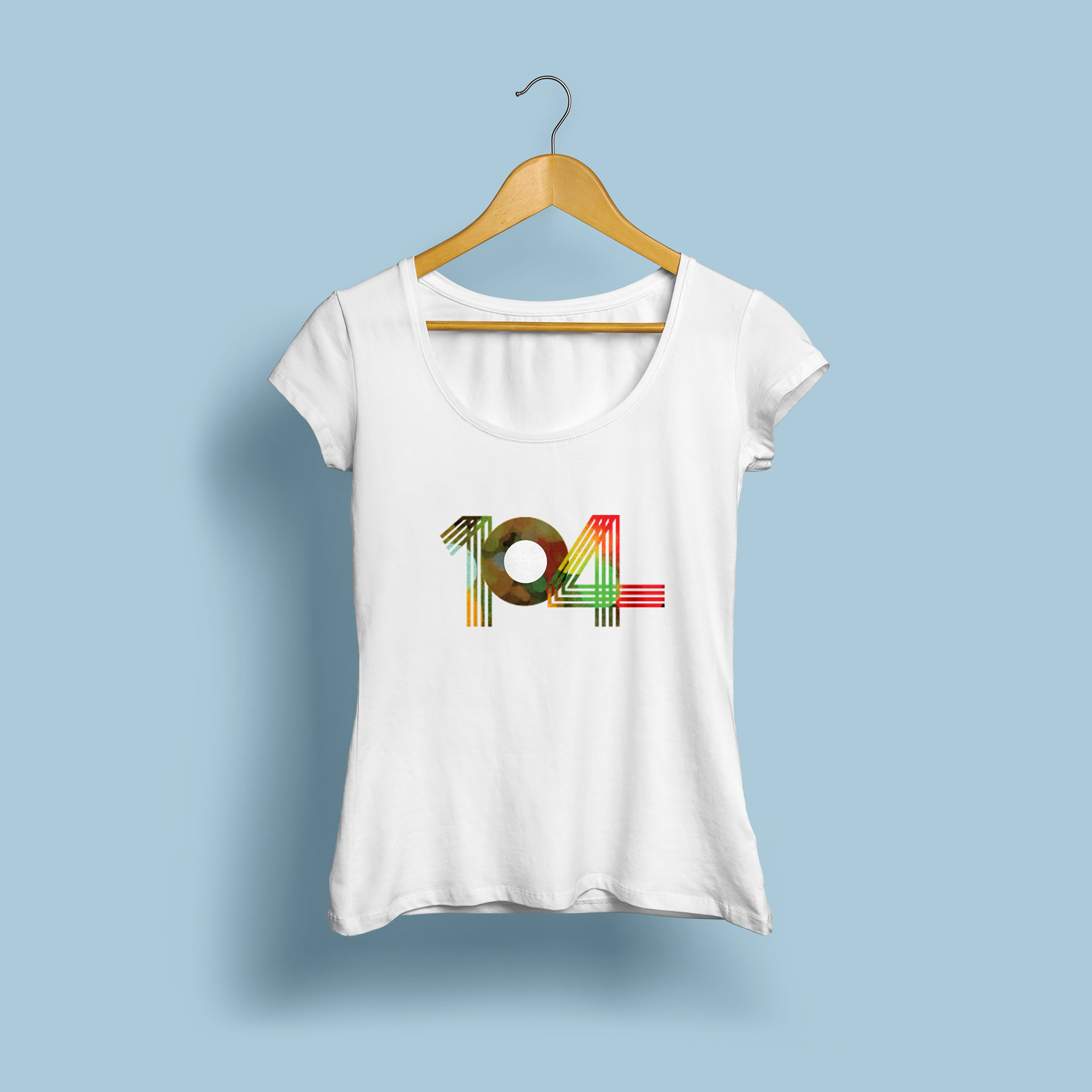
The concept behind this logo is to represent student body in the 104 logo. This is an art show that is created by all different types of art students. There are four degree options within the OU School of Fine Arts, but it takes
all of us working together to create this art show and this school. This can be seen with the four lines that come together to create the 1 and 4.

Postcard
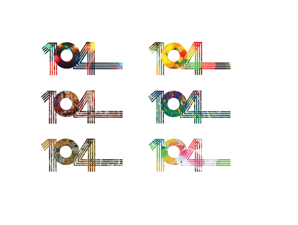
The Logo is meant to appear different every time you see it. The image and colors making up the lines are interchangeable, allowing every postcard, poster, banner and shirt to have a different look.
T-Shirt and poster design
OU Pediatric
Genetic Center
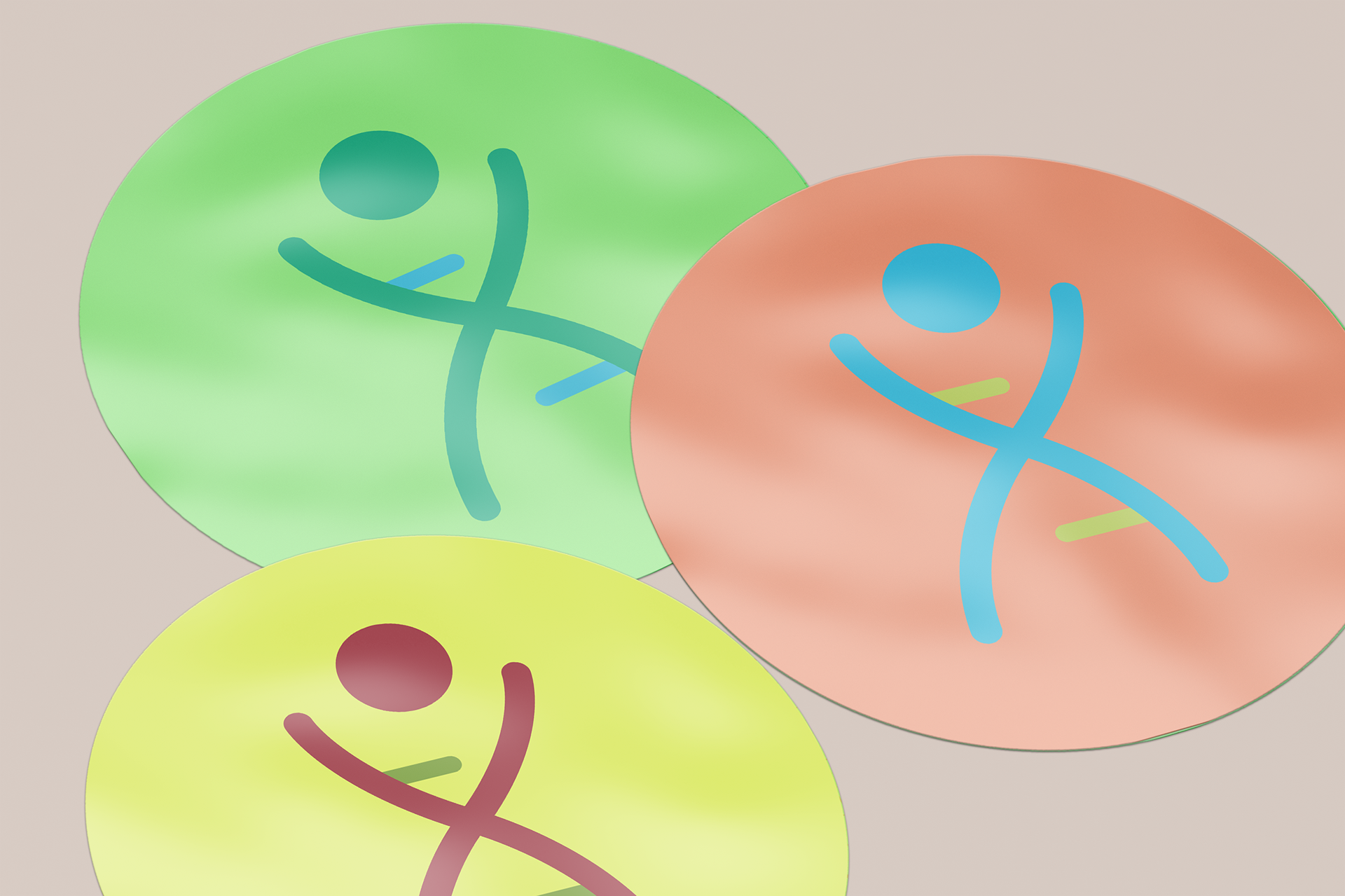
The idea behind this logo was to create something that spoke to genetics, while also being child friendly. Eventually the idea evolved into a double helix forming a child. This gave insight to the type of work that happens at this facility while still being inviting to the families that visit. The final logo was rendered in a 
gray gradient. This was to give the mark a clean feel, with the idea of a bright future. When having to go to
the doctor as a child, the only rewarding thing was leaving with sticker. Keeping that in mind, the application
of this logo was transmitted to stickers in multiple colors. This would give the children something to look forward to, and have fun collecting!
Two Doves
 Printing
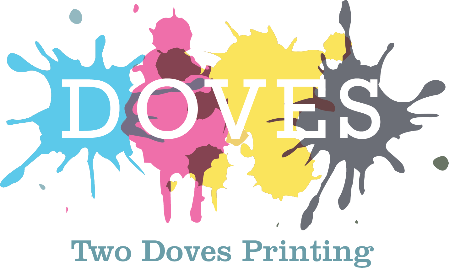
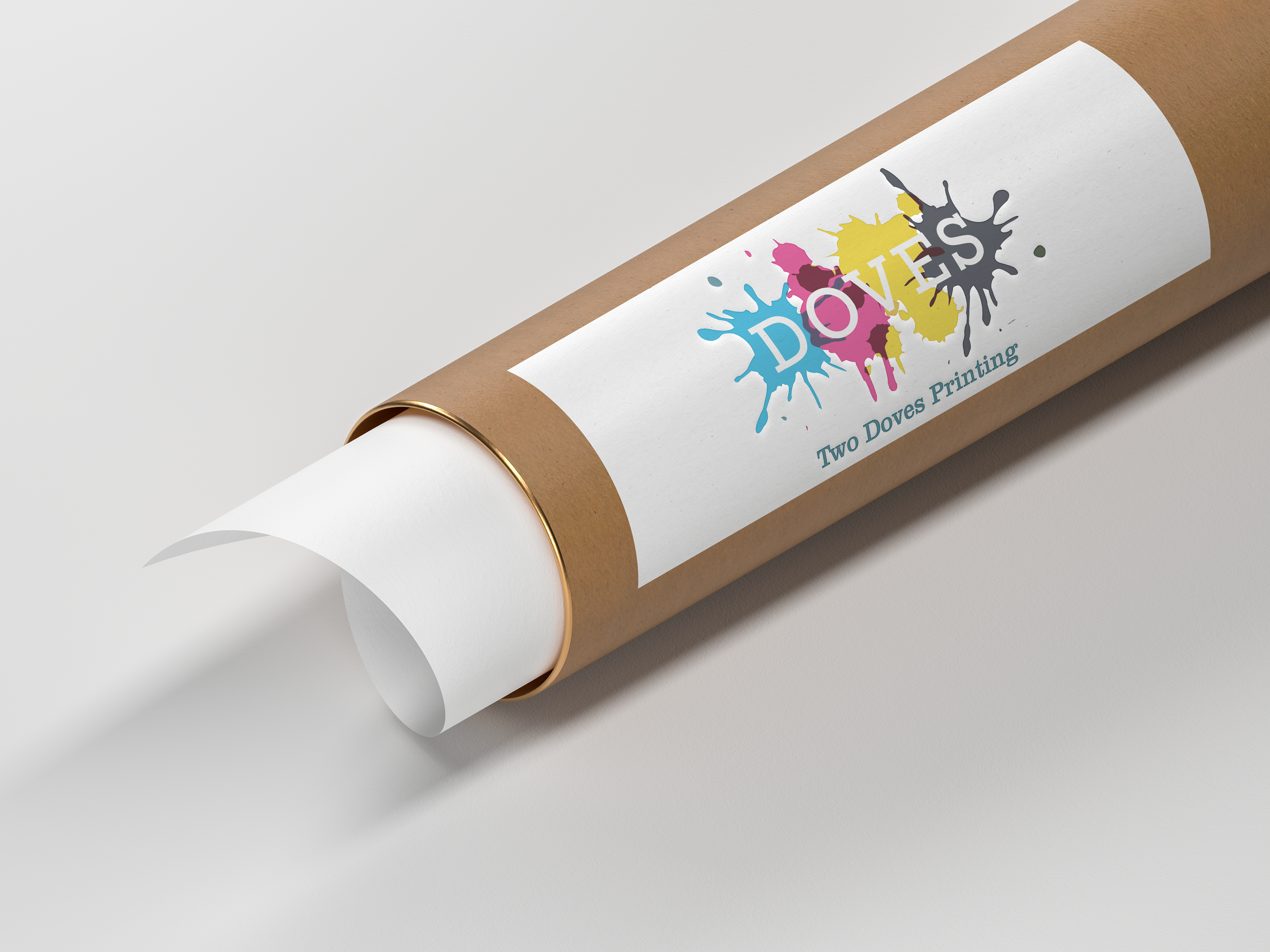
This design was for a printing company. The idea behind the mark was to use an ink or paint splatter to reveal the name of the company. In the final mark, the splatters represent the CMYK colors. These are the primary colors that a printer reads in order to print a piece. The application to the right, shows a possible way the logo can function on a package.
Wilson's Flowers:
Floral Shop
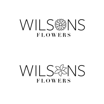
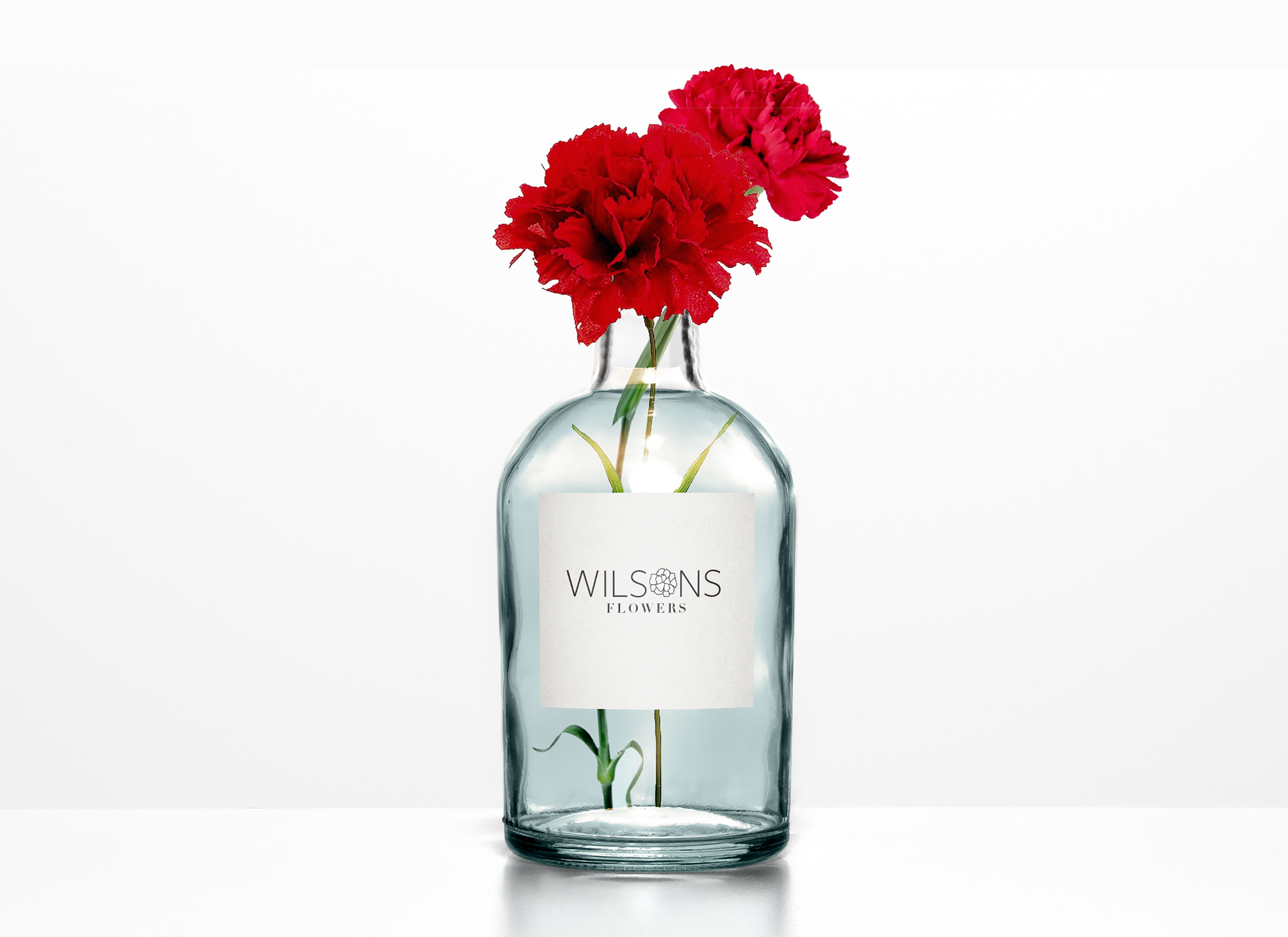
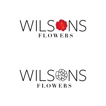
The idea behind this logo was to create a word mark that read simply as a flower shop. To do this a flower takes the place of the O, in Wilson's. For the final mark, it can appear either in color or in black and white. The idea is also that the flower representing the O can change based on the season or the best selling flowers.

Also check these out!

Back to Top