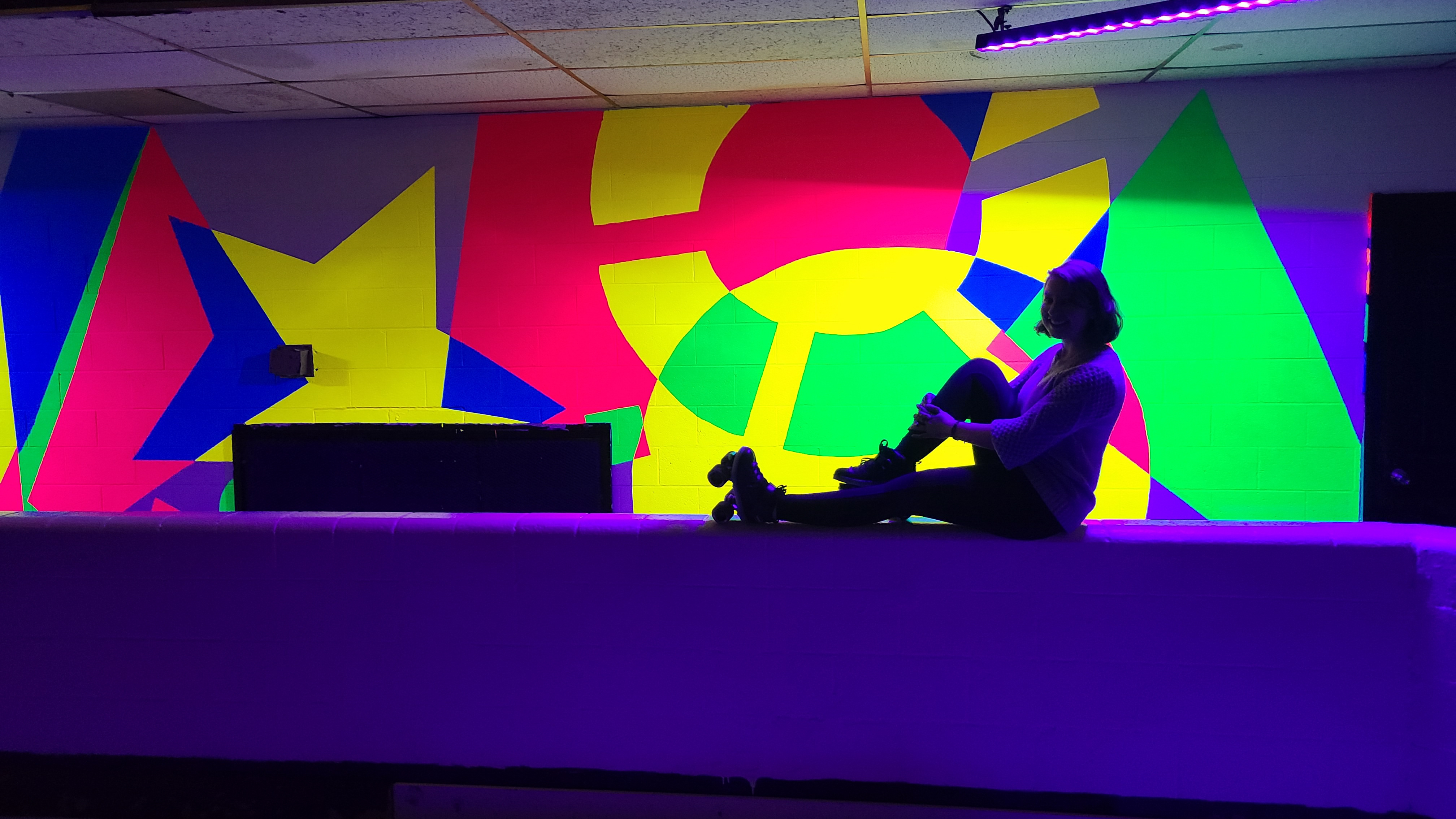
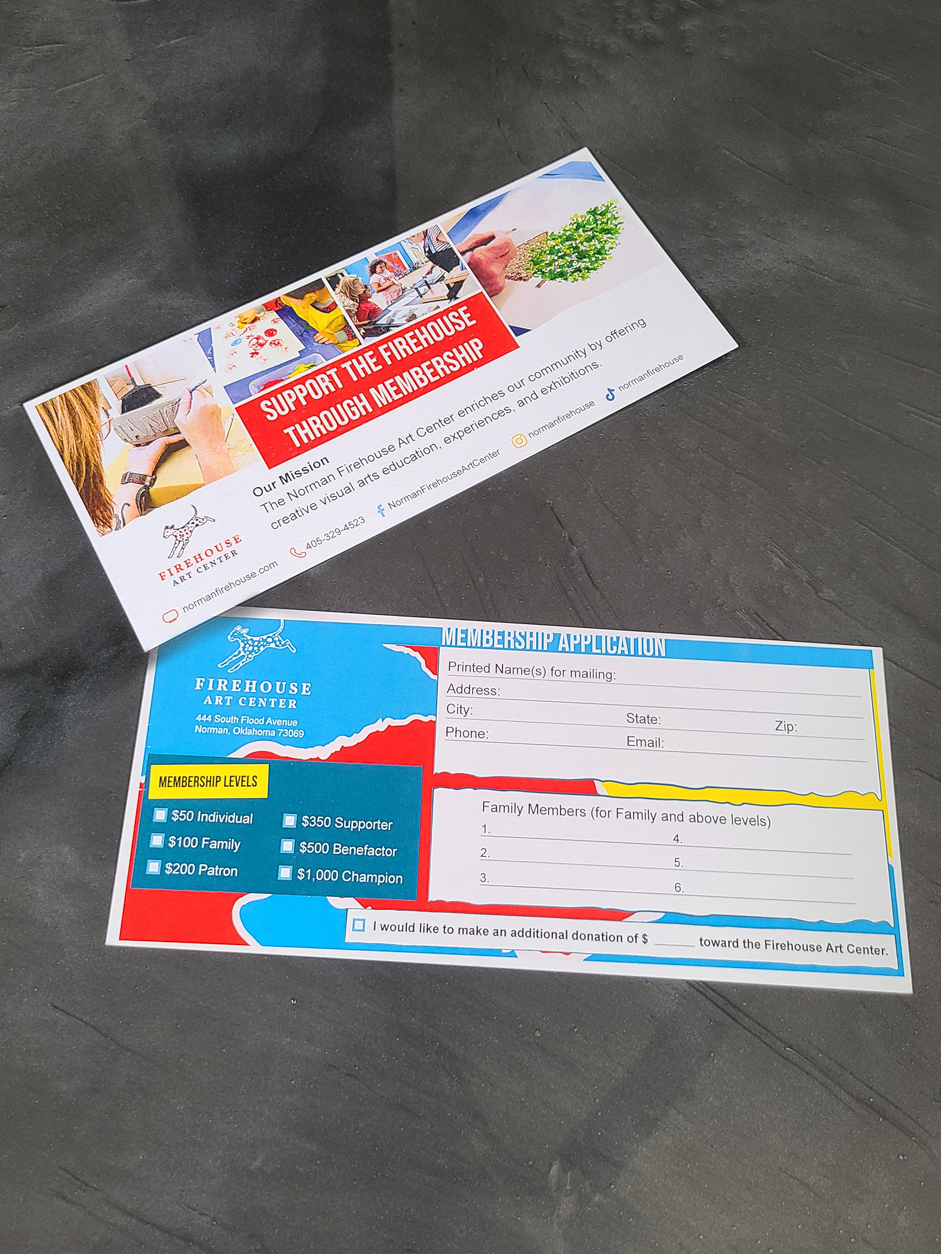
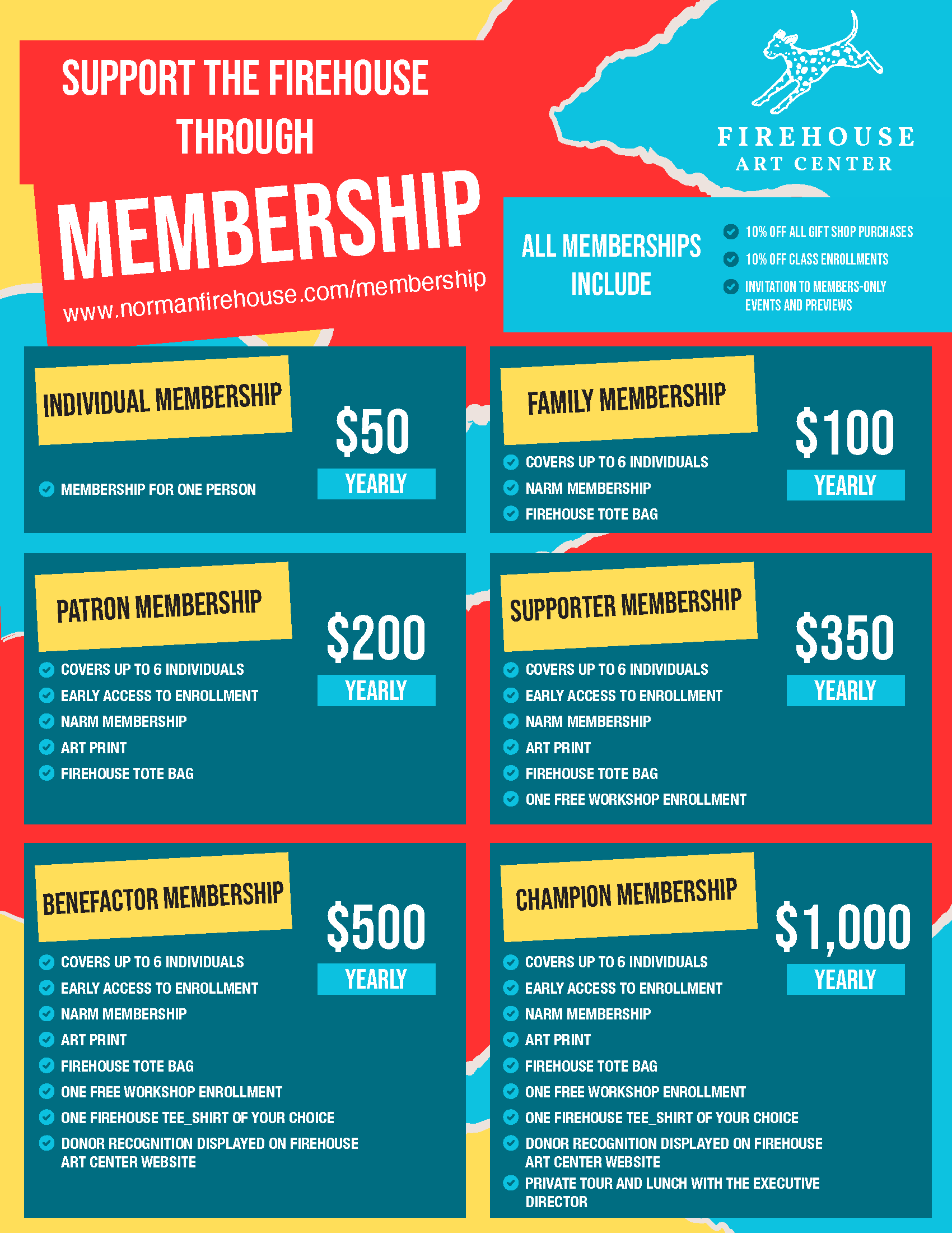
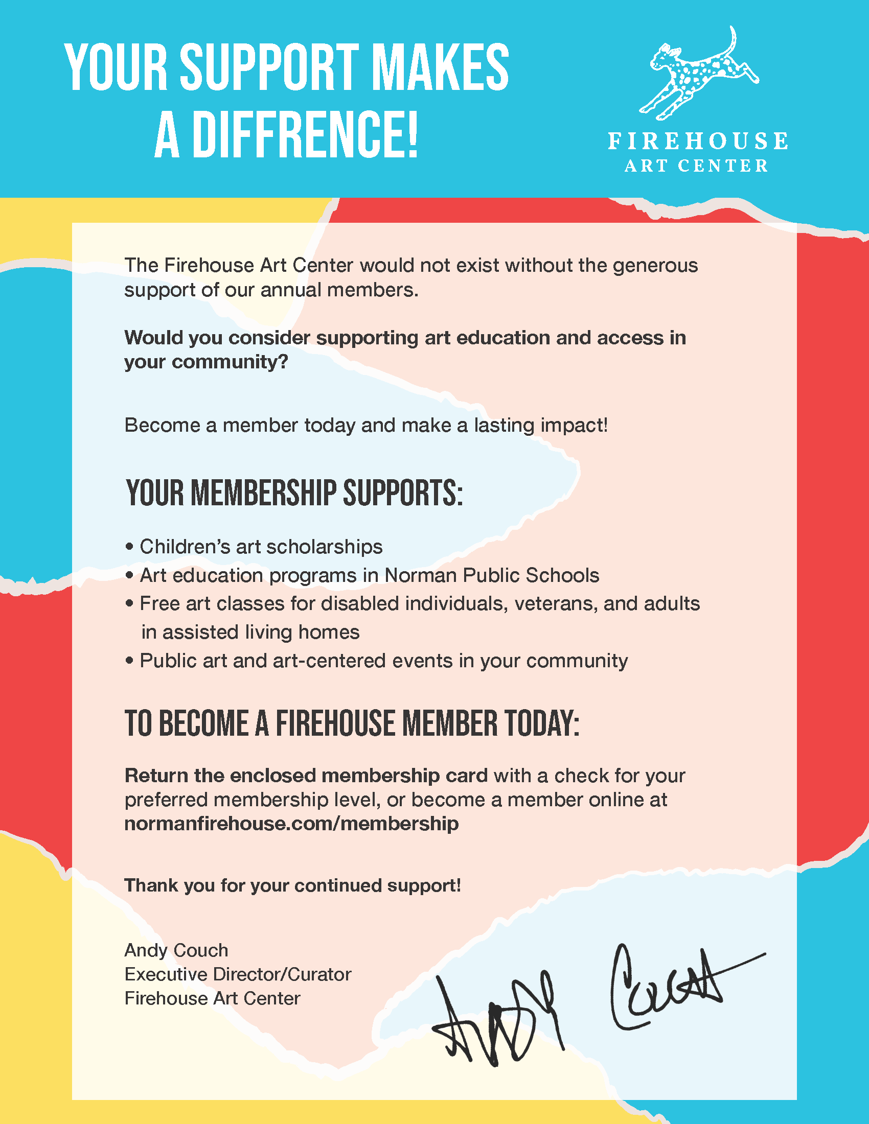
Membership
Applications
Applications
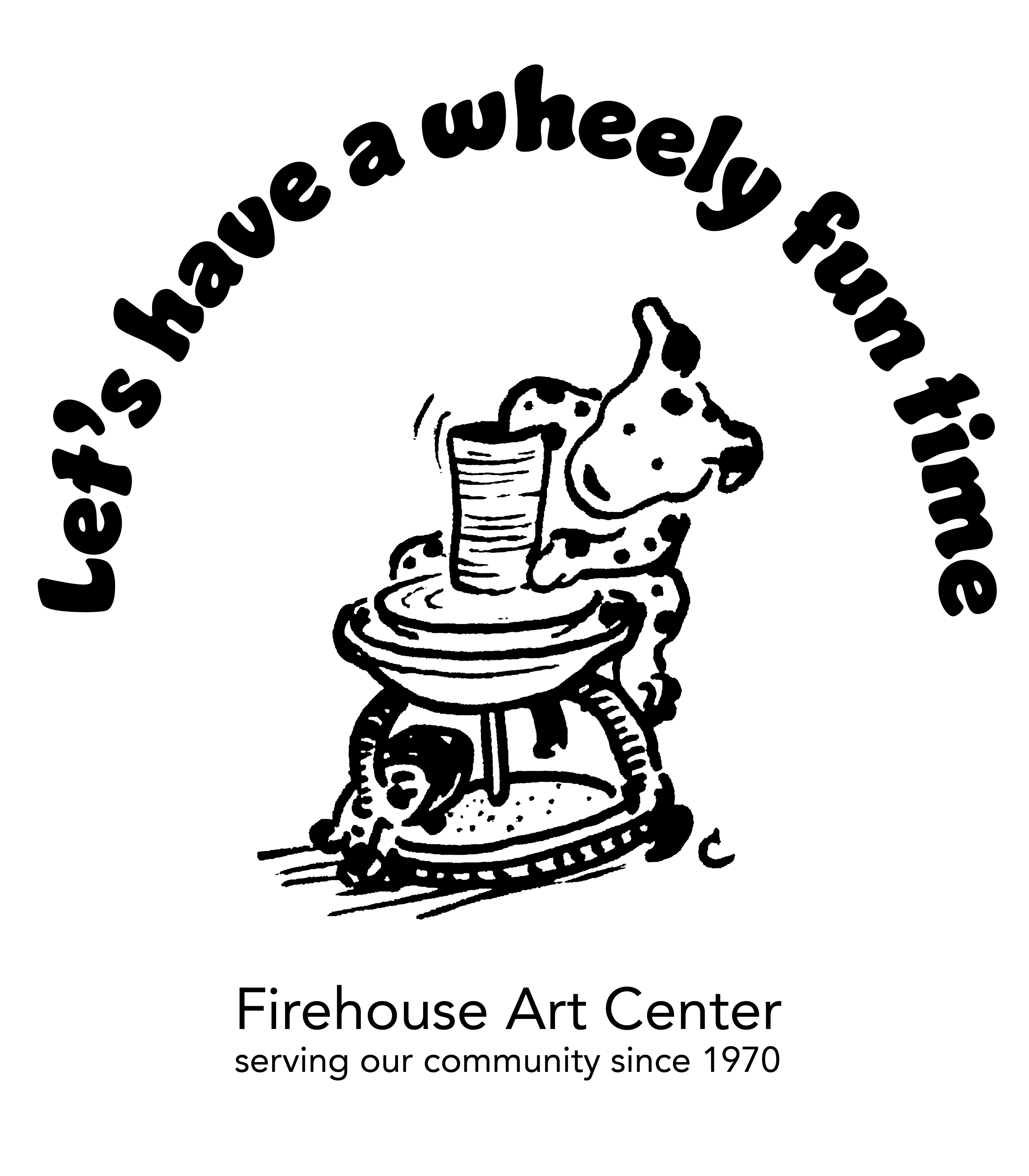
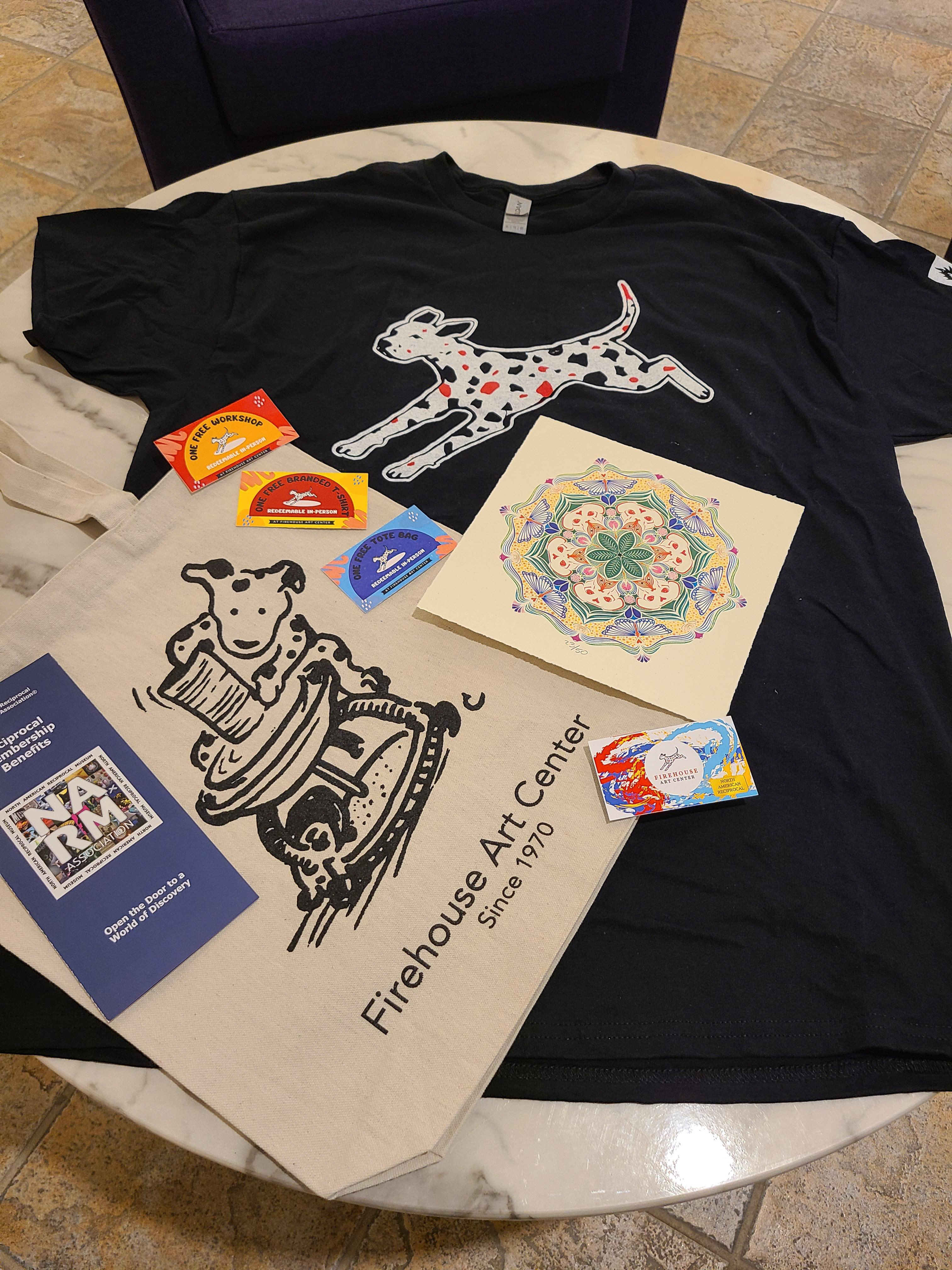
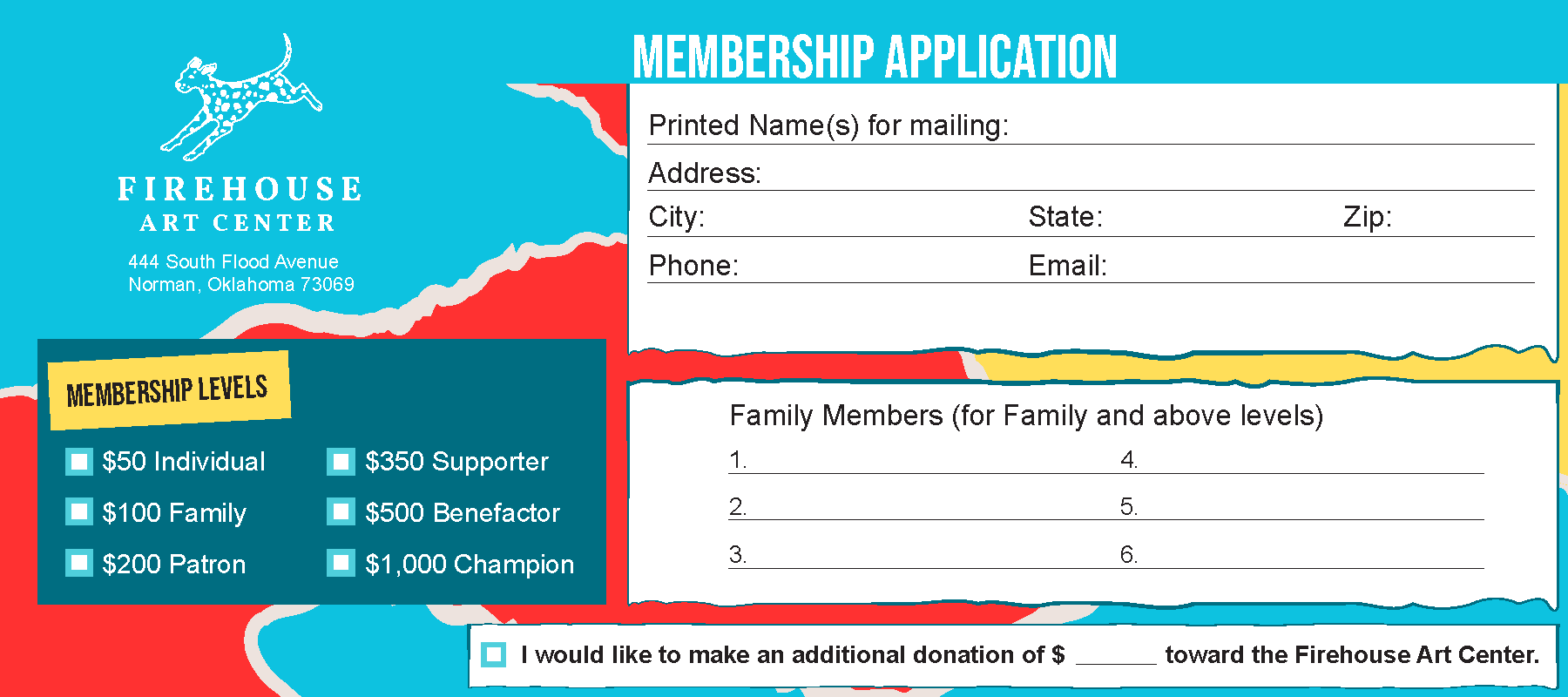
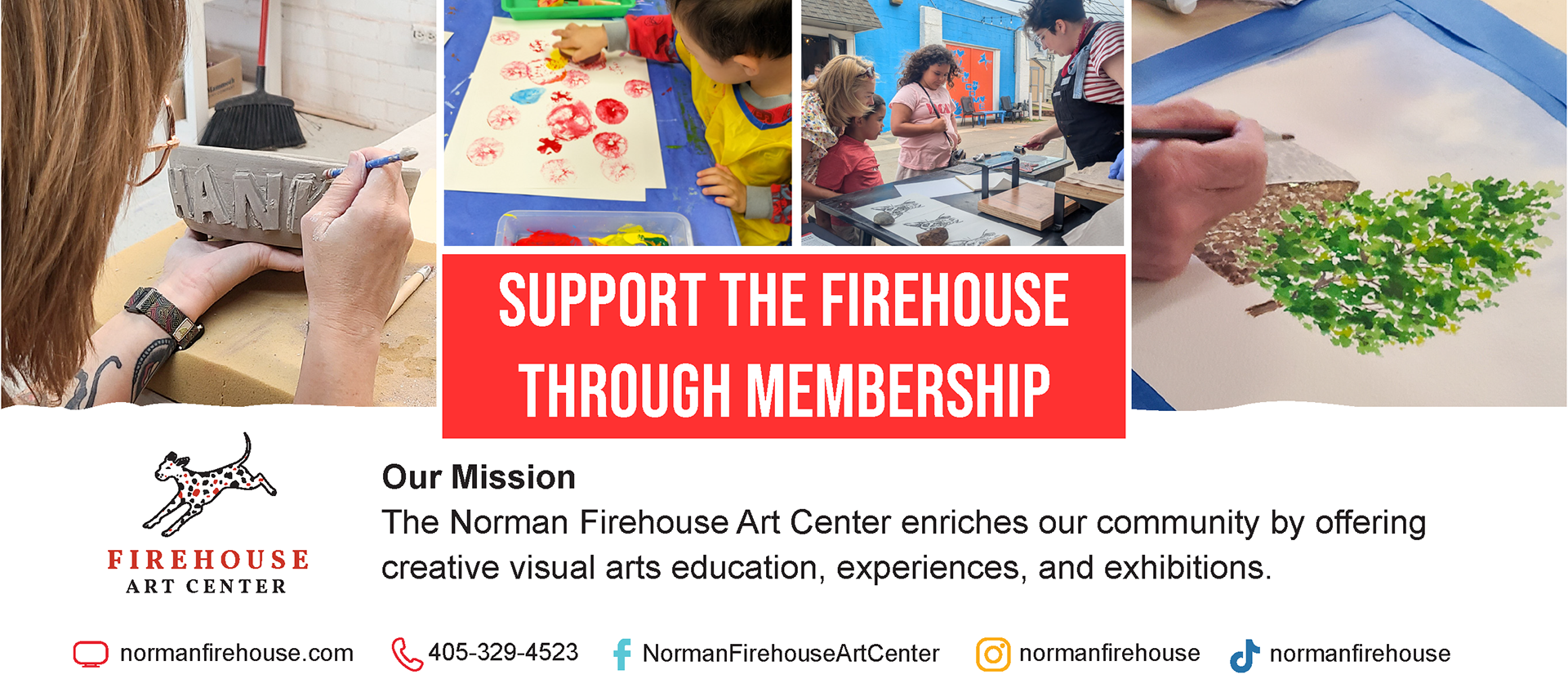
May 2025 | Firehouse Art Center
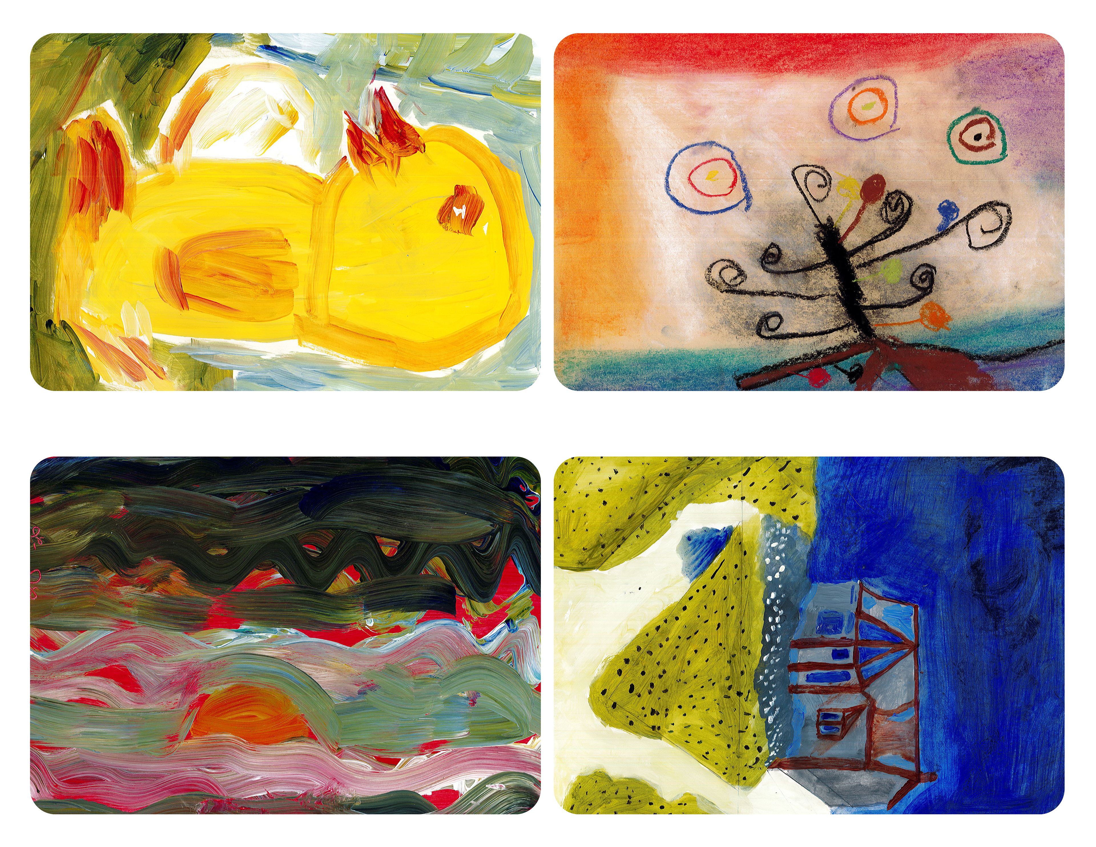
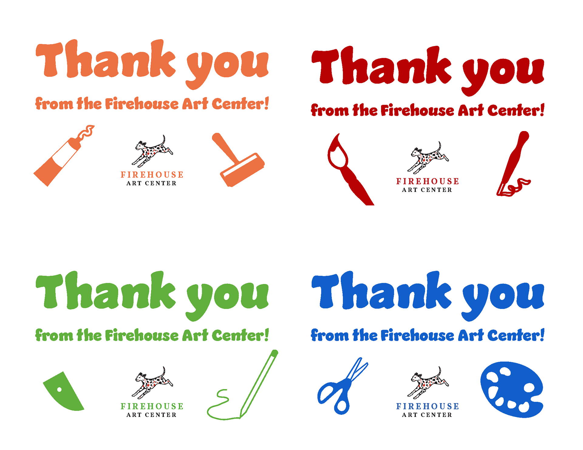
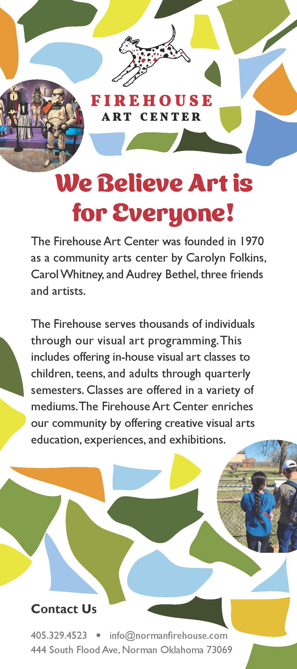
After leading the rebranding process and establishing the new brand color palette, I worked closely with the Grant and Development team to design a full membership drive campaign. This included a printed membership letter, refreshed member benefits, a custom tote bag, a redesigned membership application, new membership cards, and thank-you cards featuring artwork from children’s classes.
Semester
Booklets,
Rack Cards,
and brochure
Booklets,
Rack Cards,
and brochure
Aug. 2024-May 2025 | Firehouse Art Center
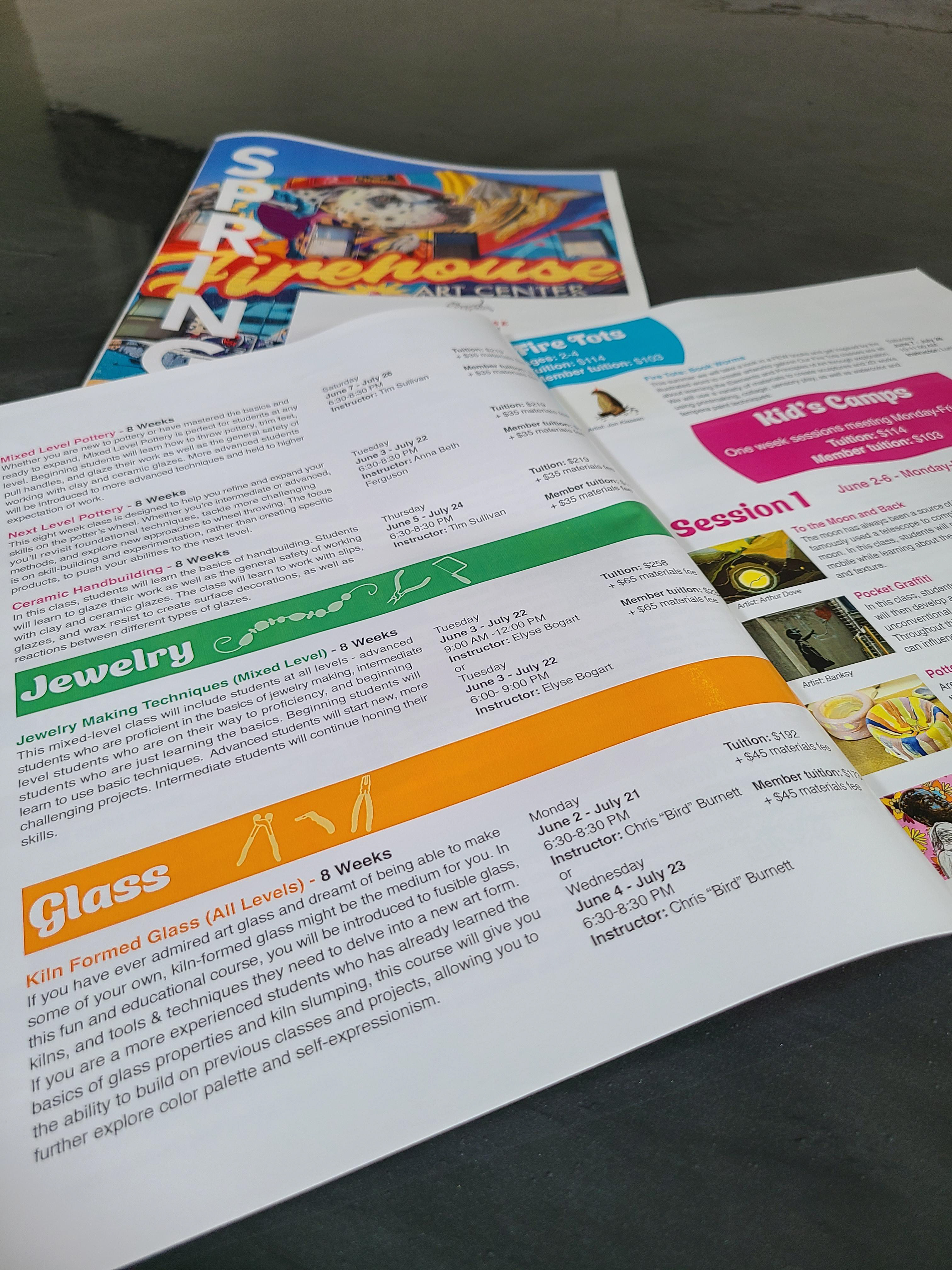
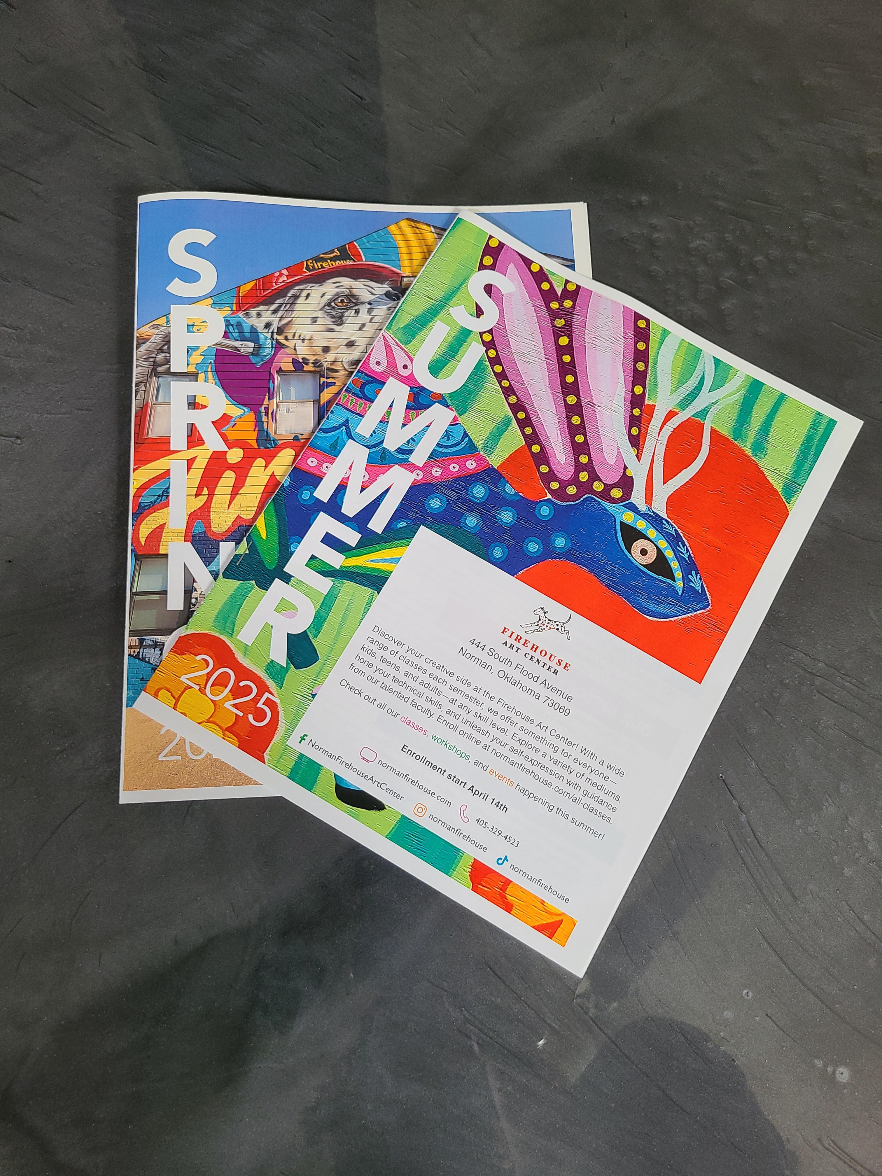
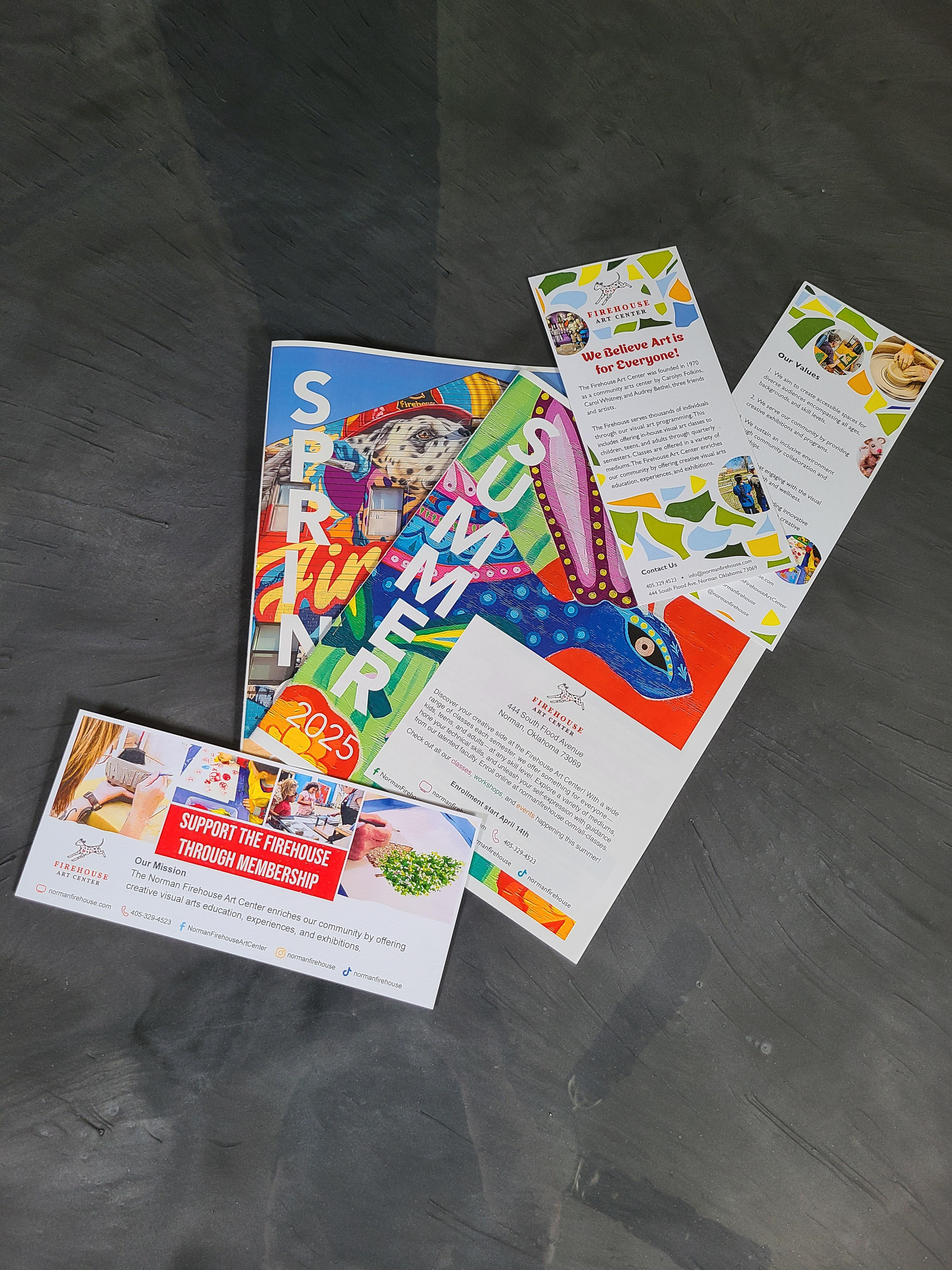
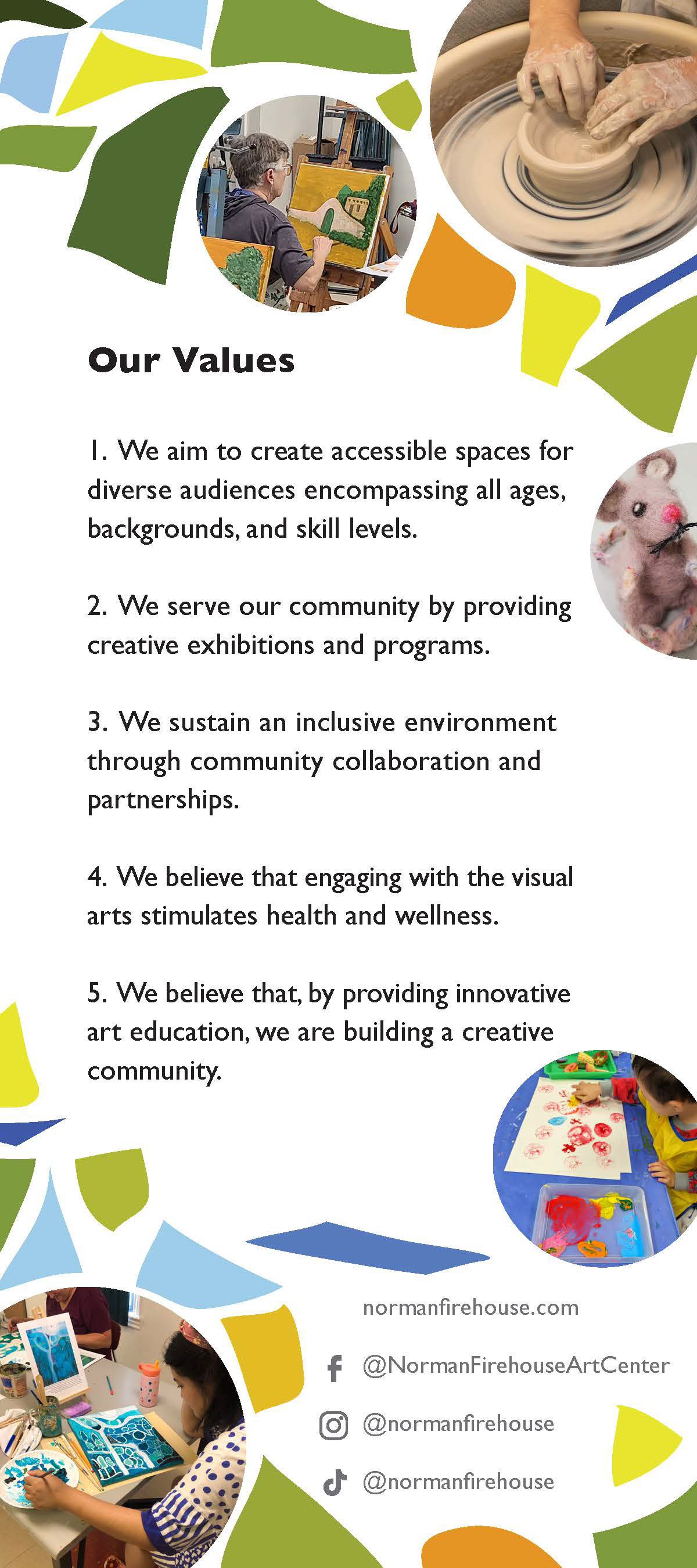
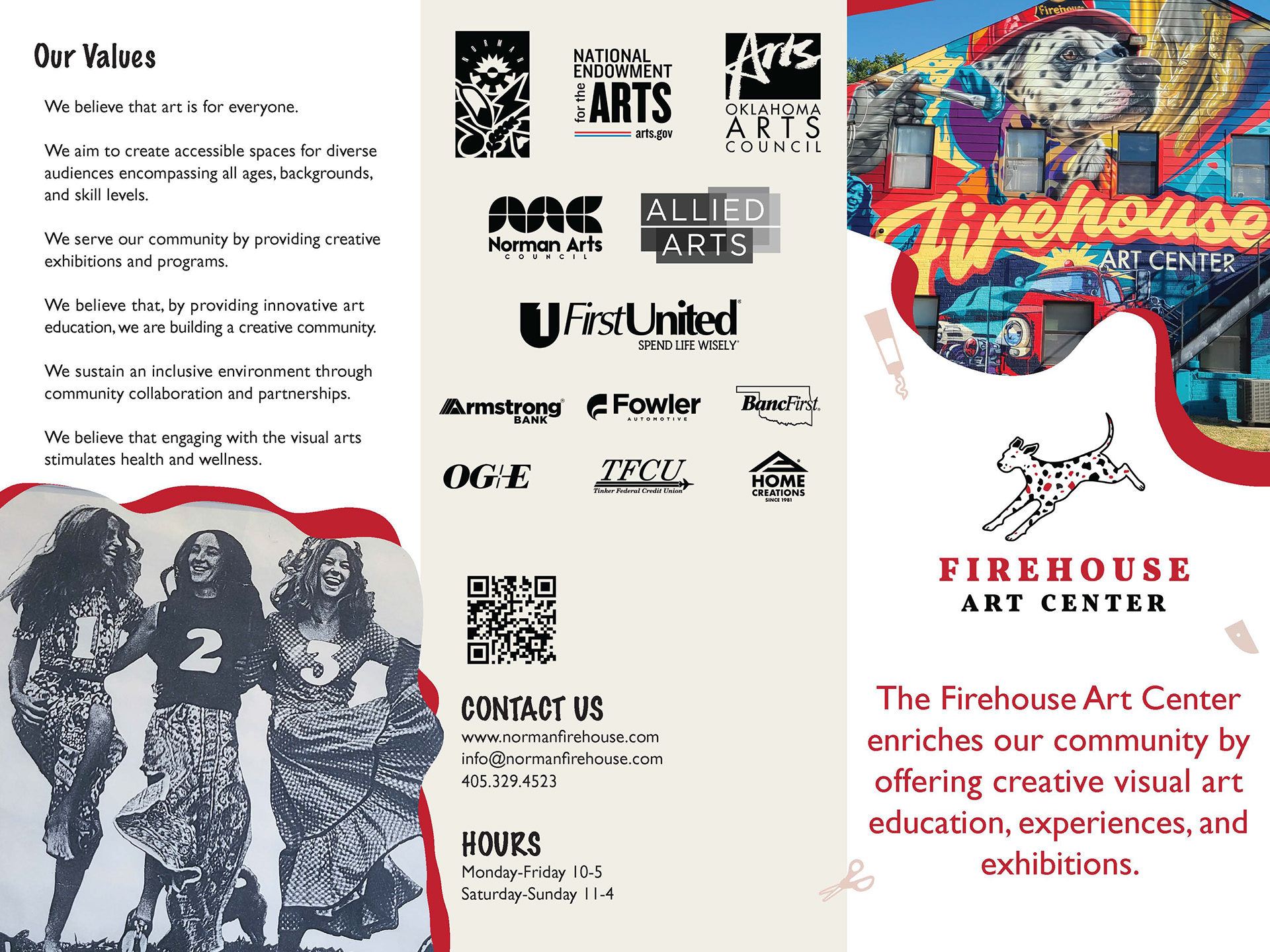
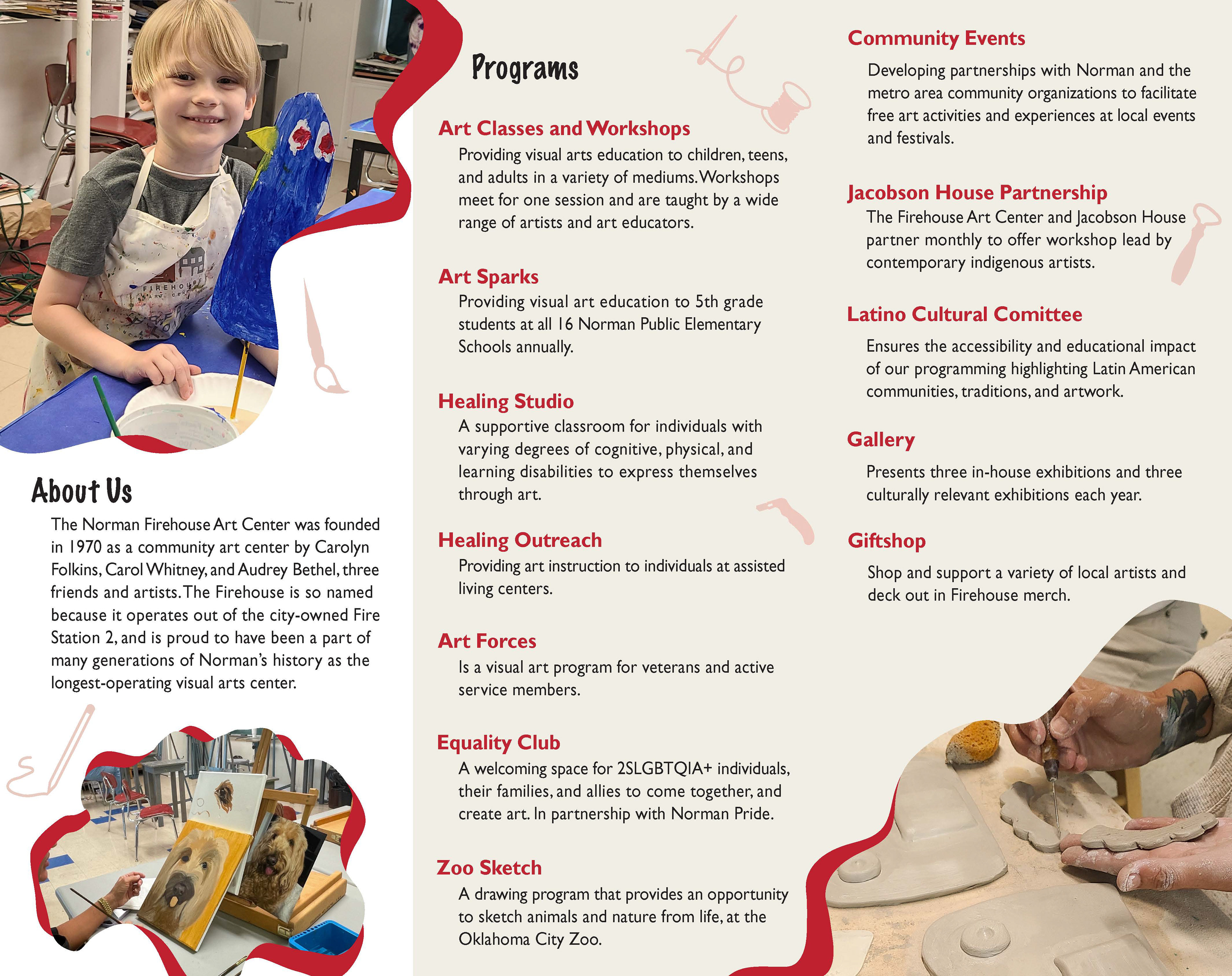
The Firehouse runs four semesters of classes each year, offering creative programming for adults, teens, and children. For this project, the goal was to design materials that were not only eye-catching, but also engaging enough to guide people all the way to enrollment.
To do this, I created a series of printed course booklets that incorporated visual elements from the Firehouse itself—using its colorful murals, playful icons representing different art mediums, and bright imagery to highlight children’s classes. These pieces worked together to create an inviting, user-friendly experience that helped the booklets stand out as both informative and fun. As a result, the summer semester alone saw nearly 300 children enrolled.
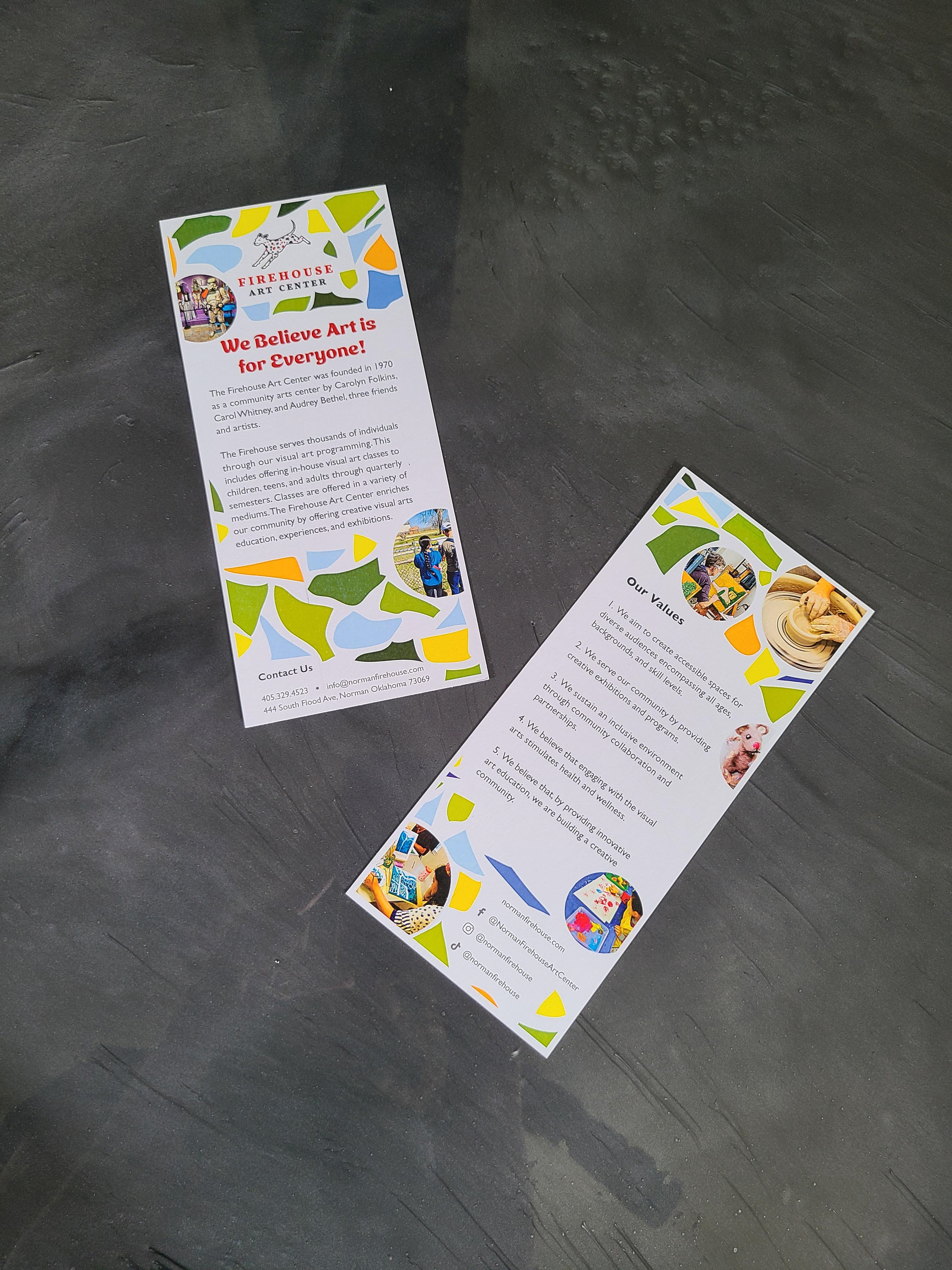
In addition, I designed a multi-page brochure offering a clear, high-level overview of the Firehouse’s programming. The layout balances brief program descriptions with vibrant image pairings and consistent iconography to represent each art medium, making the information both accessible and visually engaging.
One of the students’ favorite activities involves creating art from torn paper—this inspired the design of the promotional rack card. I developed a layered, torn-paper collage aesthetic, integrating photos and illustrations that represent the wide range of classes and creative opportunities offered at the Firehouse.
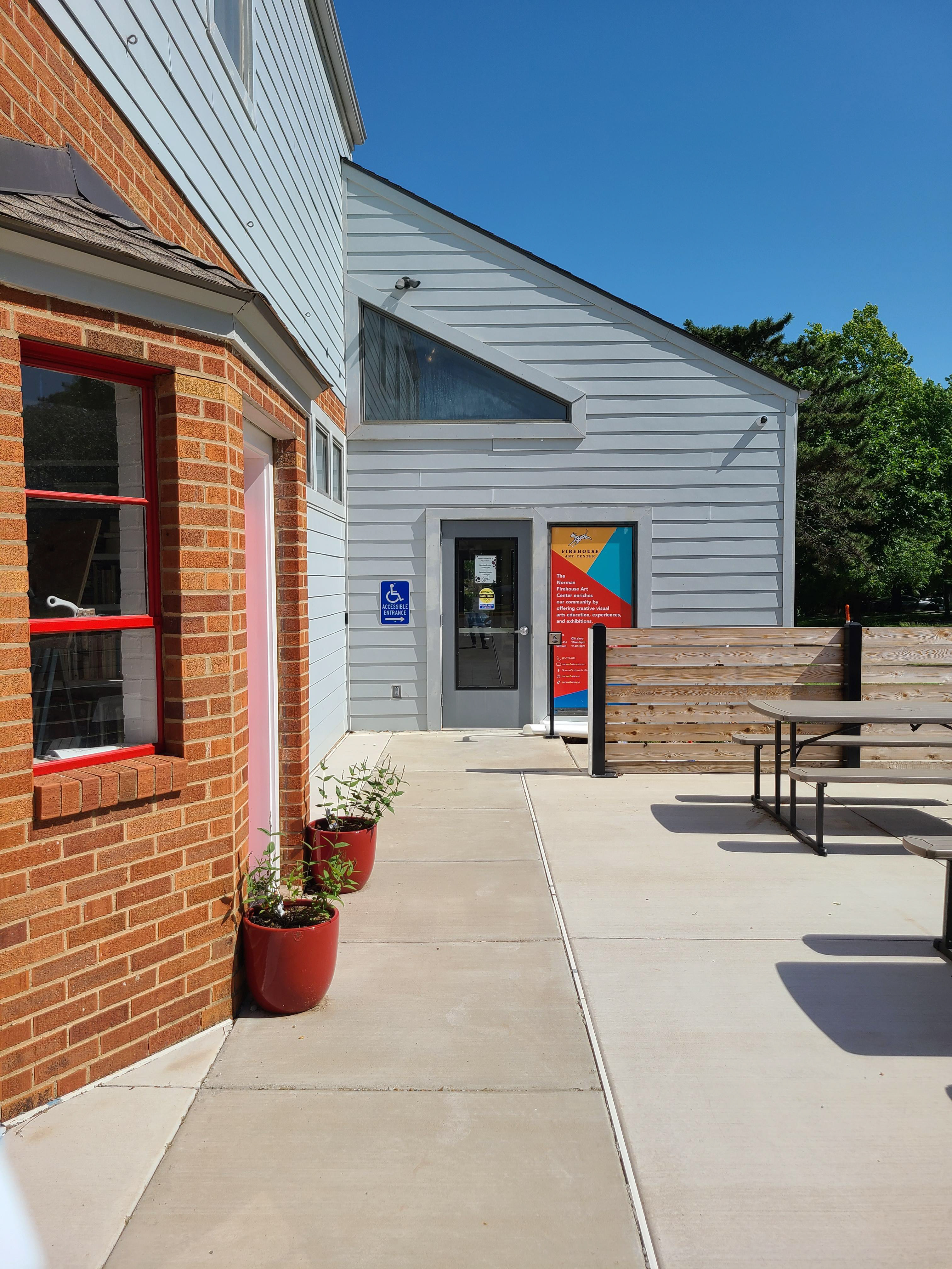
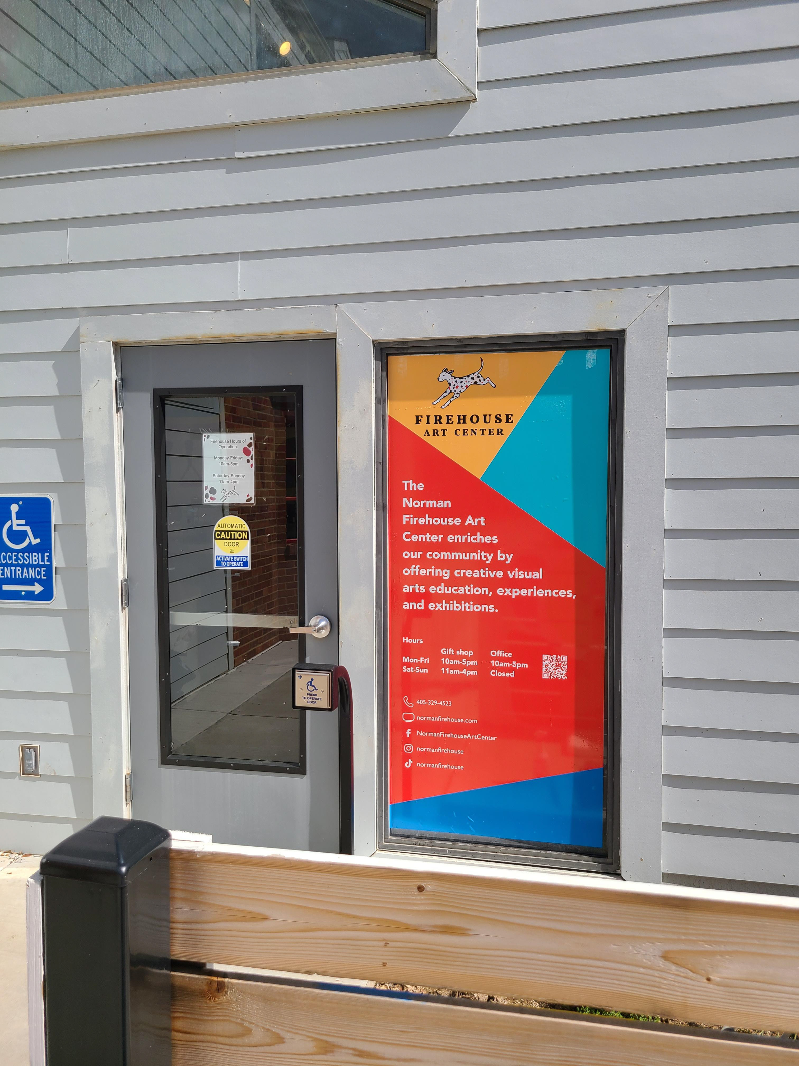
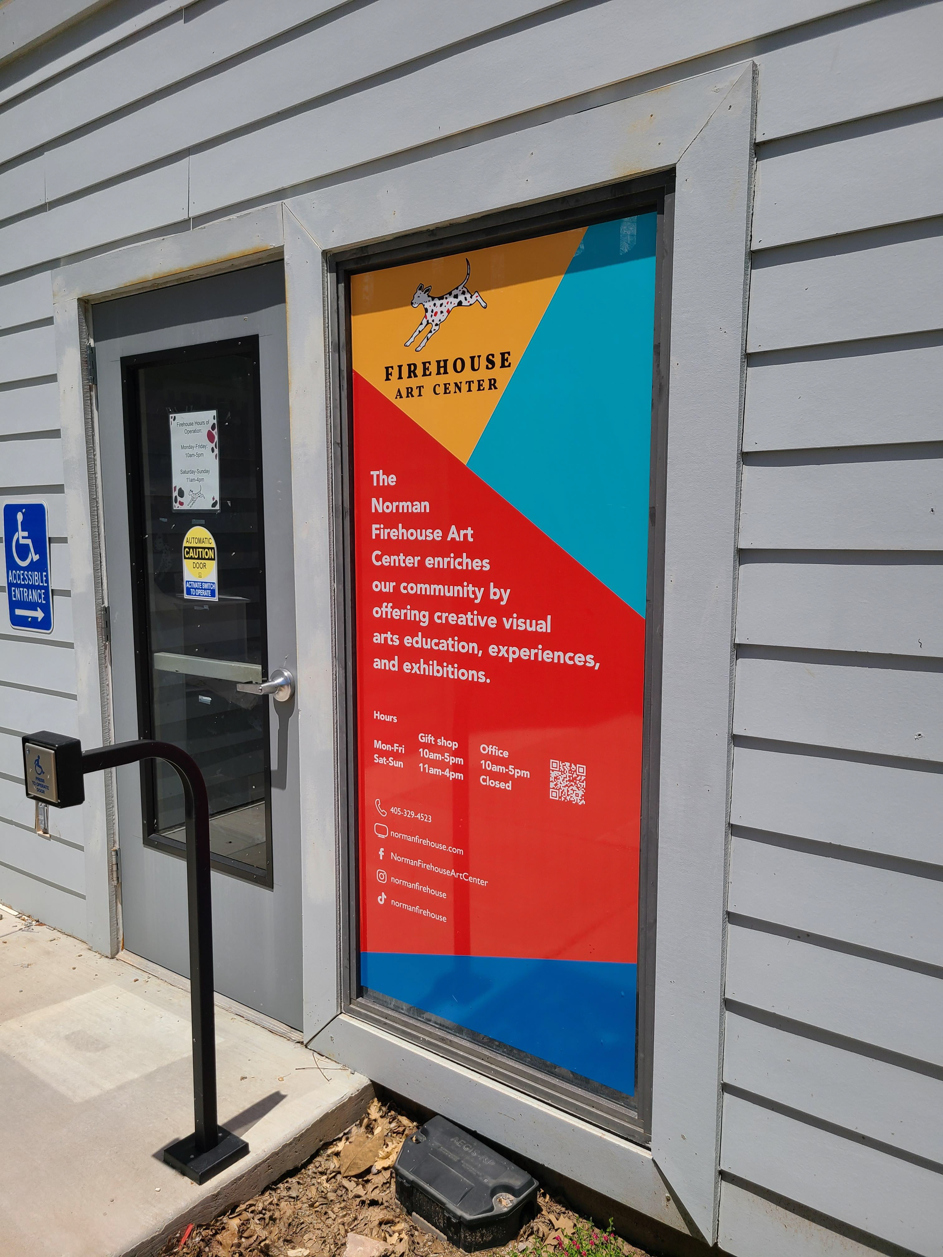
Window Vinyl
May | Firehouse Art Center
During a comprehensive rebrand of the Firehouse Art Center, the team identified a need to update the building’s front-facing appearance. A large window at the entrance had become frosted on the inside, preventing visibility and detracting from the building’s visual appeal. This presented an opportunity to use the space as a branded communication tool that could both reflect the organization’s new identity and provide valuable information to the public.
A custom window vinyl was created using the Firehouse’s newly developed brand colors, fonts, and graphic style. The design included the mission statement, hours of operation, and social media details, all laid out with clarity and visual harmony. The vinyl not only served a functional purpose but also reinforced the Firehouse’s identity as a creative and community-centered organization.
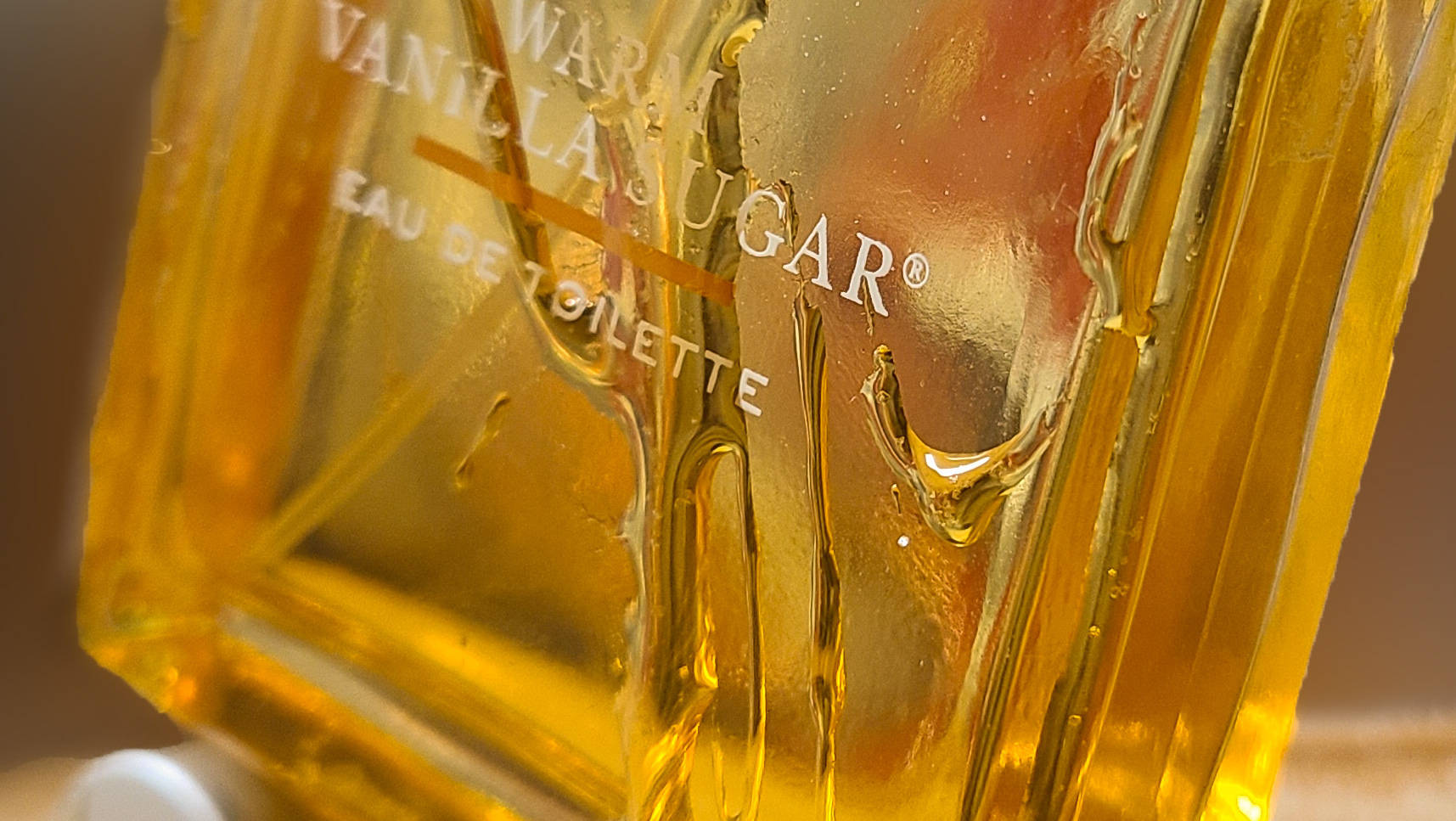
Beer Labels
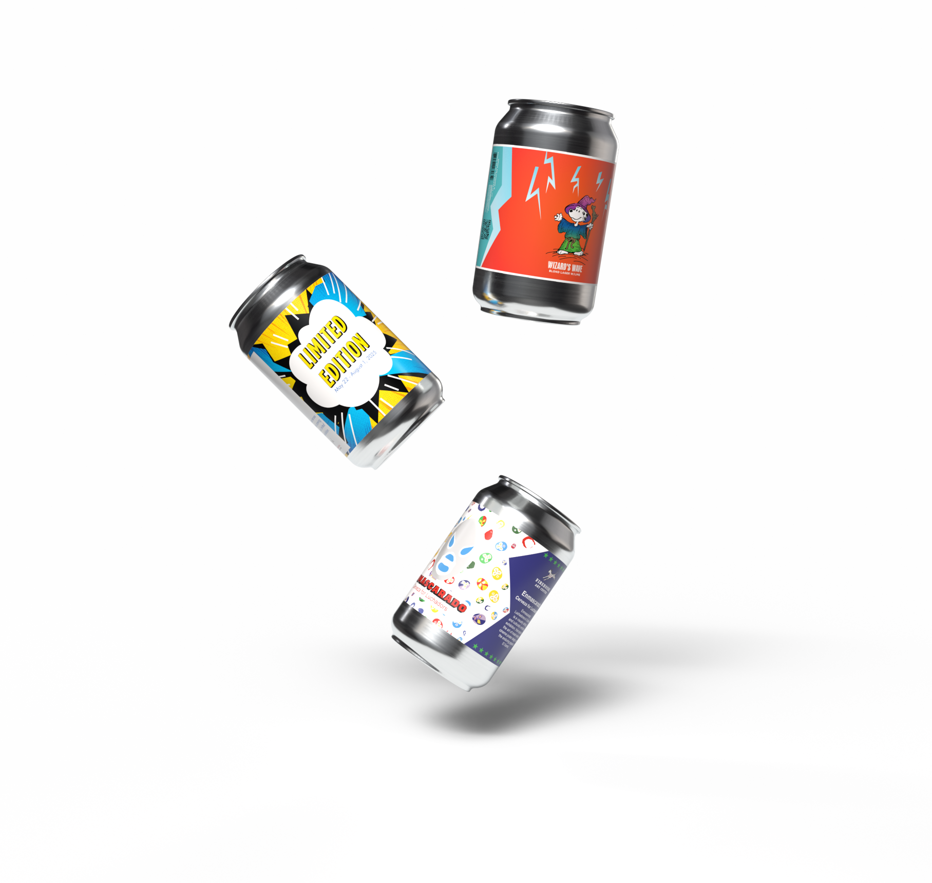
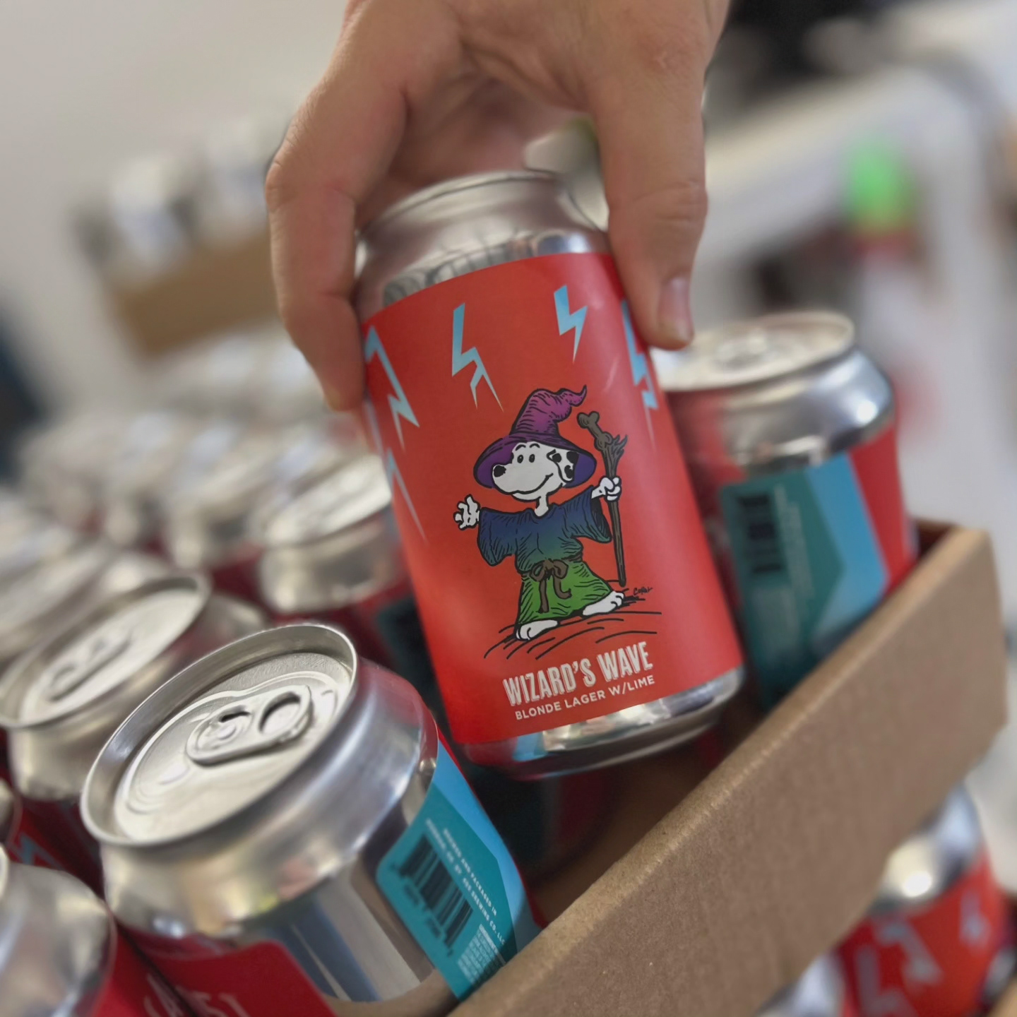
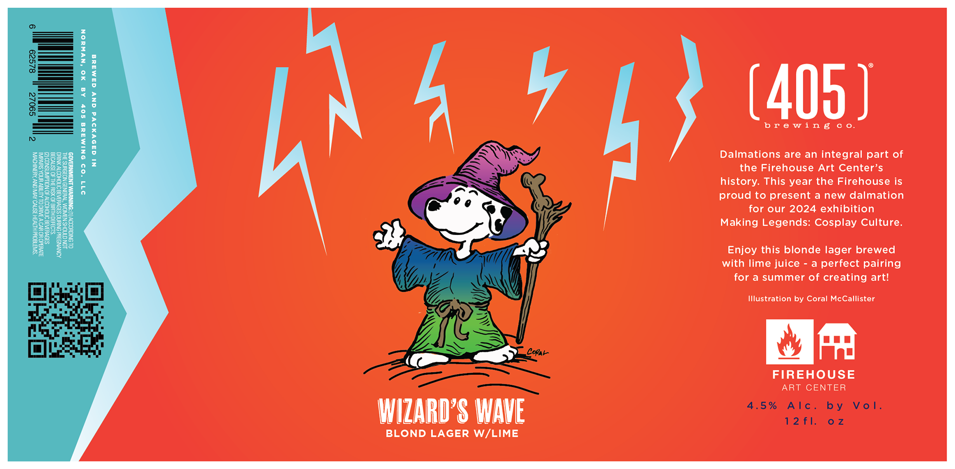
April 2024 | Wizard's Wave - [405] Brewing Company
Created in partnership with [405] Brewing Company and a founding member of the Firehouse Art Center, Wizard’s Wave was designed to debut alongside the Making Legends: Cosplay Culture exhibition. Inspired by classic Dungeons & Dragons lore, the label channels the energy of fantasy spellcasting — a visual nod to the spell "Warding Wave" and the rich storytelling tradition of tabletop gaming.
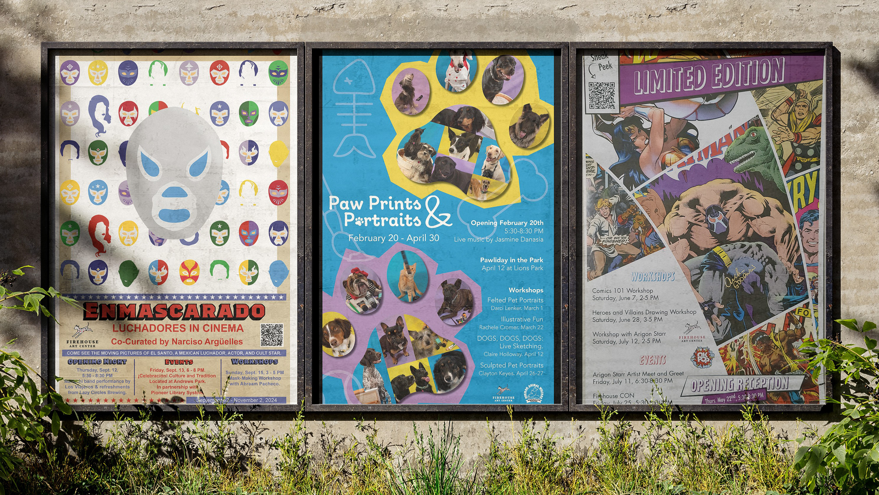
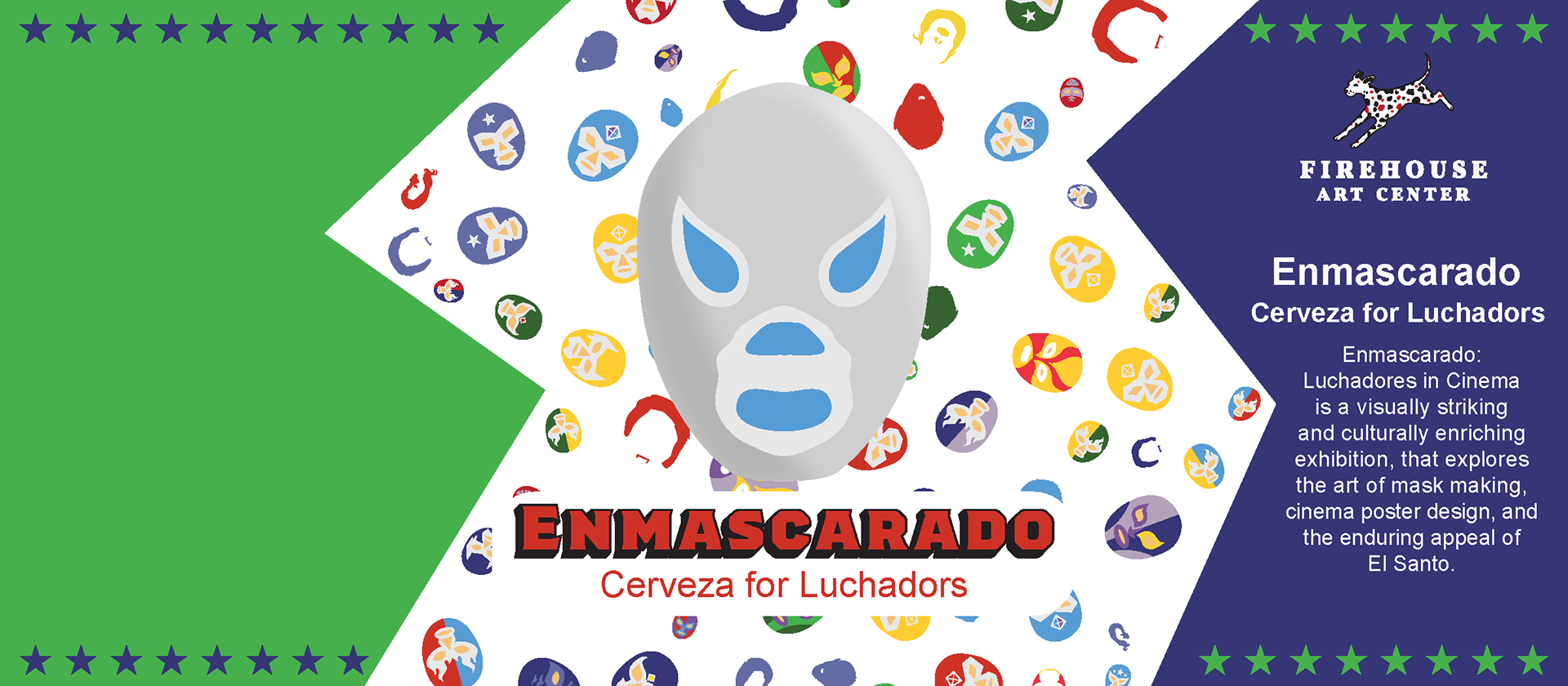
August 2024 | Cerveza - Lazy Circles
To celebrate the opening of Enmascarado: Luchadores in Cinema, this label was developed in collaboration with Lazy Circles Brewing. The design honors the cinematic legacy of El Santo and the colorful, high-drama world of Mexican wrestling. With bold colors and heroic iconography, the label captures the cultural power and flair of lucha libre on and off the screen.
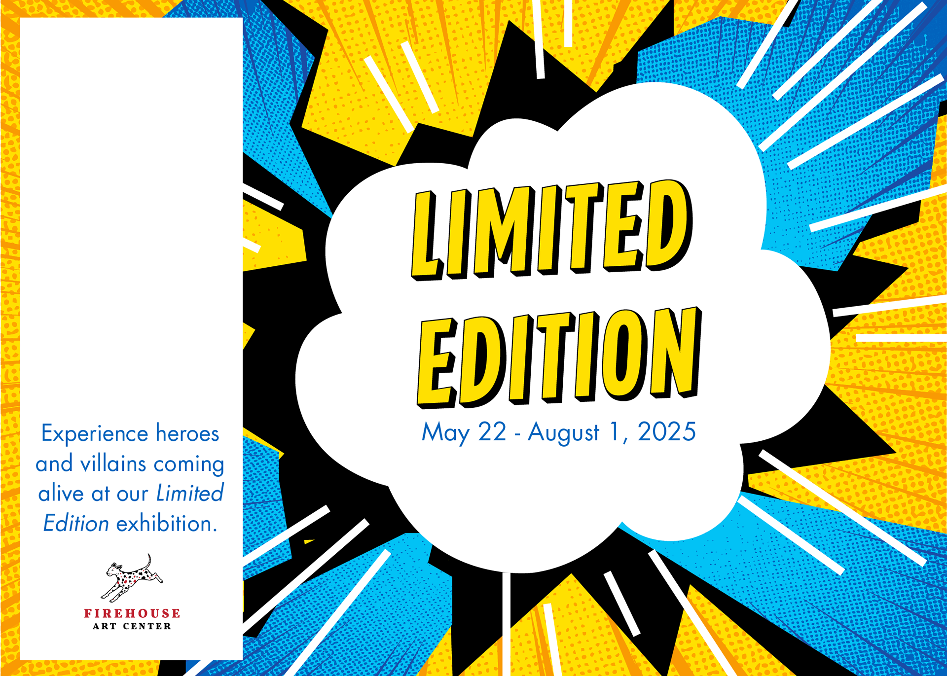
May 2025 | Limited Edition - BIG
For the Limited Edition comic book exhibition, this explosive label was created in partnership with Beer Is Good Brewing Company. Designed to feel like a comic panel bursting off the can, it captures the dynamic energy of vintage superhero art, bold ink lines, and the pop-art punch of classic print comics
Magazine
Concepts
Concepts
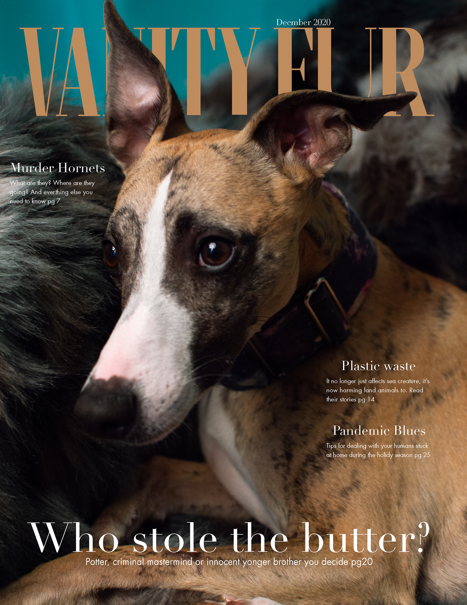
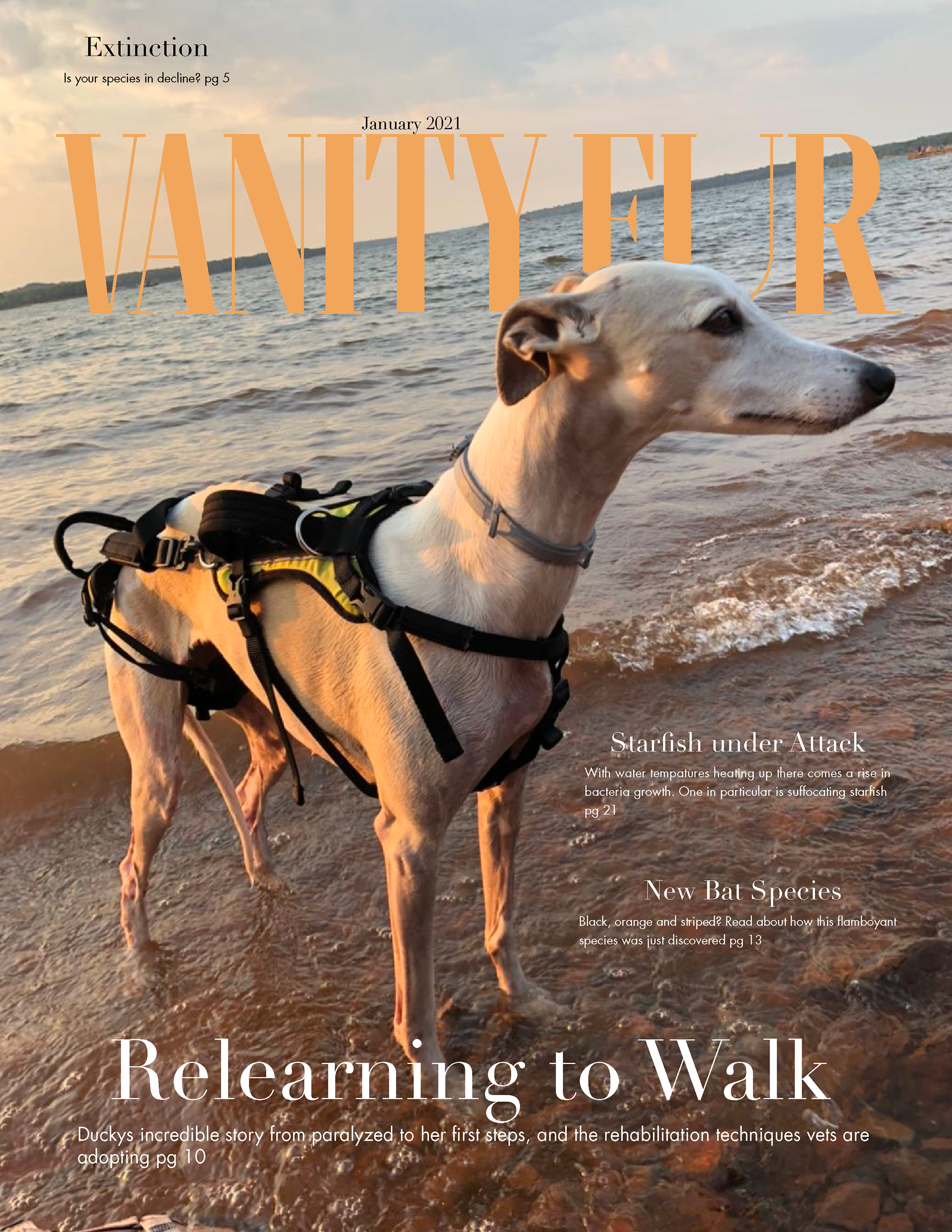
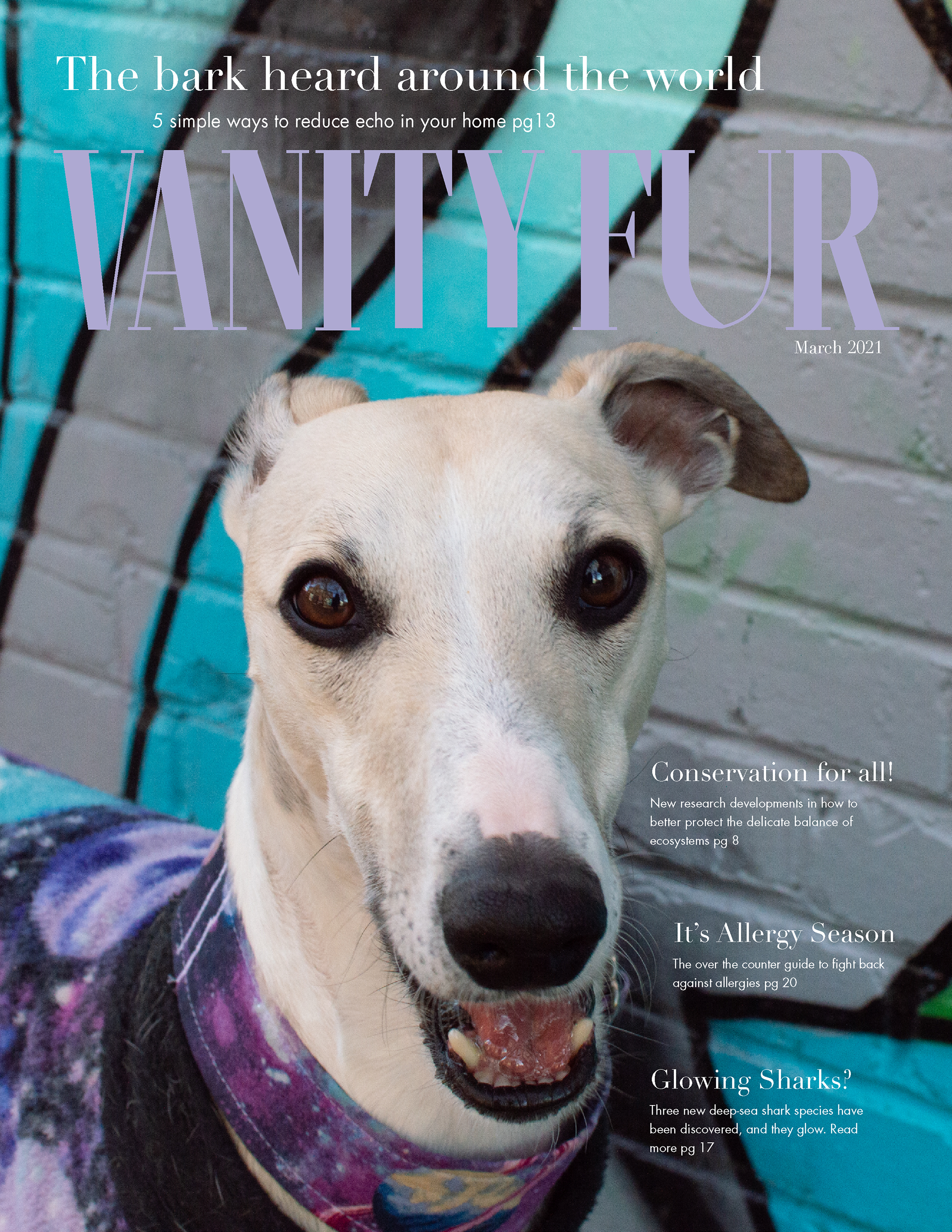
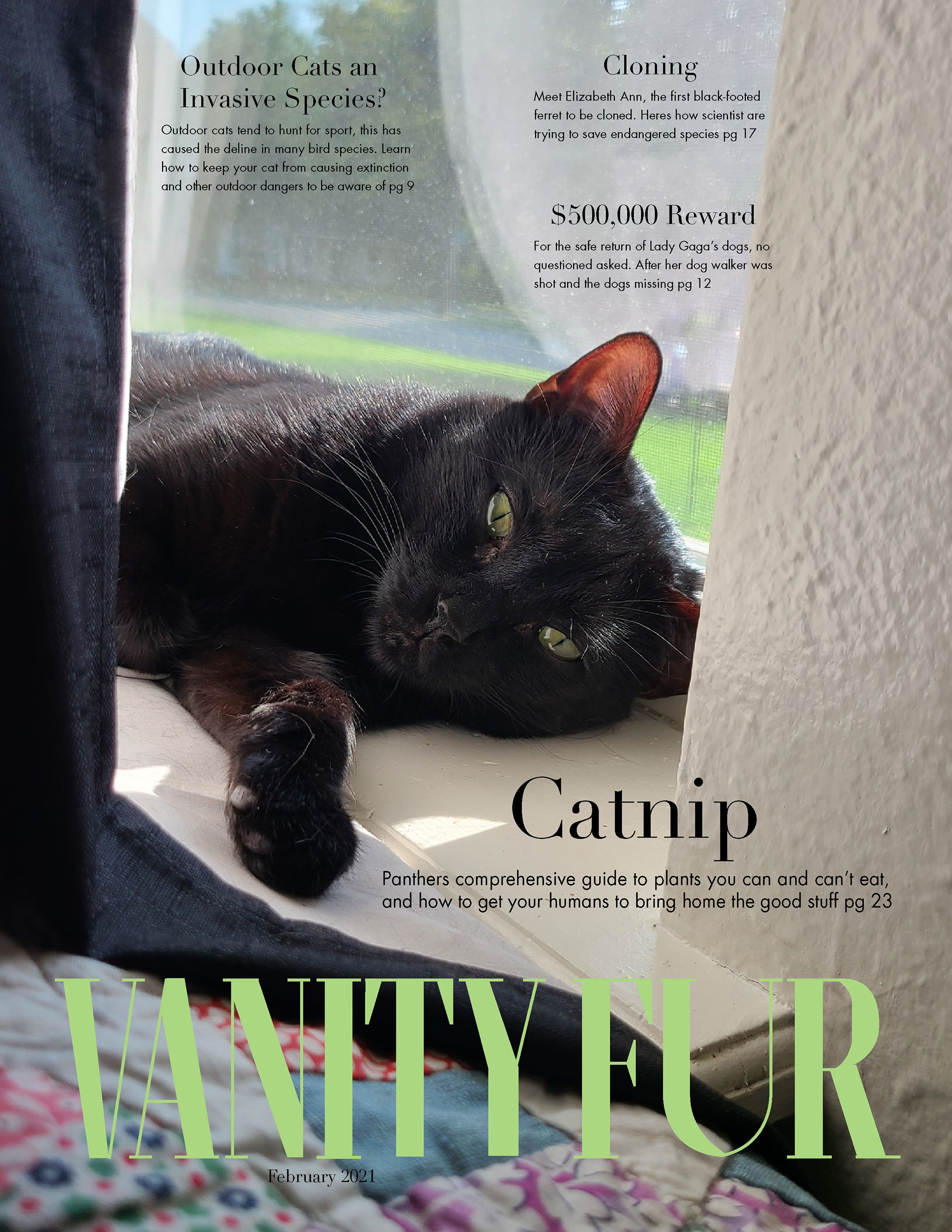
Vanity Fur: The Animal Issue
After taking this picture of Potter (above photo) I knew it belonged on the cover of a scandalous magazine.
The idea was to create a fun playful magazine from the animals point of view. Filled with current events about animals, that affect the entire world. For example, how camels are dying from ingesting water bottle waste, or how large number of starfish are dying from a new bacteria. Important stories that usually are not heard. Our pets are peoples pride and joy, we need to help them and animals around the world. Spreads coming soon!
The idea was to create a fun playful magazine from the animals point of view. Filled with current events about animals, that affect the entire world. For example, how camels are dying from ingesting water bottle waste, or how large number of starfish are dying from a new bacteria. Important stories that usually are not heard. Our pets are peoples pride and joy, we need to help them and animals around the world. Spreads coming soon!


Personality
Book, Poster
and Postcards
Book, Poster
and Postcards

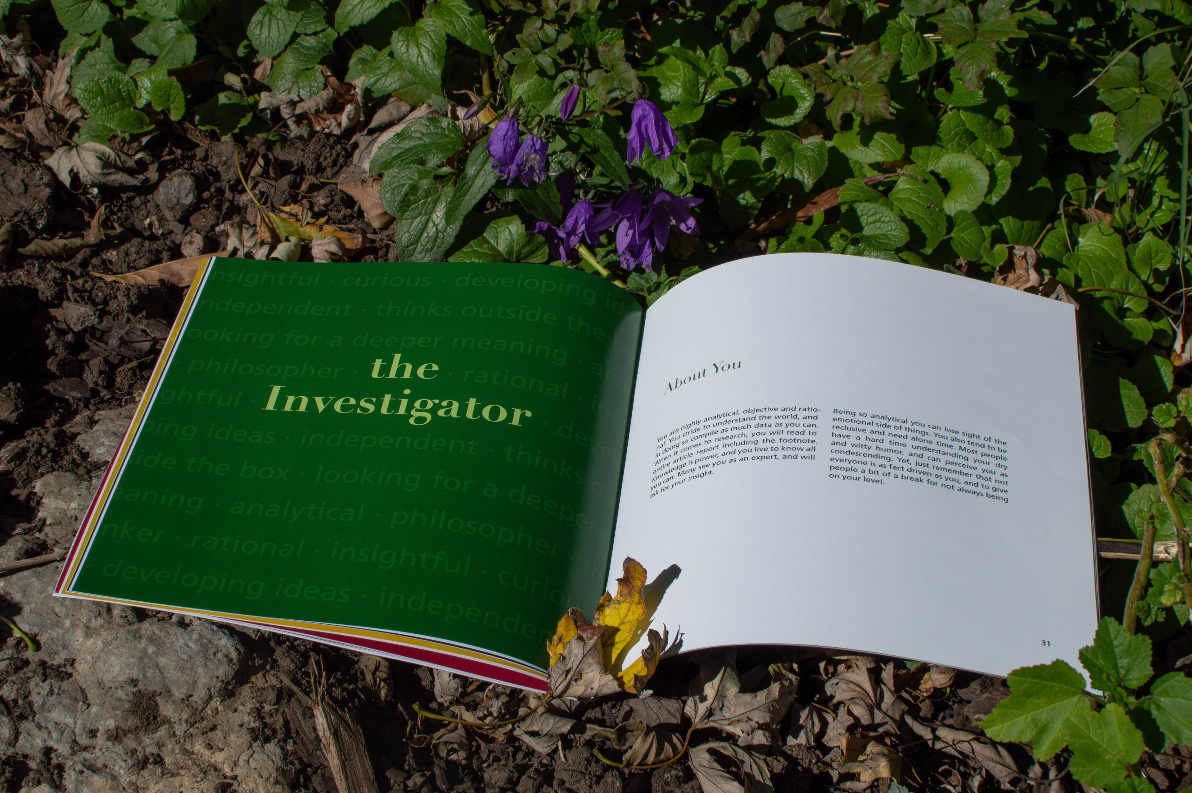
Who are you, is a book that looks into the nine Enneagram personalities. Each section focuses on one personality, looking at their strengths, weaknesses, interactions with others and what jobs may be perfect
for them. The sections each end with a quote that is meant to inspire that specific personality type. Each
section is separated by the color that represents that personality. The purpose of the book, is the more you
know, the better you can be. If you can understand why you think or act they way you do, then you have the ability to become a better you. The book is also meant to be an enjoyable read, that is different for everybody.

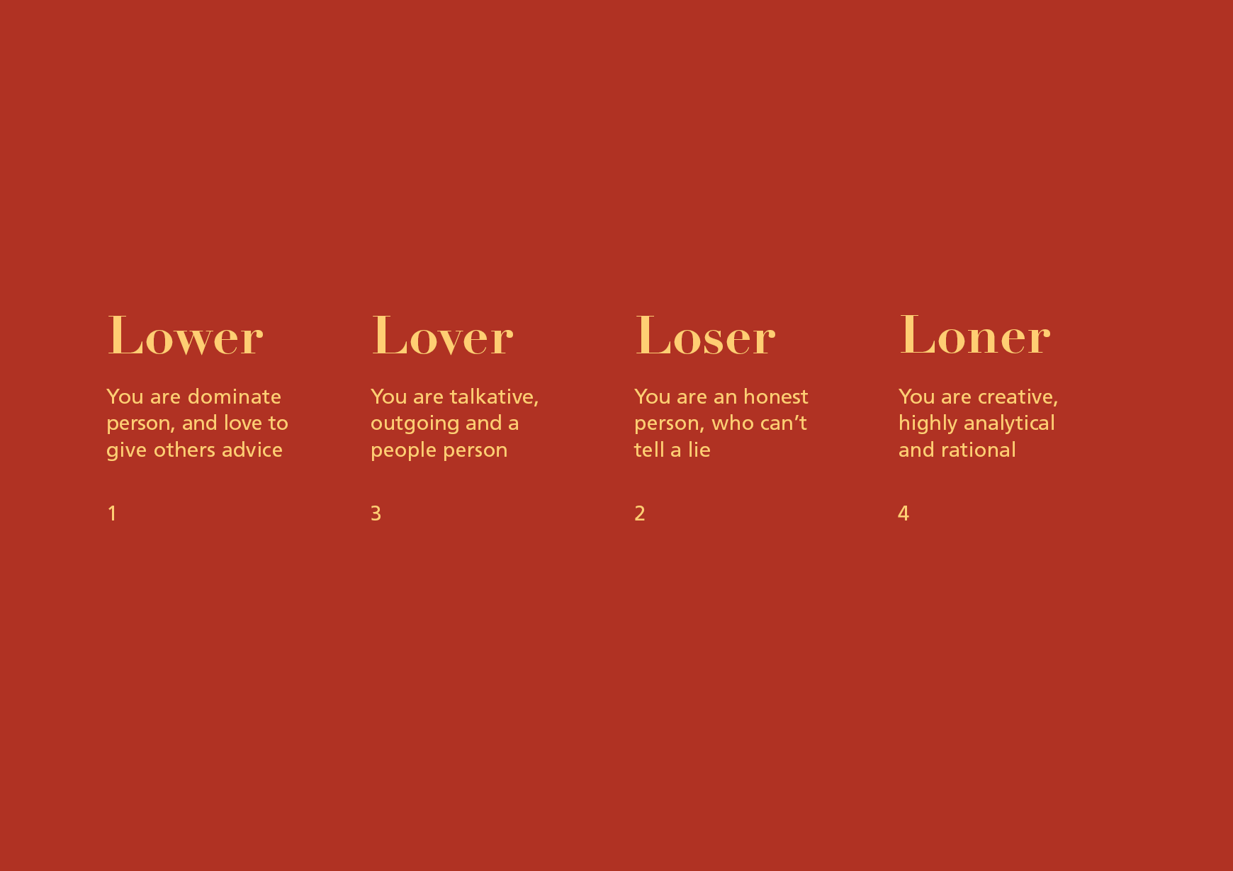
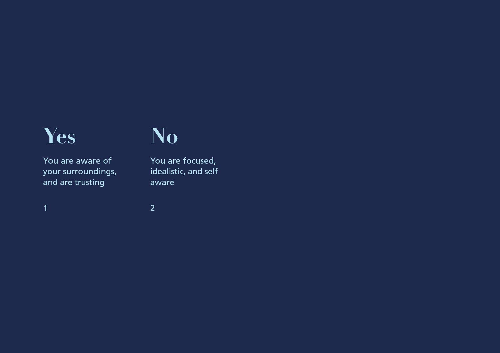
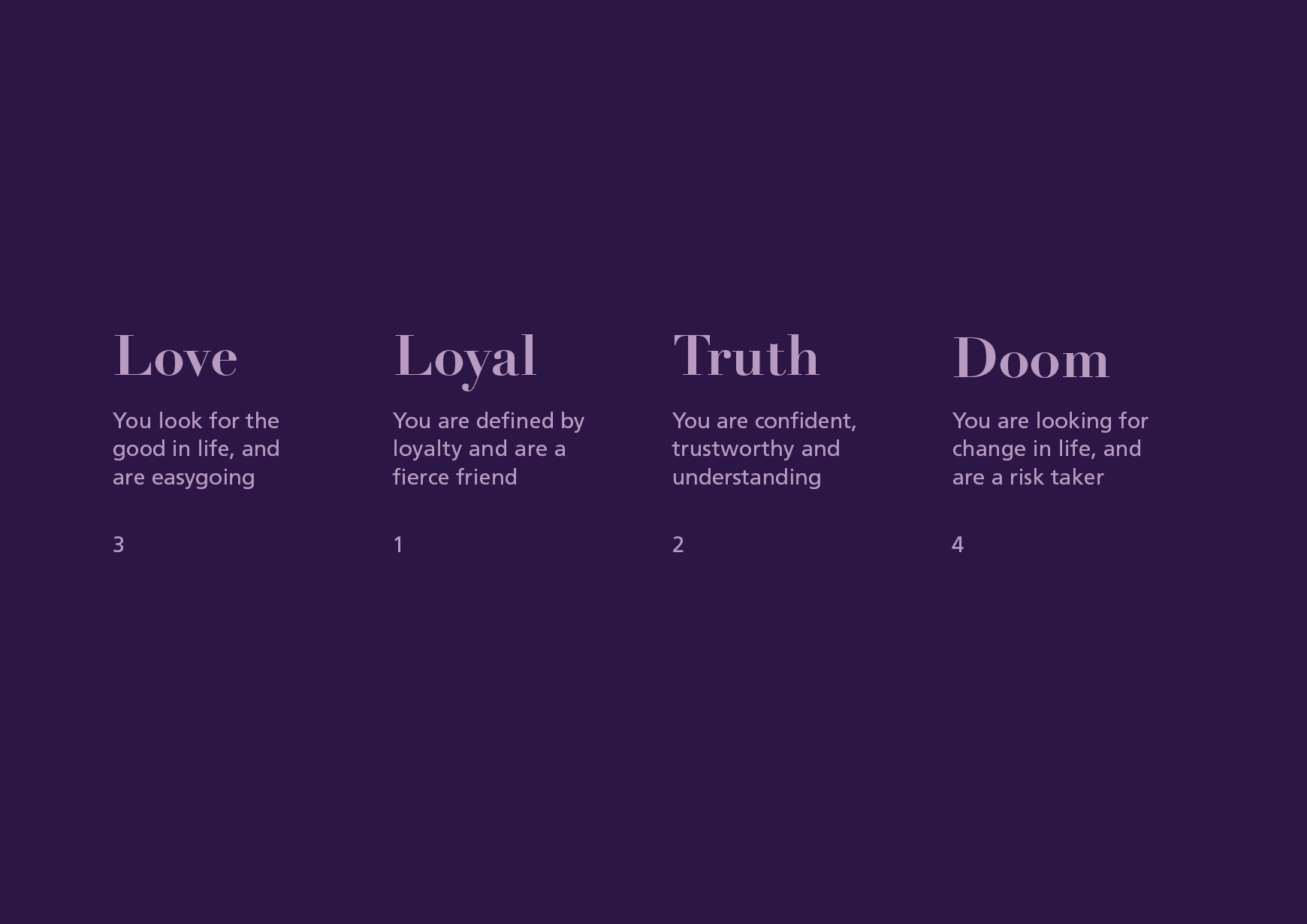
In support of the book, postcards and posters were created. The posters serve as a personality quiz. There
are nine questions, as you go through each, points are accumulated. Then check the key card to see which personality you fall into. Everyone has all nine personality traits, but there is always a dominate one. Our personality also changes based on our state of mine, whether we are stressed or upset. The point of the postcards is not to bring you down to one personality but to narrow you down to a few.
are nine questions, as you go through each, points are accumulated. Then check the key card to see which personality you fall into. Everyone has all nine personality traits, but there is always a dominate one. Our personality also changes based on our state of mine, whether we are stressed or upset. The point of the postcards is not to bring you down to one personality but to narrow you down to a few.
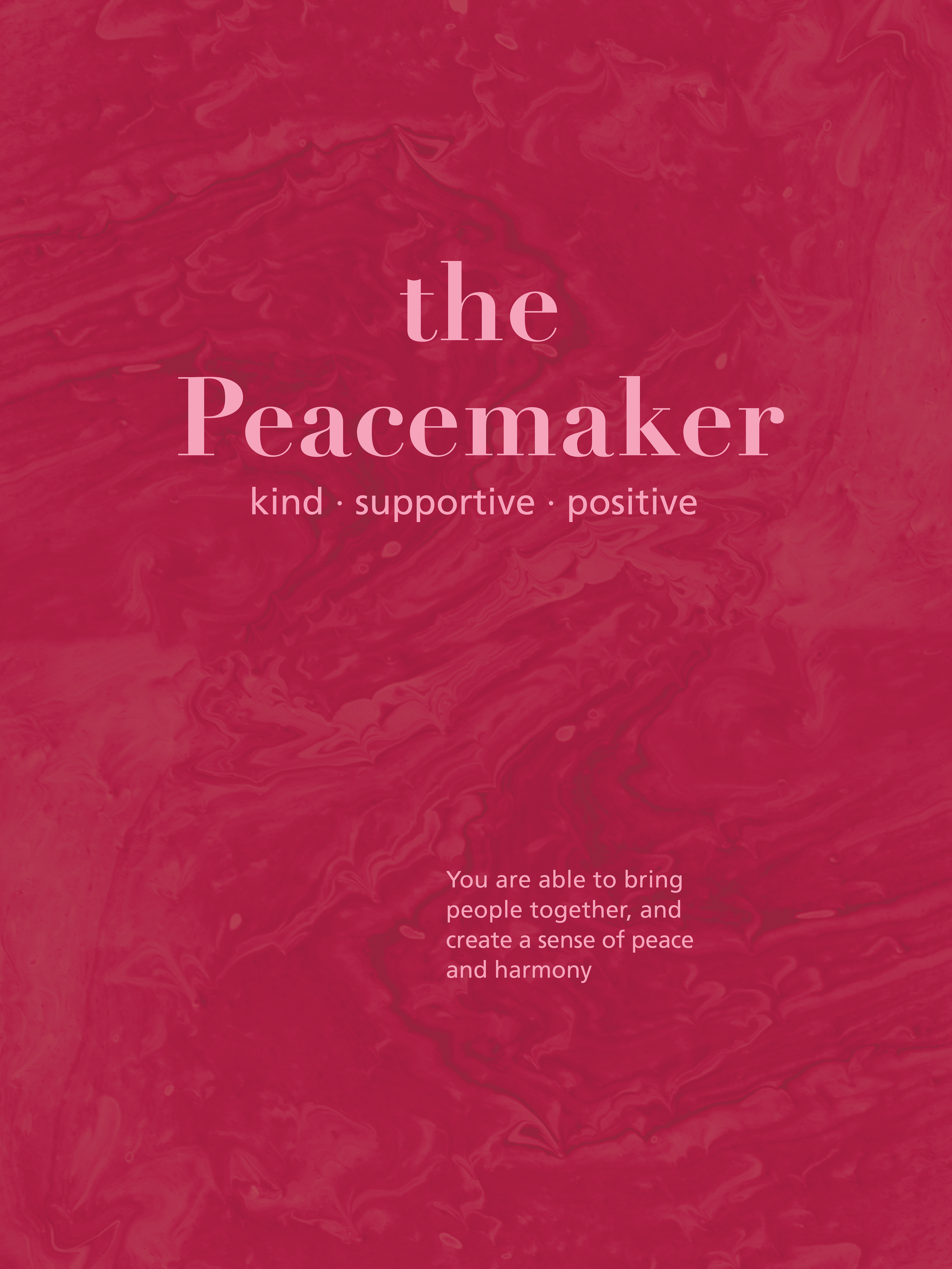
Once a person finds out their dominate personality they could get a poster with that specific type. It would have the best attribute of that type, along with three words that represent them. The posters are a celebration of who you are!

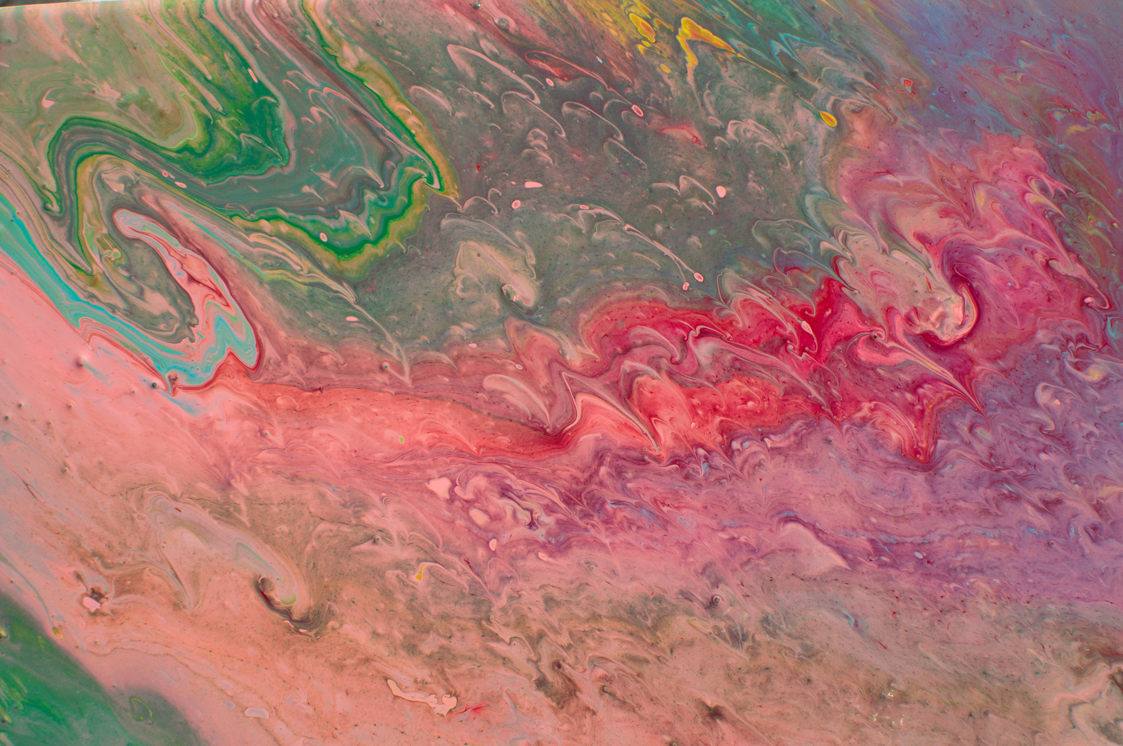

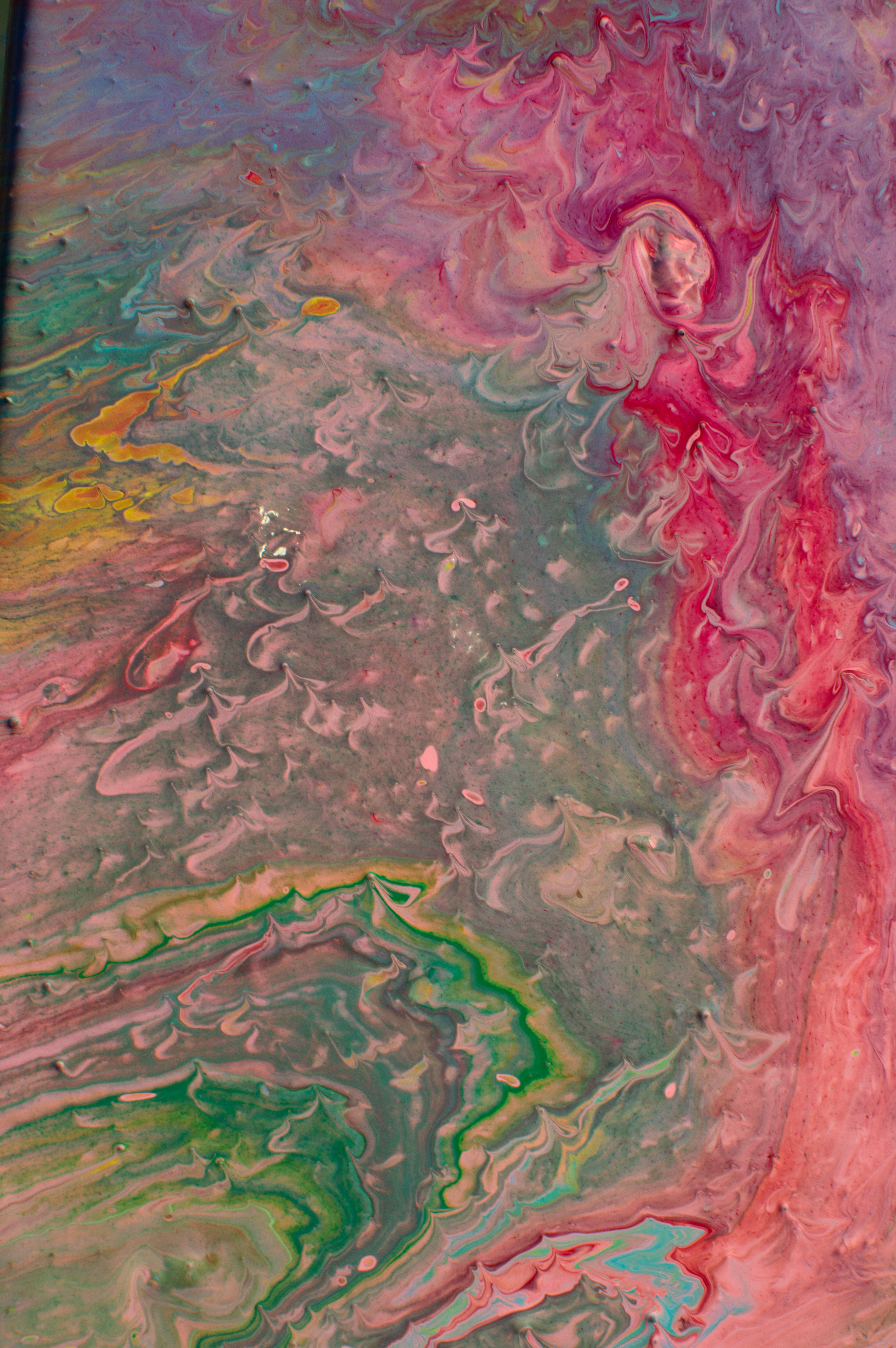
The textures created in the book, postcard and posters were made from a painting. Using all nine of the personality colors I made a paint pour. In the book these textures have an overlay of the personality color. The paintings show how the personalities are separate, but come together to create a masterpiece. The project was to show how we are all masterpieces.